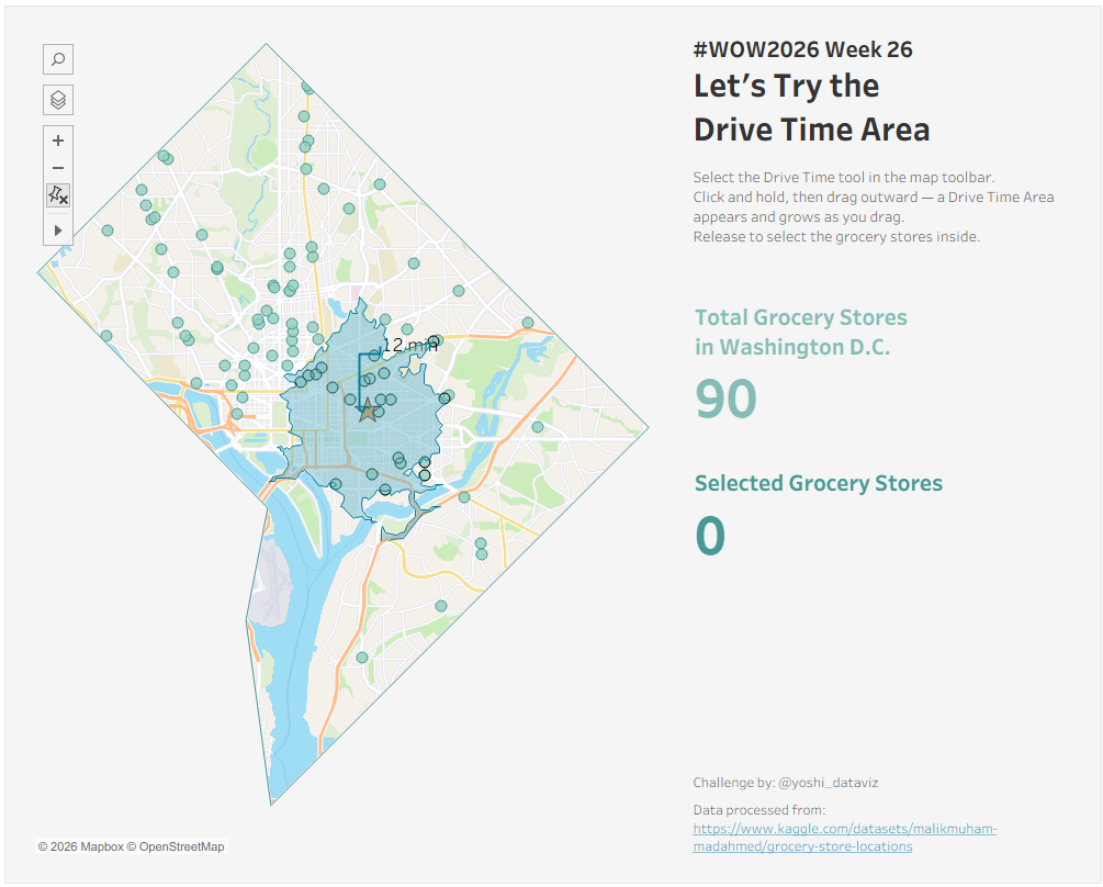
#WOW2026 | Week 26 | Let’s Try the Drive Time Area

Introduction Tableau 2026.2 added a new Drive Time Area tool to maps, and I couldn’t resist building a challenge around it. You click a spot, drag outward, and Tableau shows how far you can really drive based on actual roads, not a straight line circle. This week, start from Union Station in Washington D.C. and […]

#WOW2026 | Week 26 | Let’s Try the Drive Time Area Read More »

Tableau, Workout Wednesday
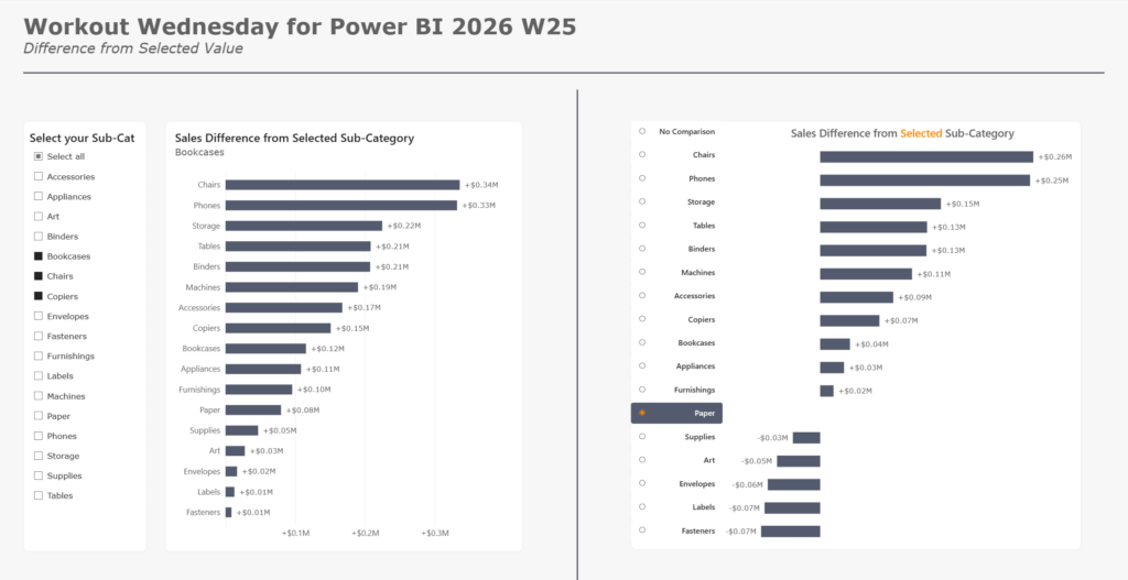
2026 Week 25 | Power BI: Find the difference from a selected value

Introduction We have a new contributor to WoW for Power BI, Robbin Vernooij.  Please check out Robbin’s challenge below, including the solution video! ⬇️ This week we’re looking to give our users the capability to select which sub-category they want to use as a comparison value for all others! This technique has many different use

2026 Week 25 | Power BI: Find the difference from a selected value Read More »

Power BI, Workout Wednesday

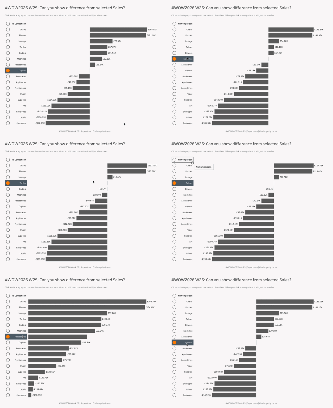
2026 Week 25: Can you show difference from selected Sales?

Introduction This challenge is similar to other challenges, except you’re trying to think differently. Previously this challenge would have been done with LODs or Table Calcs, whilst using Parameter Actions. But you don’t need those fancy Table Calcs or LODs to make the basis of this to work.Yes this does contain some hacky elements, mainly

2026 Week 25: Can you show difference from selected Sales? Read More »

Tableau, Workout Wednesday
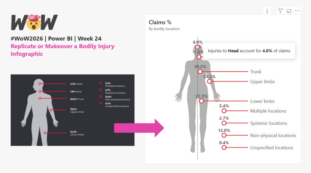
2026 Week 24 | Power BI : Infographic Makeover

Introduction In this week’s challenge we are replicating or doing a makeover on a bodily injuries Infographic, with your choice of two datasets. The design inspiration comes from Safe Work Australia’s Key Statistics   Use your imagination and think about ways you can improve the visual presentation of your dataset of choice. Extra points for

2026 Week 24 | Power BI : Infographic Makeover Read More »

Power BI, Workout Wednesday

#WOW2026 | Week 24 | Can you measure and visualize travel distance?

Introduction The World Cup is in North America this month, and I saw a post showing the locations of national team training sites along with venues where games are being held, and the distance they were each travelling. I was curious if I could build something similar, and I was similarly curious how much each

#WOW2026 | Week 24 | Can you measure and visualize travel distance? Read More »

Tableau, Workout Wednesday
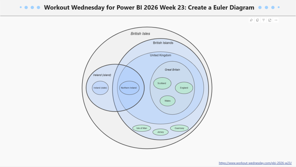
2026 Week 23 | Power BI: Create a Euler Diagram

Introduction This week we are exploring a new type of visual: an Euler diagram.  An Euler diagram is a powerful visualization tool used to depict hierarchical relationships and set containment. Unlike a Venn diagram, which displays all possible logical intersections—even those that are empty—an Euler diagram focuses specifically on the connections present in your data.

2026 Week 23 | Power BI: Create a Euler Diagram Read More »

Power BI, Workout Wednesday

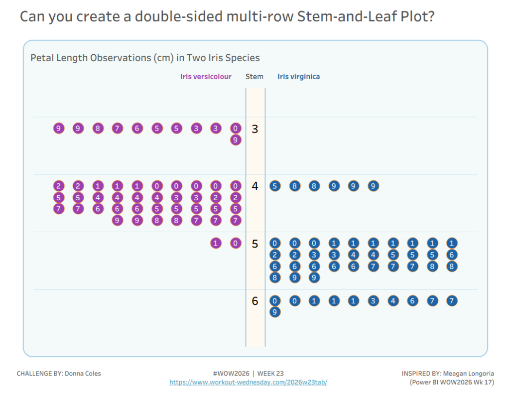
#WOW2026 | Week 23 | Can you create a double-sided multi-row Stem-and-Leaf Plot?

Introduction When browsing around for inspiration for this week’s challenge, I came across this stem & leaf Power BI WOW challenge by Meagan Longoria, which in turn was inspired by a Tableau #WOW challenge set by Yusuke in 2024. So I thought it would be fun to go ‘full circle’ and see if I could

#WOW2026 | Week 23 | Can you create a double-sided multi-row Stem-and-Leaf Plot? Read More »

Tableau, Workout Wednesday
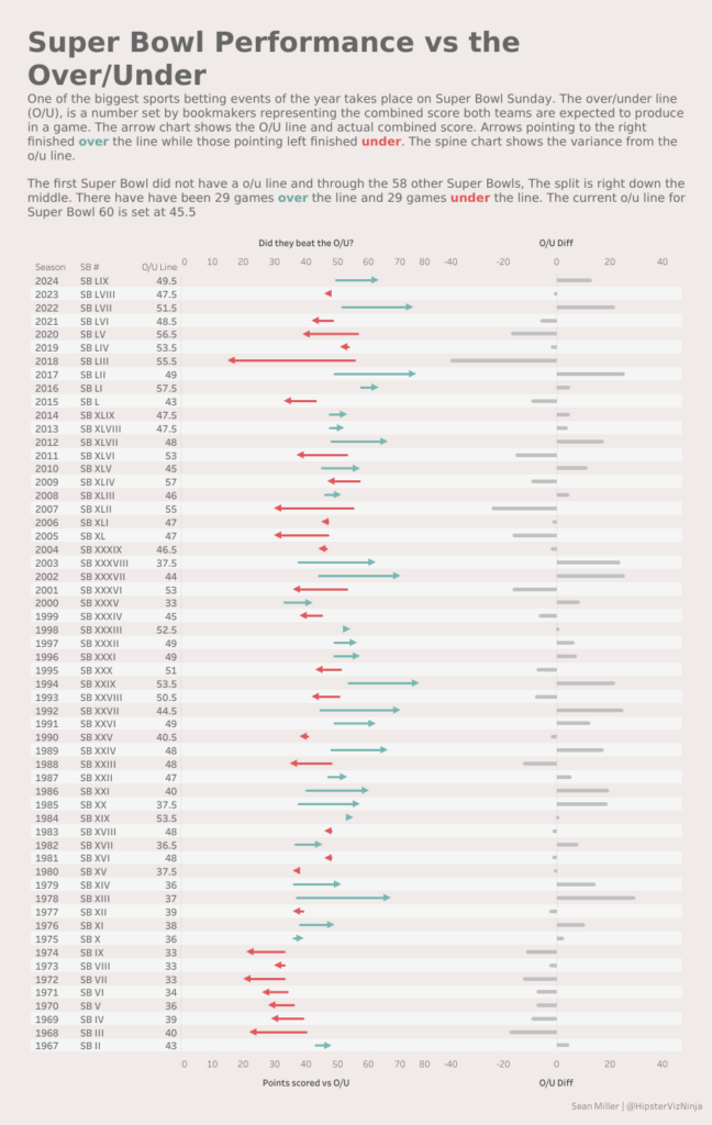
#WOW2026 | 23 | Fun with Gantt Charts

Introduction For the week’s challenge we’re looking at Gantt charts! Gantt chart don’t have to necessarily show timeline data. In Tableau, they can be used to show “floating” bar charts. Which can be very powerful in certain use cases. This challenge looks at historical American Football Super Bowl betting odds and game results. In this

#WOW2026 | 23 | Fun with Gantt Charts Read More »

Tableau, Workout Wednesday