Workout Wednesday

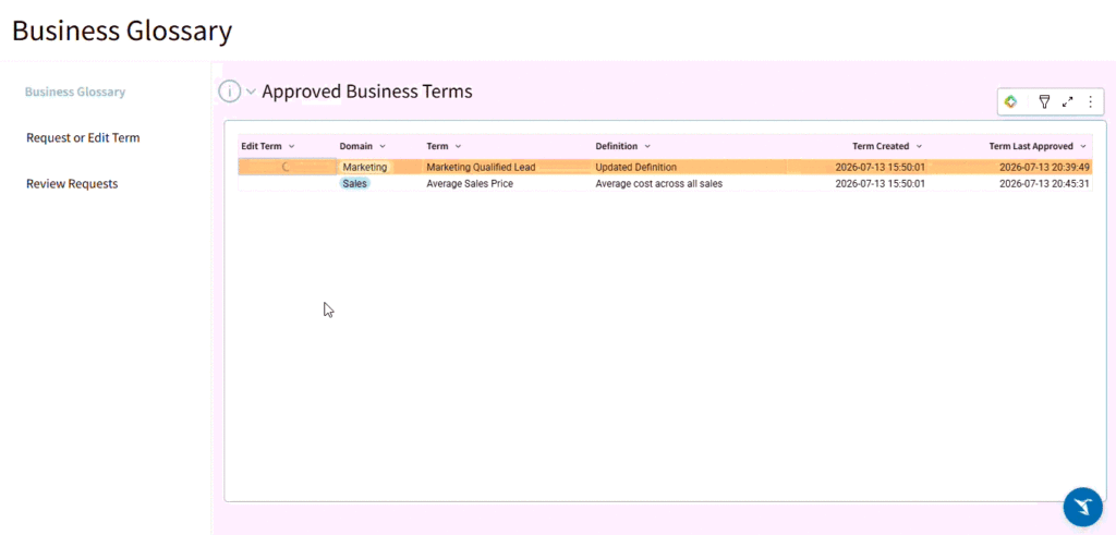
2026 Week 29 | Sigma: Do you approve…. again?

Introduction Welcome to Week 29 of 2026! This week, we’re going to create an approval process.  In the past, we’ve created one using Insert Row and Update Row(s) actions.  In this version, we will utilize Sigma’s new Insert Row(s) action to create an activity stream.  With this new action, we can allow for tabular inputs, […]

2026 Week 29 | Sigma: Do you approve…. again? Read More »

Sigma, Workout Wednesday
2026 Week 28 | Power BI: Redesign a KPI monitor for the CHO

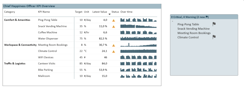
Introduction Imagine, your company hired a Chief Happiness Officer (CHO). Their job: keep the office running smoothly. Coffee stocked, ping-pong table used, no-show meetings under control. They ask for a dashboard. Your first instinct? KPI cards. One per metric, previous value, delta, nice arrow. Clean. Visual. The CHO loves it. Until there are more metrics.

2026 Week 28 | Power BI: Redesign a KPI monitor for the CHO Read More »

Power BI, Workout Wednesday

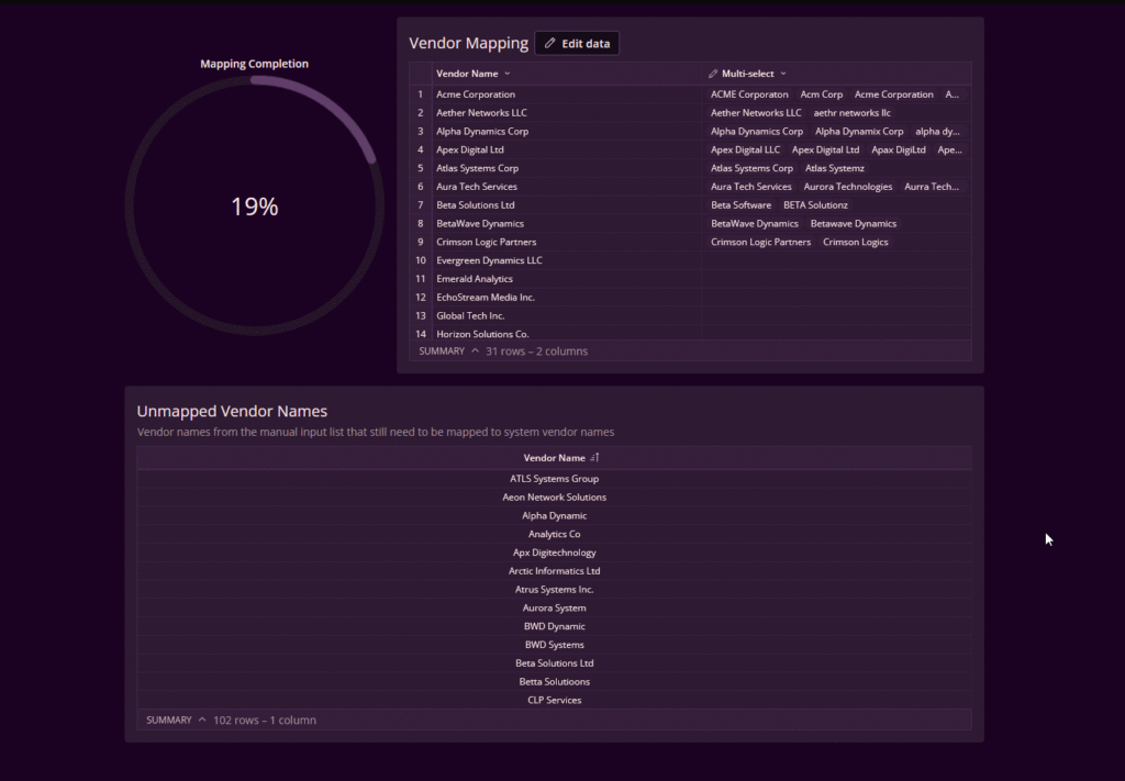
2026 Week 28 | Mapping and Unnesting

Introduction I’ve been on a mapping kick lately – as input tables make data entry and writeback easier, they come with some pitfalls: misspellings, circular references, and cowboy mapping. Today I want to show you a new strategy for handling mapping effectively in Sigma (sometimes called crosswalk tables by AI) using the new Unnesting feature.

2026 Week 28 | Mapping and Unnesting Read More »

Sigma, Workout Wednesday
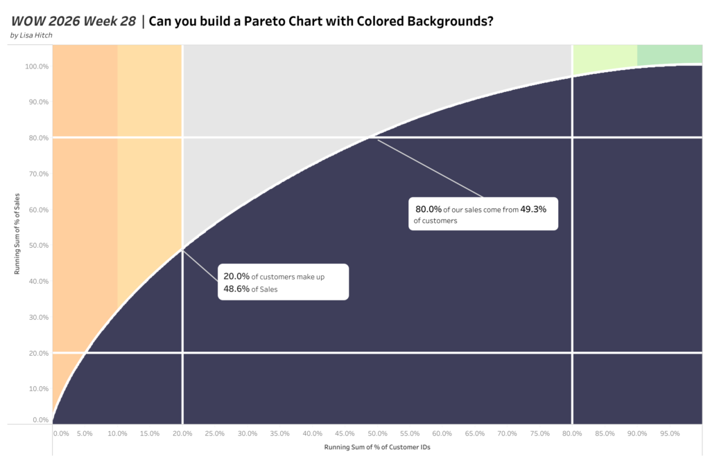
2026 | Week 28 | Can you build a Pareto Chart with Colored Backgrounds?

Introduction This week we have a challenge by Lisa Hitch, Coach of the New York Data School and Winner of the Tableau Conference Tips Battle.  This week we’re putting a fresh spin on a classic chart: the Pareto chart! The Pareto principle (also known as the 80/20 rule) tells us that roughly 80% of outcomes

2026 | Week 28 | Can you build a Pareto Chart with Colored Backgrounds? Read More »

Tableau, Workout Wednesday

2026 Week 27 | Power BI: Create Smarter Tooltips with Sentence Template Tooltips

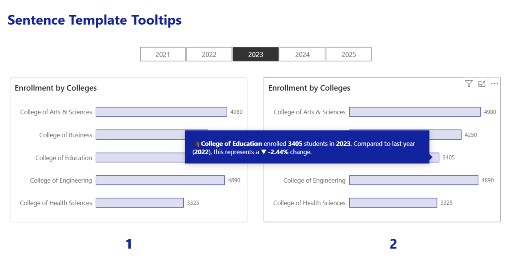
Introduction You’ve probably seen the default Power BI tooltip that lists values like Sales, Profit, or Enrollment. While that’s useful, it doesn’t always explain what those numbers mean. Sentence template tooltips let you turn those values into a natural sentence… making your reports easier to understand without creating a custom tooltip page. Where can you

2026 Week 27 | Power BI: Create Smarter Tooltips with Sentence Template Tooltips Read More »

Power BI, Workout Wednesday

#WOW2026 | Week 27 | Can you build a trellis chart with segment pies?

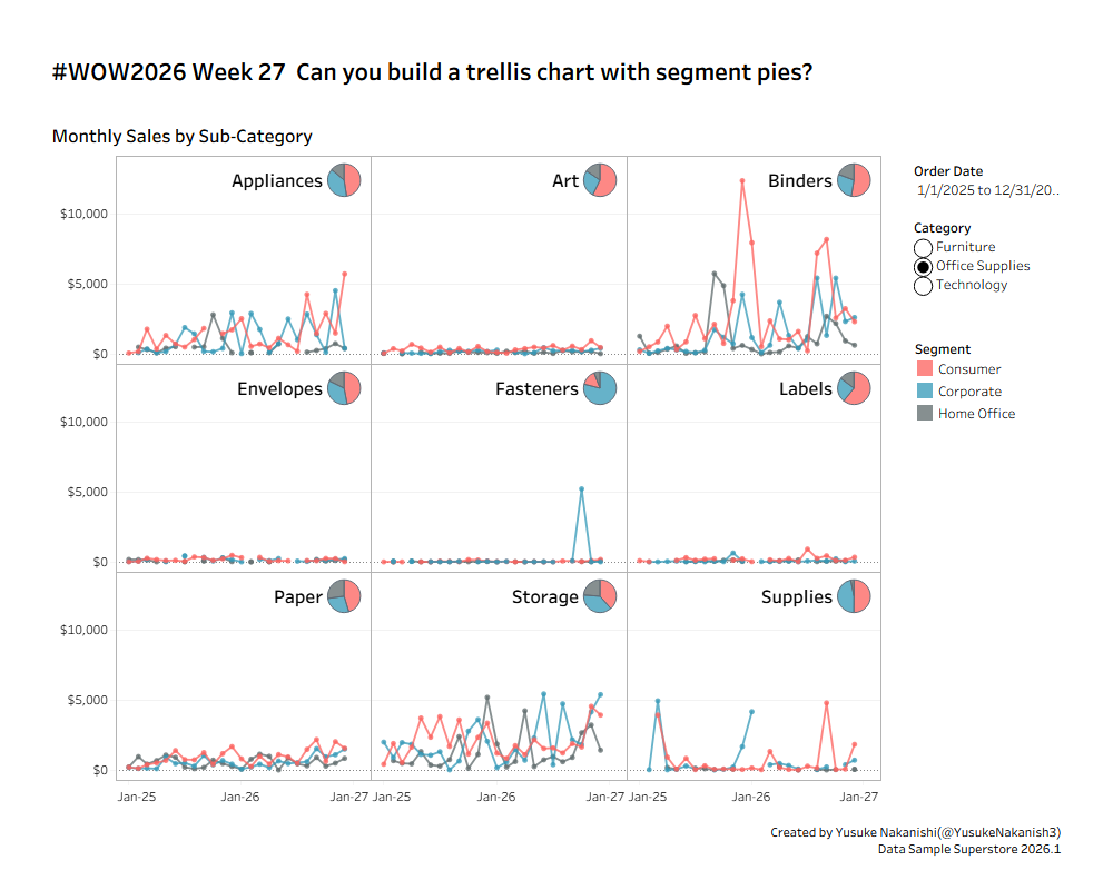
Introduction The other day, at the Hokuriku Tableau User Group, I had the opportunity to talk all about trellis charts with a room full of practitioners—covering everything from the basics and handling missing values to the aspect ratio of individual line chart panels, and more.This week’s challenge features trellis charts as its theme once again,

#WOW2026 | Week 27 | Can you build a trellis chart with segment pies? Read More »

Tableau, Workout Wednesday

2026 Week 26 | Sigma: Level of Detail Calculations

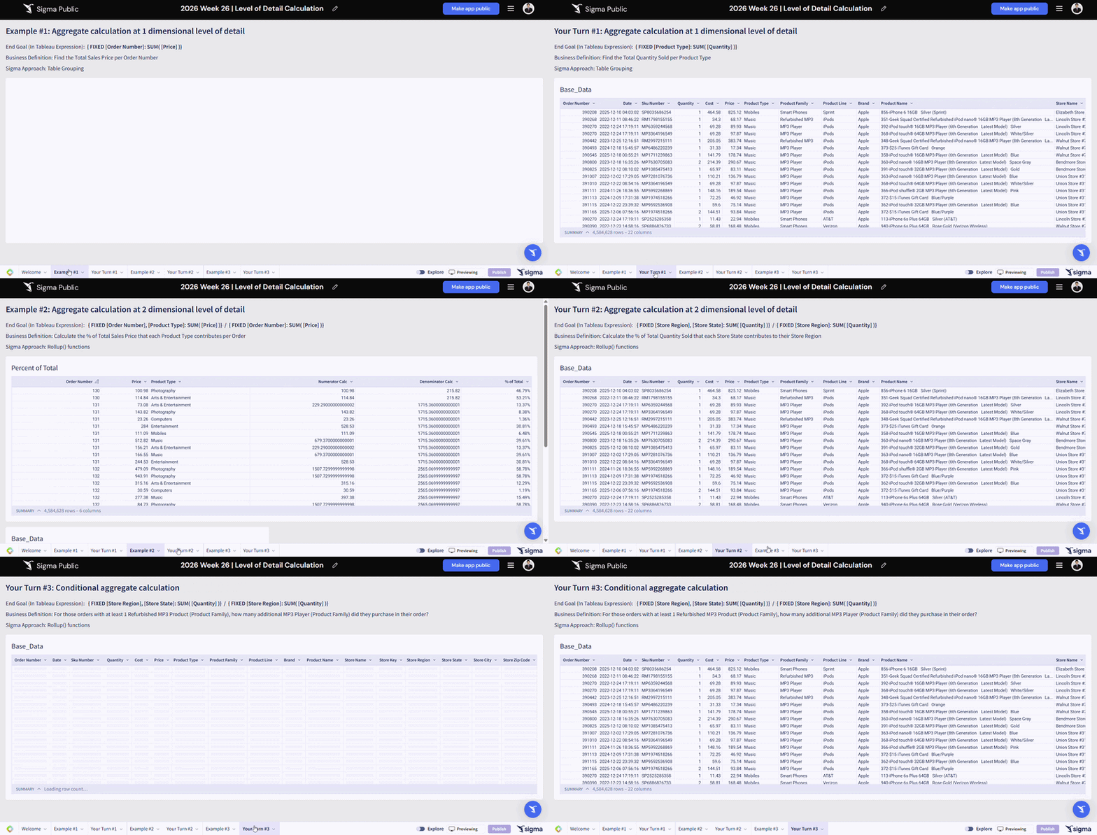
Introduction Welcome to Week 26 of 2026! We are bringing “Level of Detail” expressions that you might be famililar from other BI tools into Sigma this week! In short, Level of Detail expressions allow you to perform aggregation by specifically defined dimensions that is less granular than the row level, while preserving the overall table

2026 Week 26 | Sigma: Level of Detail Calculations Read More »

Sigma, Workout Wednesday
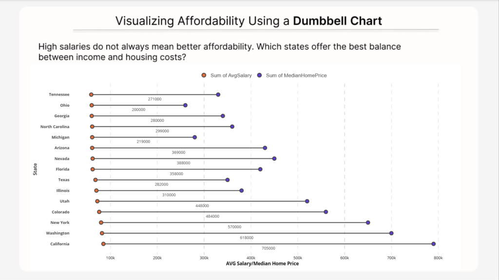
2026 Week 26 | Power BI: Visualizing Affordability Using a Dumbbell Chart

Introduction This week, we have another new contributor to Workout Wednesday for Power BI: Nabha Ahmed. Give Nabha’s challenge a try! In this challenge, we explore a data visualization technique called a dumbbell chart. A dumbbell chart is used to compare two related values within the same category. It displays both values as points connected

2026 Week 26 | Power BI: Visualizing Affordability Using a Dumbbell Chart Read More »

Power BI, Workout Wednesday