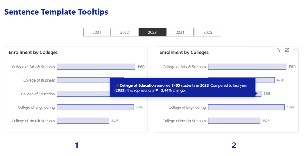
2023 Week 01 | Power BI: Use DAX to control visual display

Introduction Welcome to Workout Wednesday 2023, Power BI edition! If this is your first time joining us, we’re happy you’re here. The goal of this initiative is to help you build your Power BI skills. We provide the data and the instructions, and you build the visuals! We hope you have fun and learn a new

2023 Week 01 | Power BI: Use DAX to control visual display Read More »

2026 Week 18 | Sigma: AI Sentiment Analysis with Snowflake Cortex

Introduction Imagine you are the Senior Customer Success Manager at a SaaS company that runs on a subscription model, and you are responsible for reviewing complaint resolutions proposed by junior-level agents.  This week, we are bringing Snowflake AI_Sentiment(), AI_Classify(), and AI_Complete() functions into Sigma AI App. Snowflake Cortex AI will help you identify the customer’s

2026 Week 18 | Sigma: AI Sentiment Analysis with Snowflake Cortex Read More »

#WOW2026 | Week 18 | Let’s Visualize TC25! (#TC26 Live Edition)

Introduction This challenge was released at the TC26 Workout Wednesday session. Whether you’re here in the room or finding it later, I hope you’ll have fun! In this challenge, we’ll visualize the sessions of Tableau Conference itself. Three difficulty tiers are available, so pick the one that matches your confidence and give it a try.

#WOW2026 | Week 18 | Let’s Visualize TC25! (#TC26 Live Edition) Read More »

#WOW2026 | Week 17 | Can you build a radar chart using viz extensions?

Introduction Since I jumped the gun on Community Month with Jack’s guest challenge last time around, I was exploring some of the other viz extensions from LaDataViz, when I came upon a radar chart. Since Donna’s challenge last week was a radar chart inspired by a community member technique, I thought it would be interesting

#WOW2026 | Week 17 | Can you build a radar chart using viz extensions? Read More »

2026 Week 17 | Power BI: Create a Double-Sided Stem-and-Leaf Plot

Introduction Inspired by a previous Tableau challenge, we are making a double-sided stem-and-leaf plot, but we are using a different dataset and showing the observed petal length of two species of iris. A stem-and-leaf plot displays numerical data by splitting each value into a “stem” (leading digit) and a “leaf” (trailing digit), arranging them so

2026 Week 17 | Power BI: Create a Double-Sided Stem-and-Leaf Plot Read More »

2026 Week 16 | Power BI: Recreate the Tableau Satellite Chart

Introduction This week, we are making a Power BI version of a previous Tableau challenge by Donna Coles. We are making small multiple spiral charts, also called satellite charts. Satellite charts can be used to show percentages when values exceed 100%. Rather than creating one circle like a donut chart, the line spirals out to

2026 Week 16 | Power BI: Recreate the Tableau Satellite Chart Read More »

#WOW2026 | Week 16 | Can you build a radar chart with map layers?

Introduction For this week’s community challenge, I am drawing inspiration from this blog post by fellow Ambassador and new Visionary, Johan de Groot. I’ve had radar charts on my back-burner for some time, but never got round to putting out as a challenge, as felt they may seem ‘too fiddly’. But Johan shared a ‘map

#WOW2026 | Week 16 | Can you build a radar chart with map layers? Read More »

Week 15

2026 Week 15 | Power BI: Exploring and Enhancing the new Theme

Introduction In this week’s challenge we are exploring the new Power BI Theme that is in Preview : https://powerbi.microsoft.com/en-us/blog/deep-dive-into-modern-visual-defaults-and-customizing-theme-improvements-preview/   The new theme comes with new chart defaults and additional Style Presets.   The challenge is to set your own defaults by downloading the JSON Theme file and modifying it.   You can use a

2026 Week 15 | Power BI: Exploring and Enhancing the new Theme Read More »