Author name: Meagan Longoria

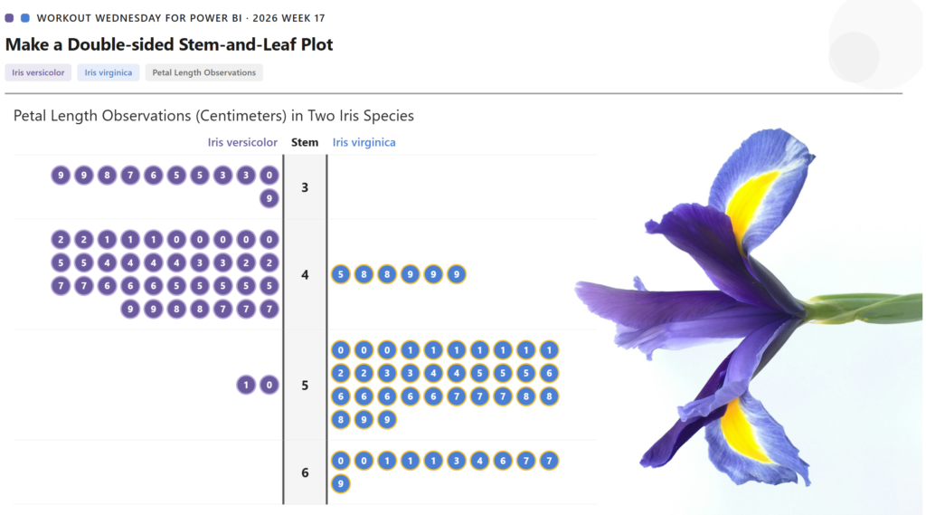
2026 Week 17 | Power BI: Create a Double-Sided Stem-and-Leaf Plot

Introduction Inspired by a previous Tableau challenge, we are making a double-sided stem-and-leaf plot, but we are using a different dataset and showing the observed petal length of two species of iris. A stem-and-leaf plot displays numerical data by splitting each value into a “stem” (leading digit) and a “leaf” (trailing digit), arranging them so […]

2026 Week 17 | Power BI: Create a Double-Sided Stem-and-Leaf Plot Read More »

Power BI, Workout Wednesday
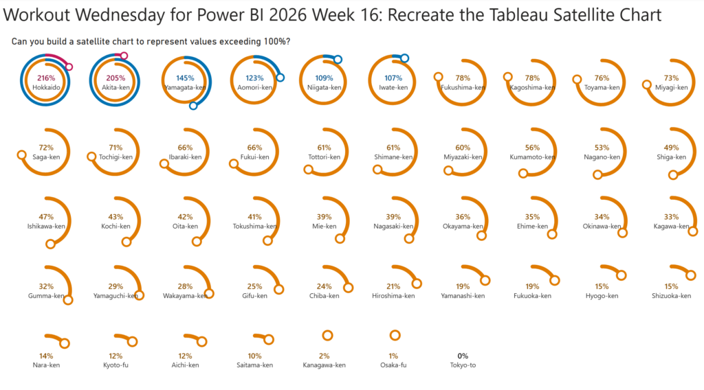
2026 Week 16 | Power BI: Recreate the Tableau Satellite Chart

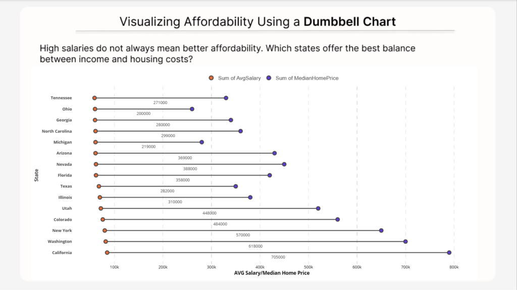
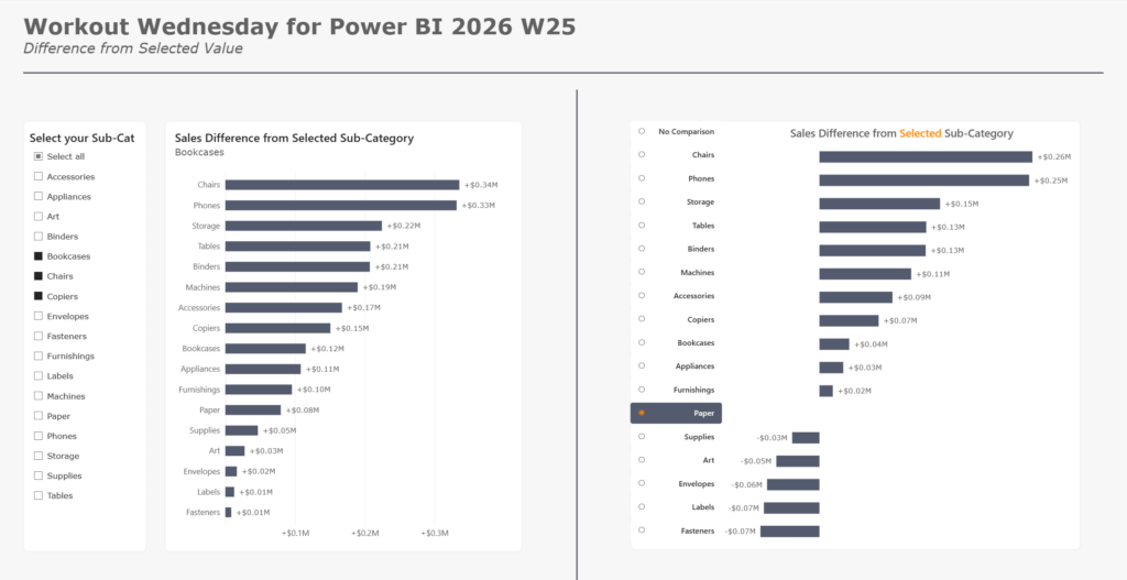
Introduction This week, we are making a Power BI version of a previous Tableau challenge by Donna Coles. We are making small multiple spiral charts, also called satellite charts. Satellite charts can be used to show percentages when values exceed 100%. Rather than creating one circle like a donut chart, the line spirals out to

2026 Week 16 | Power BI: Recreate the Tableau Satellite Chart Read More »

Power BI, Workout Wednesday
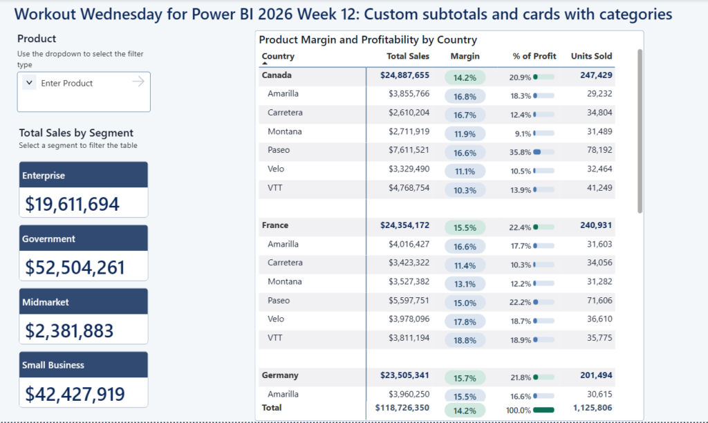
2026 Week 12 | Power BI: Custom matrix subtotals and cards with categories

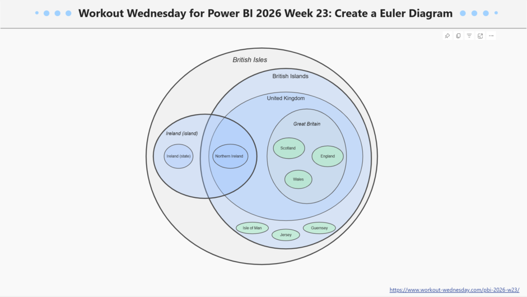
Introduction This week we are looking at some newer core visuals and formatting features: cards that in a segmented tile layout, a slicer that supports partial text matching, and a matrix where the percentage-of-total calculation changes meaning depending on whether you’re looking at a subtotal or a detail row.  The bonus challenge pushes into SVG-in-DAX

2026 Week 12 | Power BI: Custom matrix subtotals and cards with categories Read More »

Power BI, Workout Wednesday
2025 Week 50 | Power BI: First Snowfall Scatterplot

Introduction The first snowfall in Denver was unseasonably late this year. So I got curious about the data and decided to make a visualization. While this one does communicate with data, it’s taking a bit of artistic license.  This is your challenge as well: create a first snowfall scatterplot with some wintery visual effects. You

2025 Week 50 | Power BI: First Snowfall Scatterplot Read More »

Power BI, Workout Wednesday
2025 Week 41 | Power BI: eCommerce metrics bar-in-bar visualizations

Introduction I’ve been reading the new book Dashboards That Deliver by Andy Coatgreave, Amanda Makulec, Jeffrey Shaffer, and Steve Wexler. Chapter 14 contains an eCommerce dashboard by Dorian Banutoiu that shows how many people viewed a product, added it to their cart, and then actually purchased it. I appreciated the compact nature of what the book

2025 Week 41 | Power BI: eCommerce metrics bar-in-bar visualizations Read More »

Power BI, Workout Wednesday
2025 Week 27 | Recreate This Wealth Infographic

Introduction Recreating visuals you find online helps you build visual design skills and find workarounds to common problems or feature gaps in Power BI. This week, we are recreating this infographic from Visual Capitalist about the change in global wealth. The original is shown below, followed by my version in Power BI. Requirements Create a

2025 Week 27 | Recreate This Wealth Infographic Read More »

Power BI, Workout Wednesday
2025 Week 7 | Power BI: Create a tree map organized into columns

Introduction The January 2025 update of Power BI Desktop brought us some enhancements to the tree map visual, including 3 new tiling methods and options for spacing between groups and nodes. So this week we are trying out those features to make a tree map organized into columns.  Requirements Download the “Regional Sales Sample.pbix” file

2025 Week 7 | Power BI: Create a tree map organized into columns Read More »

Power BI, Workout Wednesday
2025 Week 5 | Power BI: Add an All Category to a Bar Chart

Introduction There are times where we want to compare categorical data with a total, perhaps an average. And sometimes we don’t want to see that total at the bottom of a table. So this week we are creating a bar chart that contains a “total average” bar. We want the bar chart sorted descending by

2025 Week 5 | Power BI: Add an All Category to a Bar Chart Read More »

Power BI, Workout Wednesday