2024 Week 09 – Formulate Select and Navigate Dashboard

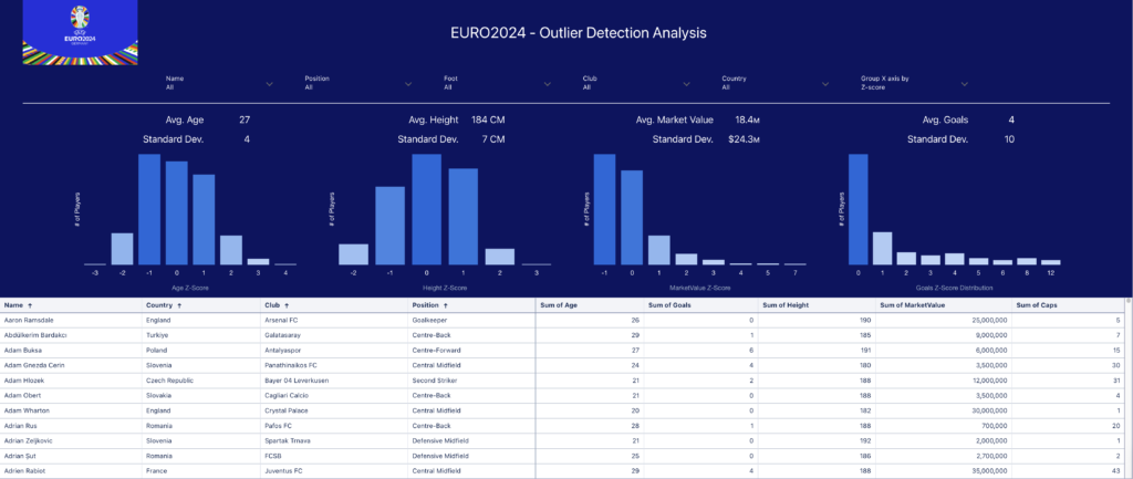
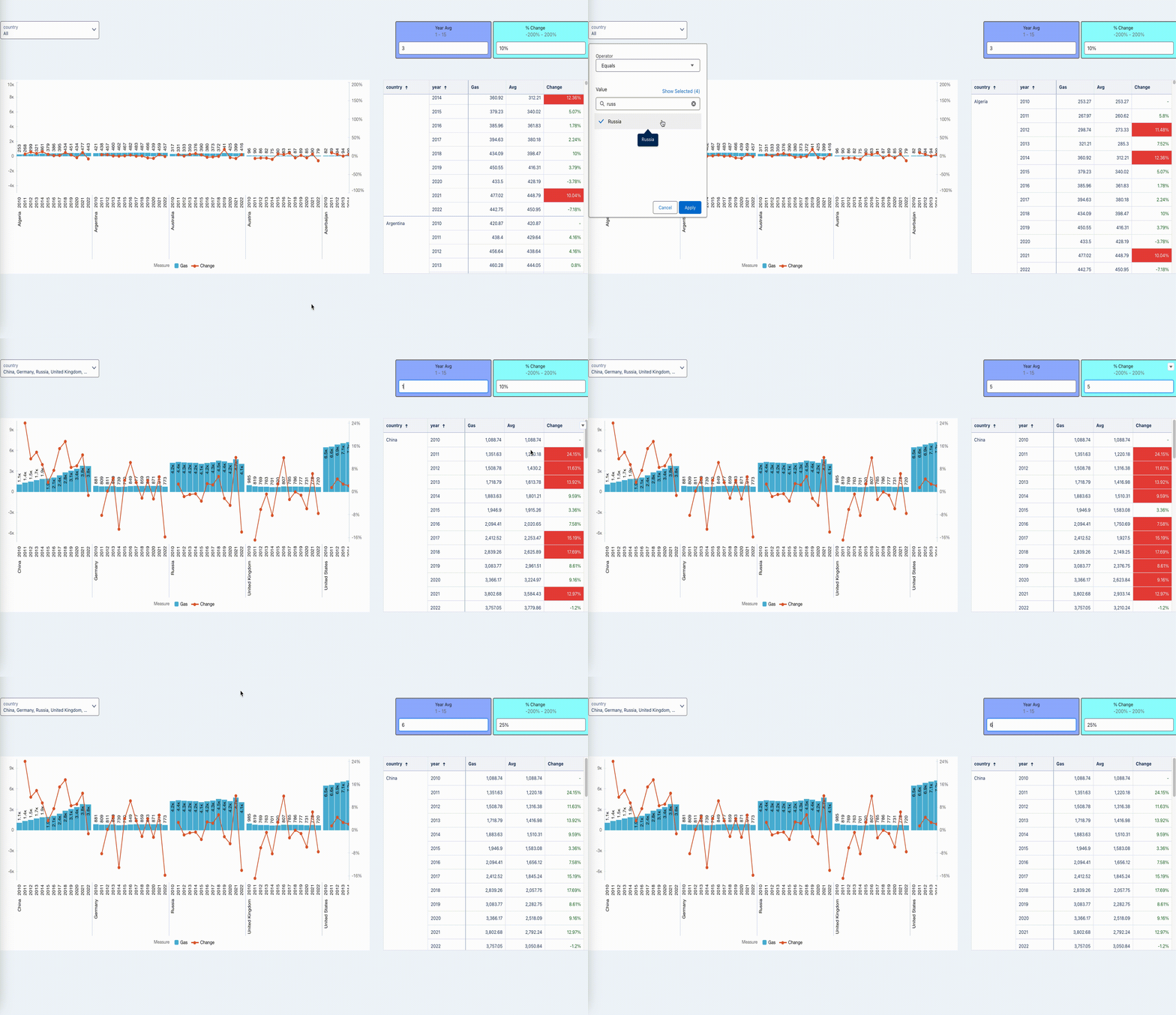
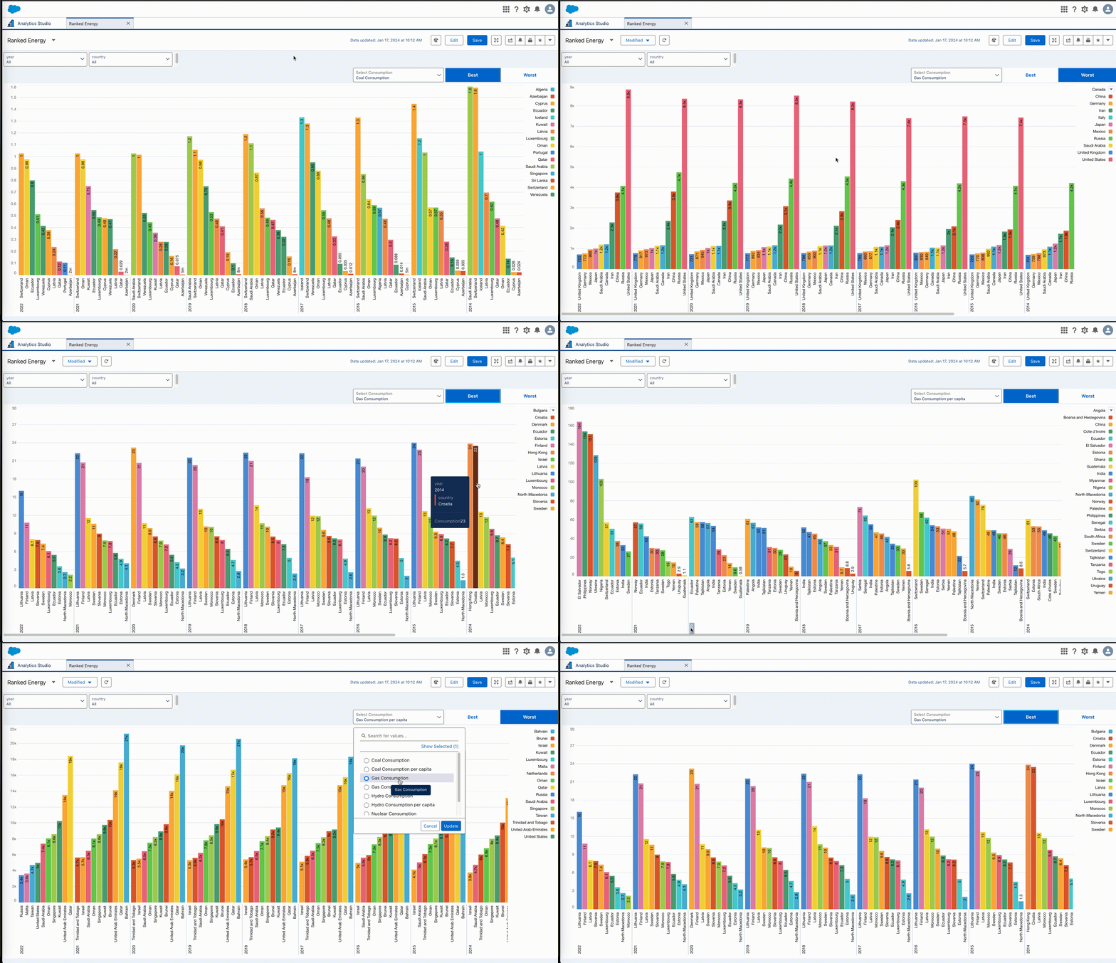
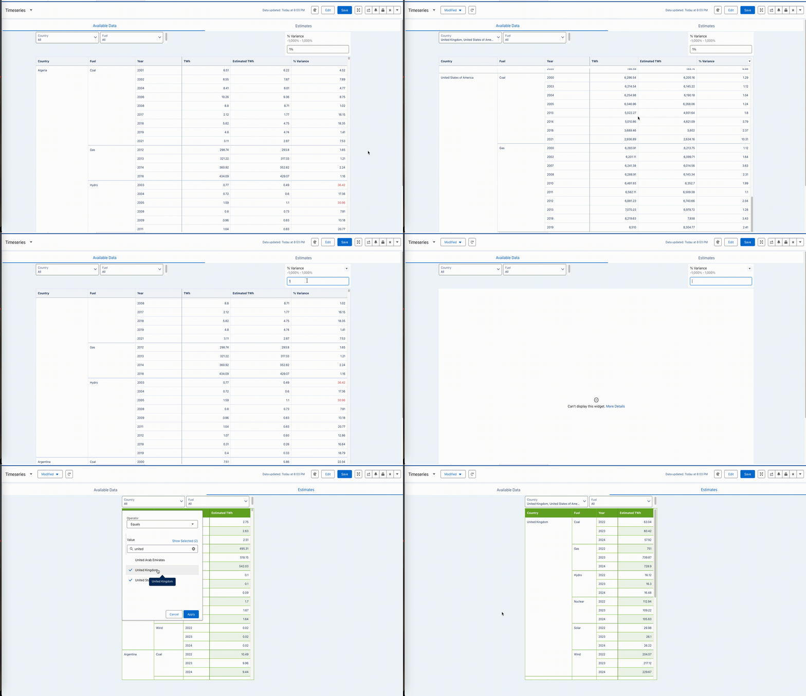
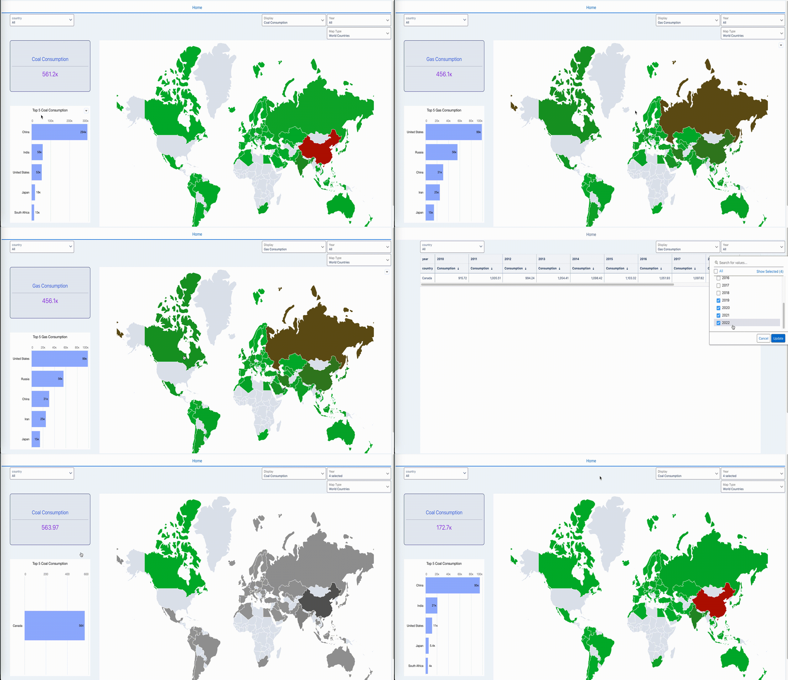
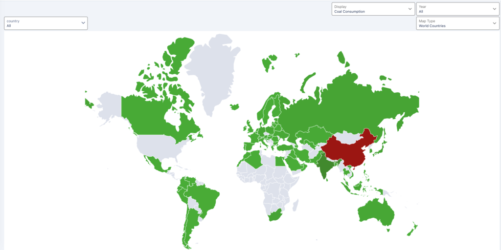
Introduction Almost the end of February! Time flies fast! – And another WoW Challenge is here!!  This week is based on the same dataset and maps we had as a challenge during Week 4! The changes are adding one KPI, and one top 5 chart to the existing dashboard. Then add an Interaction (not binding)

2024 Week 09 – Formulate Select and Navigate Dashboard Read More »

CRM Analytics, Workout Wednesday

2023 Week 01 | Power BI: Use DAX to control visual display

Introduction Welcome to Workout Wednesday 2023, Power BI edition! If this is your first time joining us, we’re happy you’re here. The goal of this initiative is to help you build your Power BI skills. We provide the data and the instructions, and you build the visuals! We hope you have fun and learn a new

2023 Week 01 | Power BI: Use DAX to control visual display Read More »

Power BI, Workout Wednesday

2026 Week 36 | Power BI: Create an Unemployment Waffle Chart

Introduction Welcome back to Workout Wednesday! This week we’re exploring parts to a whole using a waffle chart and unemployment data. This visual was inspired by Steven Ponce, whose work has been a great source of inspiration for me. It also builds on my previous Workout Wednesday waffle chart, giving me an opportunity to revisit

2026 Week 36 | Power BI: Create an Unemployment Waffle Chart Read More »

Power BI, Workout Wednesday

#WOW2026 | Week 36 | Let’s tell a story with Map Layers

Introduction We know that Tableau can be used for really great executive dashboards and analytic explorations, but one of the things that I love using Tableau the most for is storytelling. Especially whenever you can combine that with a map, Tableau can do some pretty incredible things.   This week, for Workout Wednesday, we’re going

#WOW2026 | Week 36 | Let’s tell a story with Map Layers Read More »

Tableau, Workout Wednesday

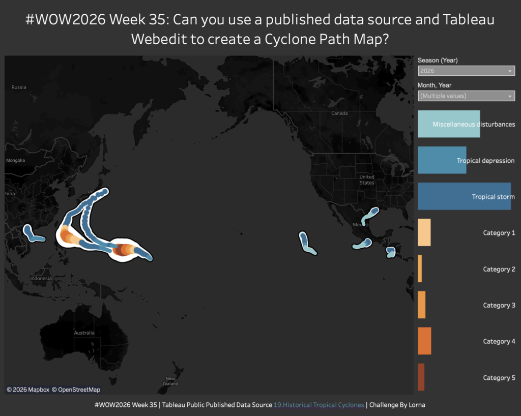
#WOW2026 Week 35 | Can you use a published data source and Tableau Webedit to create a Cyclone Path Map?

Introduction This week I wanted to use Tableau Publics WebEdit to build a viz with one of their published datasources. Granted not all of the formatting options are there that I would like, so some of the chart choices are a bit wackier than they would be in Desktop. I would have love to have

#WOW2026 Week 35 | Can you use a published data source and Tableau Webedit to create a Cyclone Path Map? Read More »

Tableau, Workout Wednesday

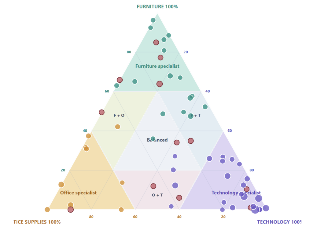
2026 Week 35 | Power BI: Ternary Charts for Cross-Sell

Introduction Traditional customer rankings tell us who generates the most revenue, but they do not explain what those customers buy. A customer may be highly valuable and still buy almost entirely from one product category – which makes the next conversation much clearer than a generic “upsell” message. This week, build a Customer Cross-Sell Map in

2026 Week 35 | Power BI: Ternary Charts for Cross-Sell Read More »

Power BI, Workout Wednesday

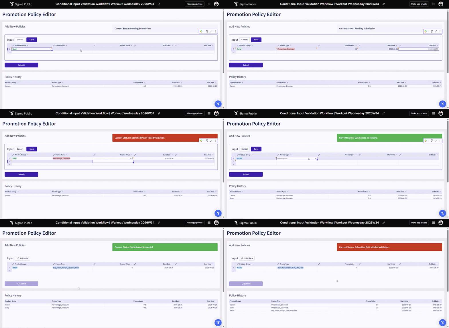
2026 Week 34 | Sigma: Input Table Staging with Conditional Validation

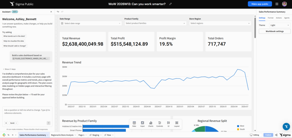
Introduction Welcome to Week 34 of 2026! Do you leverage Sigma Input Tables to produce critical data that supports downstream data marts, joins, or reporting that could be impacted by a breaking change? This example shows you how you may leverage multiple layers of Sigma Input Tables to create a staging area that checks values

2026 Week 34 | Sigma: Input Table Staging with Conditional Validation Read More »

Sigma, Workout Wednesday

2026 Week 34 | Power BI: Visualizing WoW Chart Choices

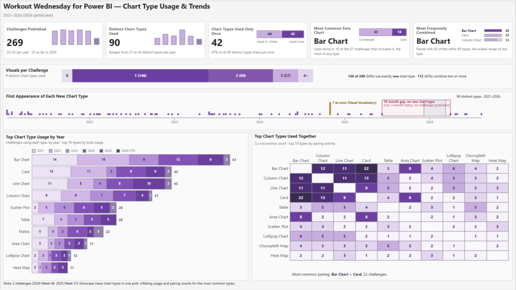
Introduction Last week’s bump chart reminded me of one of our early challenges from 2021, where David turned a ribbon chart into a bump chart. We’ve done other bump chart challenges over the years, so give them a try if you haven’t already.  This made me curious about trends in chart selection in our challenges.

2026 Week 34 | Power BI: Visualizing WoW Chart Choices Read More »

Power BI, Workout Wednesday

#WOW2026 Week 33 | Can you visualize a common starting point?

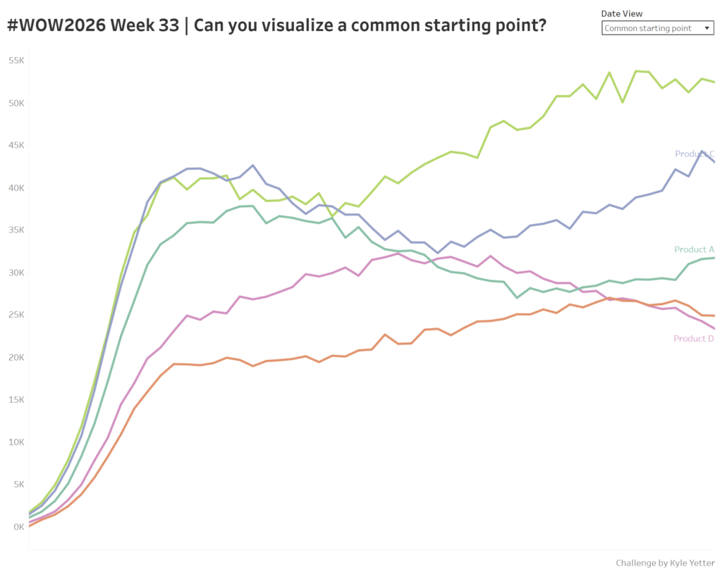
Introduction Sometimes you’ll have products that launch at different times, and so questions come up of how is this most recent launch comparing to other launches in the past? So this week, we’ll have a view of the past year for 5 different products, and then a view with all of those products from a

#WOW2026 Week 33 | Can you visualize a common starting point? Read More »

Tableau, Workout Wednesday