For the week’s challenge we’re looking at Gantt charts!
Gantt chart don’t have to necessarily show timeline data. In Tableau, they can be used to show “floating” bar charts. Which can be very powerful in certain use cases.
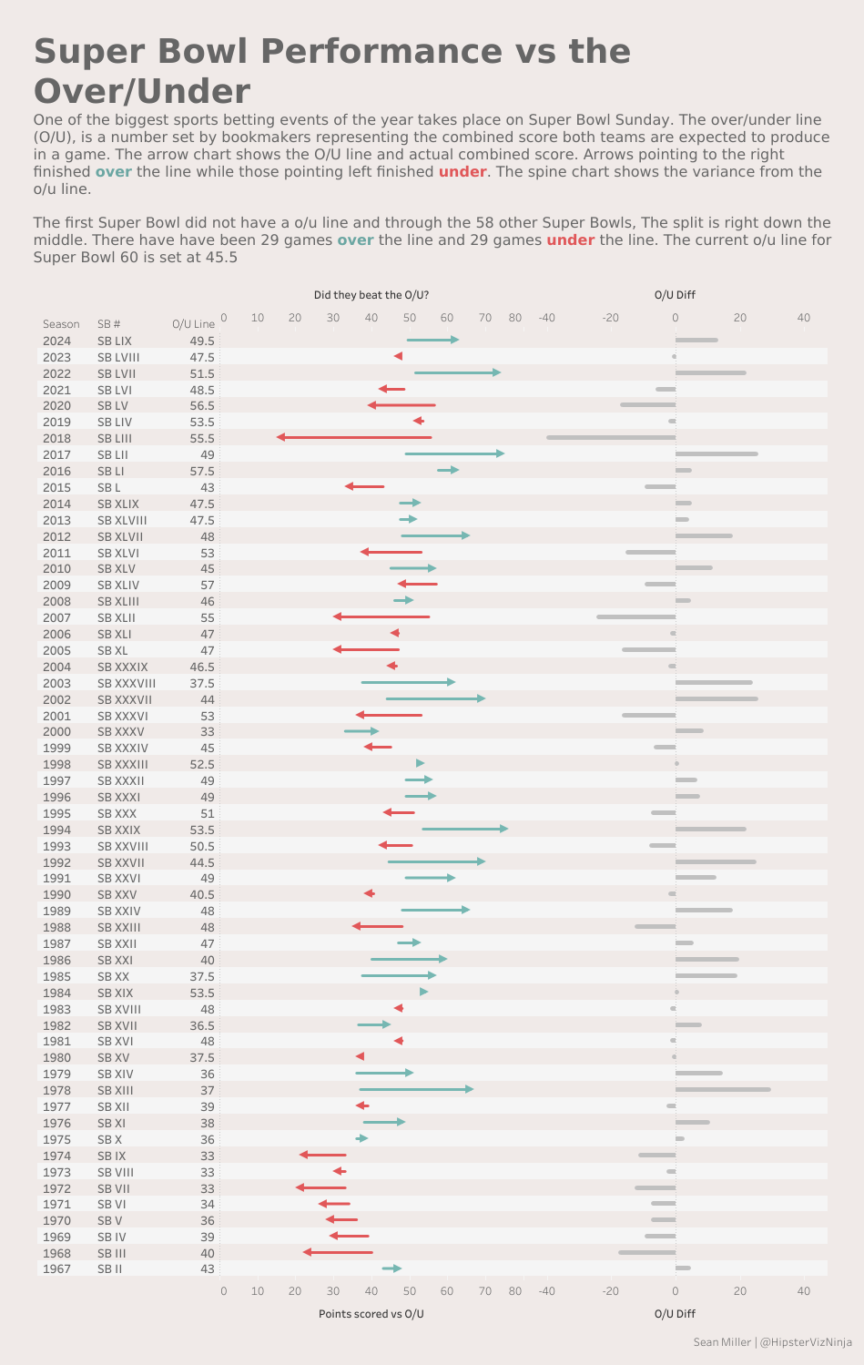
This challenge looks at historical American Football Super Bowl betting odds and game results. In this chart below, the arrow charts start at where the original gambling better line was, then the point of the arrow is the actual game result. The color of the line designates whether the actual result was over or under the betting line.
The O/U diff shows the normalized variance on a standard axis
When you publish your solution on Tableau Public make sure to take the time and include a link to the original inspiration. Also include the hashtag #WOW2026 in your description to make it searchable!