
Author name: Andrei Khaidarov

2026 Week 40 | Power BI: Metric Navigator

Introduction A profit card tells you the result. It does not show how that result is built, which components changed, or where to investigate next. This week, build an interactive Financial Metric Map in Power BI. Start with Net profit and reveal its components one branch at a time: revenue, cost of goods sold, operating […]

2026 Week 40 | Power BI: Metric Navigator Read More »

Power BI, Workout Wednesday
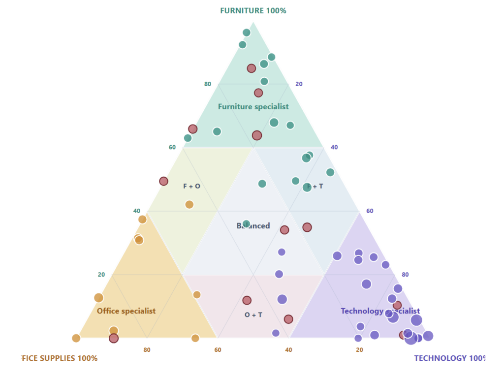
2026 Week 35 | Power BI: Ternary Charts for Cross-Sell

Introduction Traditional customer rankings tell us who generates the most revenue, but they do not explain what those customers buy. A customer may be highly valuable and still buy almost entirely from one product category – which makes the next conversation much clearer than a generic “upsell” message. This week, build a Customer Cross-Sell Map in

2026 Week 35 | Power BI: Ternary Charts for Cross-Sell Read More »

Power BI, Workout Wednesday
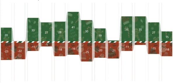
2025 Week 51 | Power BI: Holiday Traffic: Who Came, Who Left 🎄

Introduction The first snowfall in Denver was unseasonably late this year. So I got curious about the data and decided to make a visualization. While this one does communicate with data, it’s taking a bit of artistic license.  This is your challenge as well: create a first snowfall scatterplot with some wintery visual effects. You

2025 Week 51 | Power BI: Holiday Traffic: Who Came, Who Left 🎄 Read More »

Power BI, Workout Wednesday
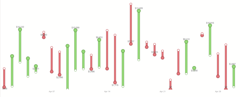
2025 Week 43 | Turning Numbers into a Story of Movement

Introduction Welcome to Week 43 of 2025! This visual was built to make change visible. The goal was not just to show numbers, but to tell a quick, visual story of how performance moves from one point to another. Each line represents a small comparison between two dates or periods. When the line is green,

2025 Week 43 | Turning Numbers into a Story of Movement Read More »

Power BI, Workout Wednesday
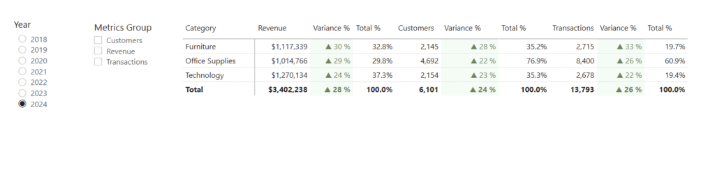
2025 Week 35 | Grouped Field Parameters in a Matrix

Introduction Welcome to Week 35 of 2025!  When building reports in Power BI, one of the most common requests I hear from users is: “Can I explore different KPIs side by side without creating dozens of visuals?” The good news: yes, you can! And it’s cleaner than ever with field parameters grouped by category. In

2025 Week 35 | Grouped Field Parameters in a Matrix Read More »

Power BI, Workout Wednesday

2025 Week 20 | Year-over-Year Selected Metric Trends

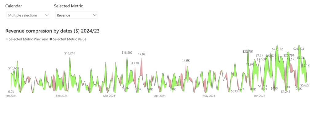
Introduction Welcome to Week 21 of 2025! This report allows users to select a performance metric (e.g., Revenue) and compare its values across 2024 and 2023. It provides a flexible way to explore year-over-year changes and spot trends or anomalies through interactive visuals. Good luck! -Andrei Requirements Main Visual: Area Chart with Year-on-Year Comparison Green

2025 Week 20 | Year-over-Year Selected Metric Trends Read More »

Power BI, Workout Wednesday

2023 Week 46 | Power BI: RFM Analysis

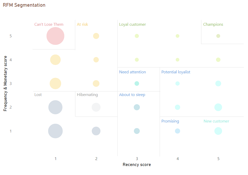
Introduction This week for Workout Wednesday we are performing RFM (recency, frequency and monetary value) analysis. RFM Analysis is a marketing technique used to quantitatively rank and group customers based on the recency, frequency and monetary total of their recent transactions. A score of 1 to 5 is assigned for each of the three main factors.

2023 Week 46 | Power BI: RFM Analysis Read More »

Power BI, Workout Wednesday