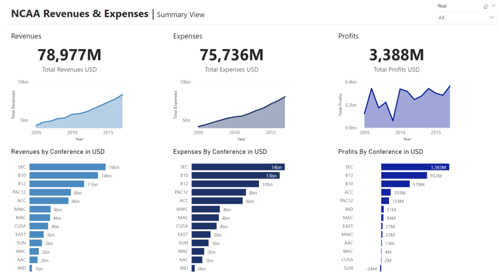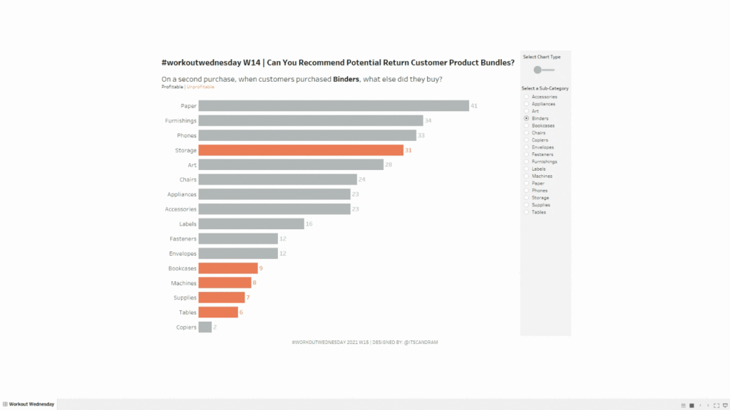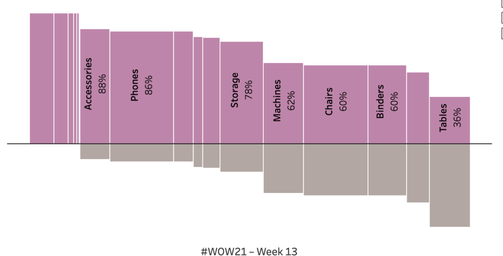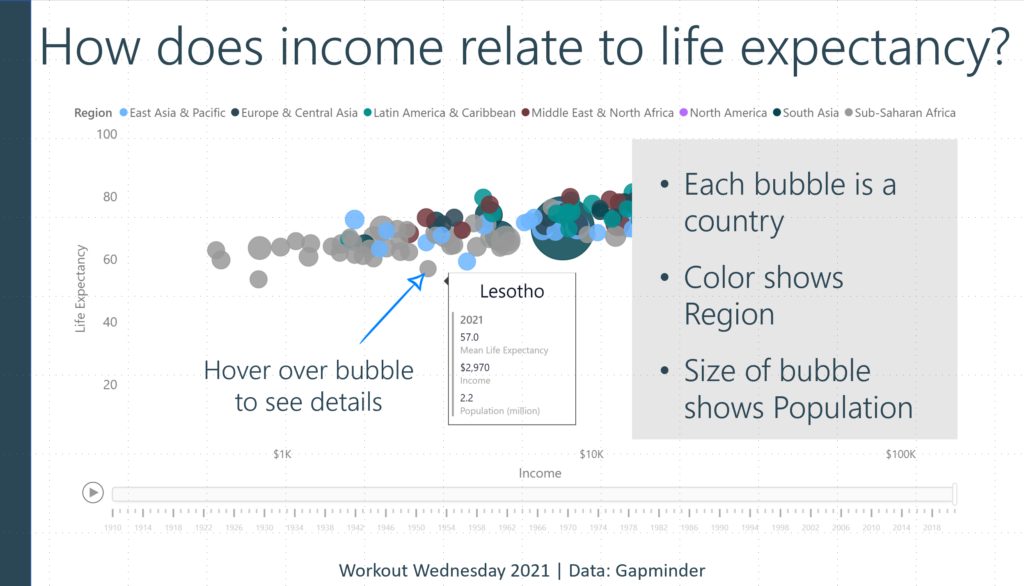
2020 Week 31 LIVE: Can you show the top 10 rank over time for each Olympic country?

Introduction For this weeks challenge we are doing a Live collaboration with Preppin’ Data. Where you work through the data prep and then use the outputs to build in Tableau. This is a live event happening on Wednesday 29th July 2020, 4pm BST. The idea of the collaboration allows you to have a look inside

2020 Week 31 LIVE: Can you show the top 10 rank over time for each Olympic country? Read More »

Tableau, Workout Wednesday

2020 Week 30: Can you create a drill down using set actions?

Introduction Hey #WOW2020, Emma Whyte here. It’s been a blast being back building a Workout Wednesday! It’s been about 2 years 7 months since my last WOW with Andy Kriebel when we kicked off this project in 2017. It’s been fun, and a little bit stressful, getting back into the mindset of setting a weekly

2020 Week 30: Can you create a drill down using set actions? Read More »

Tableau, Workout Wednesday

2020 Week 29: Can you dynamically display label on a heatmap?

Introduction The topic week is based on a recent project of my colleague, Tamás Gáspár, with whom I had the opportunity to make this super challenge for you guys. Heatmaps are a chart better suited to representing a more generalised view of numerical data, as it’s harder to accurately tell the differences between colour shades

2020 Week 29: Can you dynamically display label on a heatmap? Read More »

Tableau, Workout Wednesday

2020 Week 28: Are Sales on Track with Goal?

Introduction Congratulations!  We are now halfway through 2020 – it’s been a remarkable year, certainly full of twists, turns, and the unexpected. The purpose of this week’s challenge is to demonstrate how a metric compares to a goal.  Like most goal data I encounter, the sales goals for this challenge don’t reside in the same

2020 Week 28: Are Sales on Track with Goal? Read More »

Tableau, Workout Wednesday

2020 Week 27: What is the distribution of total orders by customer?

Introduction After many weeks of practical challenges. I’ve decided to switch it up this week. If I’m being honest I’ve been saving this challenge since August of last year (it’s still not the oldest challenge I am saving). This weeks challenge is to make a symmetrical dot plot. Not only is the dot plot symmetrical

2020 Week 27: What is the distribution of total orders by customer? Read More »

Tableau, Workout Wednesday

2020 Week 26: How does the company perform in the fiscal year?

Introduction Calendar years run from January 1st until December 31st, but an organization’s fiscal year might start in a different month. In this week’s challenge, a company’s fiscal year runs from October 1st through September 31st. Let’s see how this company performs. Configure your workbook as follows:  Click to open in Tableau Public Requirements Dashboard

2020 Week 26: How does the company perform in the fiscal year? Read More »

Tableau, Workout Wednesday

2020 Week 24: Can you compare a 3-day vs. 14-day moving average and describe the latest trend?

Introduction I’ve got an exciting challenge for you this week!  It involves collaboration with a peer of mine in the data community (Jami Delagrange, who you may recognize as an upcoming Community Month contributor) and also a challenge that involves working with COVID-19 data. This built-for-mobile dashboard was born out of seeking to understand the

2020 Week 24: Can you compare a 3-day vs. 14-day moving average and describe the latest trend? Read More »

Tableau, Workout Wednesday

2020 Week 23: Can you excel at bar charts?

Introduction This week’s challenge is relatively straight-foward: remake a bar chart to look like a Microsoft Excel bar chart. The key to this chart is the extra whitespace between months. Click to open in Tableau Public Requirements Dashboard Size: 900px by 500px Show sales by month for each of the four years. Each bar should

2020 Week 23: Can you excel at bar charts? Read More »

Tableau, Workout Wednesday