2026

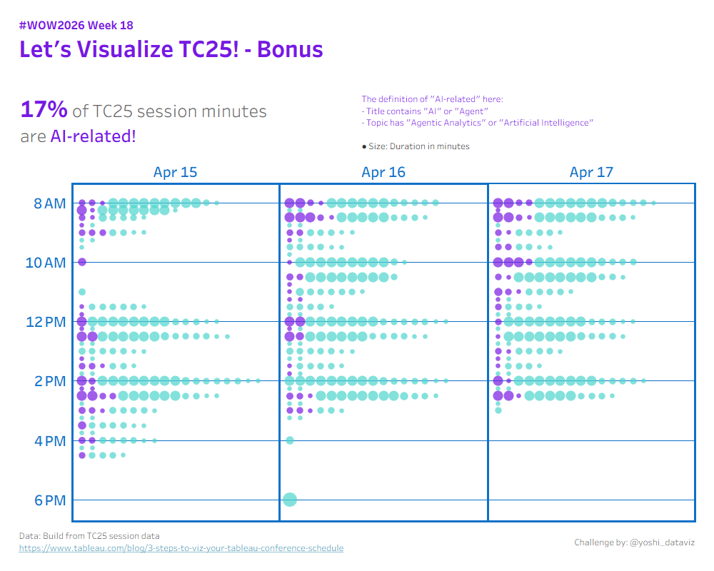
#WOW2026 | Week 18 | Let’s Visualize TC25! (#TC26 Live Edition)

Introduction This challenge was released at the TC26 Workout Wednesday session. Whether you’re here in the room or finding it later, I hope you’ll have fun! In this challenge, we’ll visualize the sessions of Tableau Conference itself. Three difficulty tiers are available, so pick the one that matches your confidence and give it a try. […]

#WOW2026 | Week 18 | Let’s Visualize TC25! (#TC26 Live Edition) Read More »

Tableau, Workout Wednesday
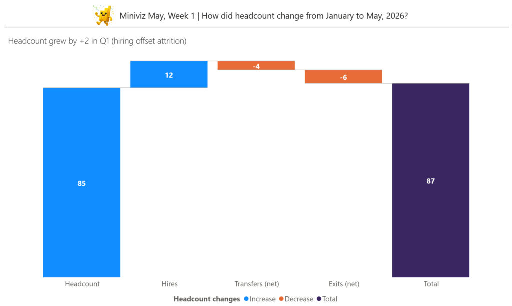
2026 Week 18 | Power BI: Miniviz May Week 1

Introduction This month, we’re teaming up with the Microsoft Fabric Community to bring you a series of bite-sized, hands-on challenges designed to help you build (and share!) your skills one week at a time. Whether you’re just getting started or looking for a quick midweek spark, Miniviz May is all about learning by doing. Jump

2026 Week 18 | Power BI: Miniviz May Week 1 Read More »

Power BI, Workout Wednesday

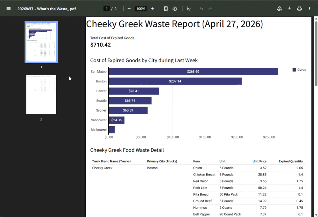
2026 Week 17 | Sigma: Let’s Waste Some Time

Introduction Welcome to Week 17 of 2026! This week, we’re going to play with a newer feature in Sigma:  Pixel Perfect Reporting.  We’re going to create a report that examines food waste which could be scheduled to export to various food truck executives on a weekly basis.  Note:  Reports cannot be shared publicly, so to

2026 Week 17 | Sigma: Let’s Waste Some Time Read More »

Sigma, Workout Wednesday

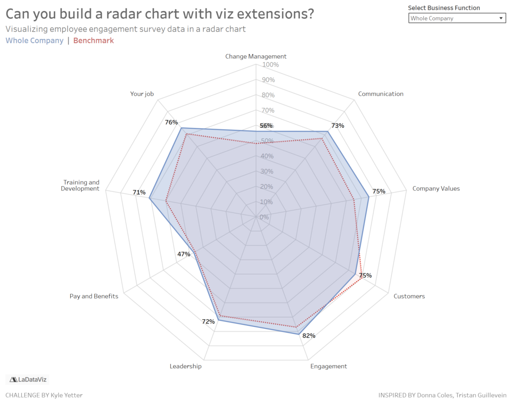
#WOW2026 | Week 17 | Can you build a radar chart using viz extensions?

Introduction Since I jumped the gun on Community Month with Jack’s guest challenge last time around, I was exploring some of the other viz extensions from LaDataViz, when I came upon a radar chart. Since Donna’s challenge last week was a radar chart inspired by a community member technique, I thought it would be interesting

#WOW2026 | Week 17 | Can you build a radar chart using viz extensions? Read More »

Tableau, Workout Wednesday
2026 Week 17 | Power BI: Create a Double-Sided Stem-and-Leaf Plot

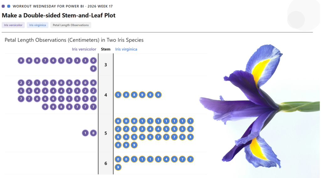
Introduction Inspired by a previous Tableau challenge, we are making a double-sided stem-and-leaf plot, but we are using a different dataset and showing the observed petal length of two species of iris. A stem-and-leaf plot displays numerical data by splitting each value into a “stem” (leading digit) and a “leaf” (trailing digit), arranging them so

2026 Week 17 | Power BI: Create a Double-Sided Stem-and-Leaf Plot Read More »

Power BI, Workout Wednesday

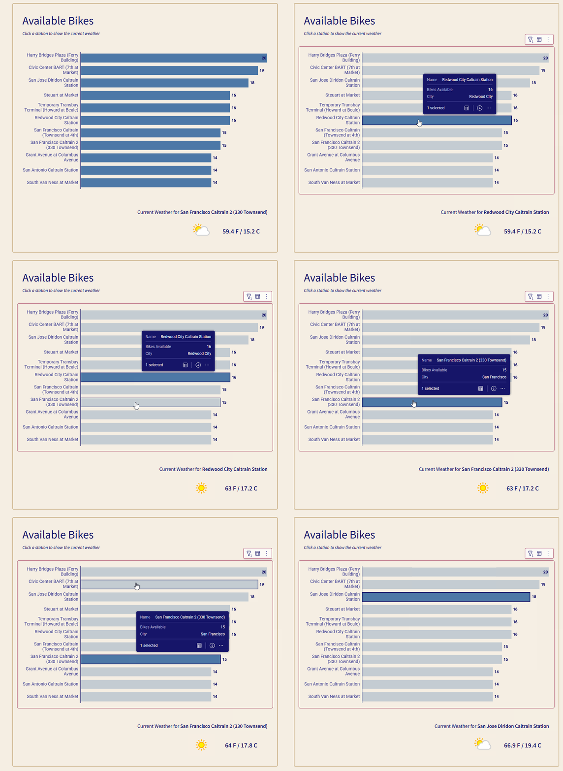
2026 Week 16 | Can you check the weather?

Introduction Sigma has been adding functionality that has taken the app from a fantastic BI solution to an outstanding Application building tool. One of the features that helps with that is the introduction of API Actions. With API Actions, you can retrieve data from outside sources and send data out to other sources. The challenge today is

2026 Week 16 | Can you check the weather? Read More »

Sigma, Workout Wednesday

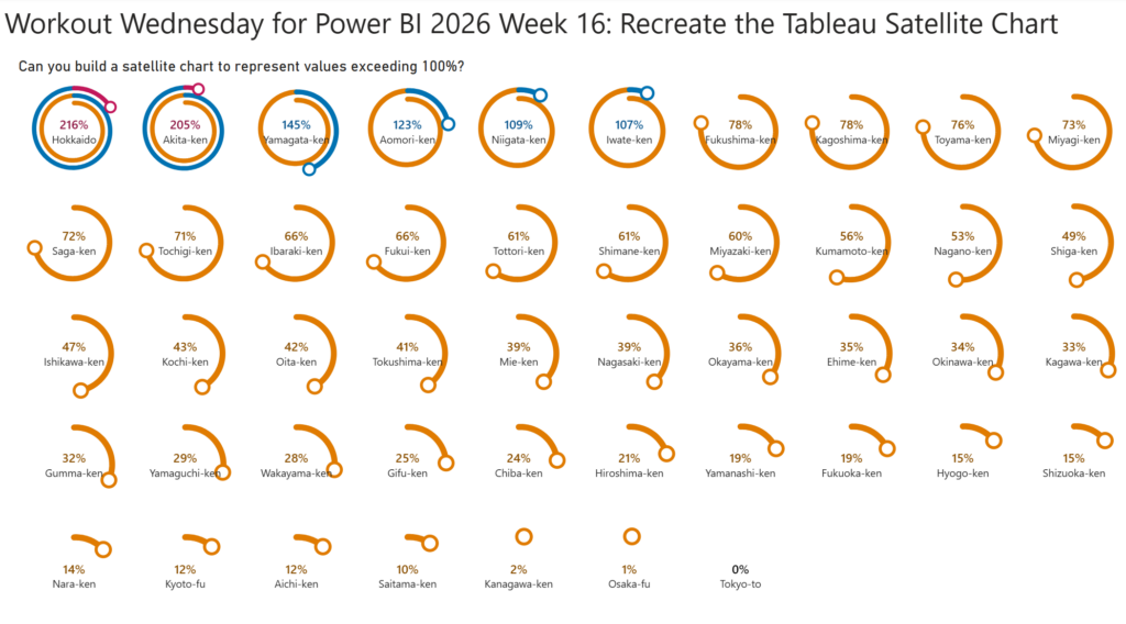
2026 Week 16 | Power BI: Recreate the Tableau Satellite Chart

Introduction This week, we are making a Power BI version of a previous Tableau challenge by Donna Coles. We are making small multiple spiral charts, also called satellite charts. Satellite charts can be used to show percentages when values exceed 100%. Rather than creating one circle like a donut chart, the line spirals out to

2026 Week 16 | Power BI: Recreate the Tableau Satellite Chart Read More »

Power BI, Workout Wednesday

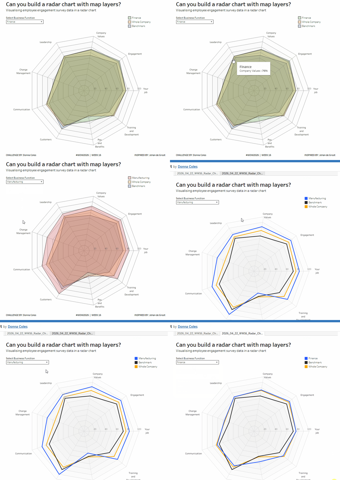
#WOW2026 | Week 16 | Can you build a radar chart with map layers?

Introduction For this week’s community challenge, I am drawing inspiration from this blog post by fellow Ambassador and new Visionary, Johan de Groot. I’ve had radar charts on my back-burner for some time, but never got round to putting out as a challenge, as felt they may seem ‘too fiddly’. But Johan shared a ‘map

#WOW2026 | Week 16 | Can you build a radar chart with map layers? Read More »

Tableau, Workout Wednesday
Week 15

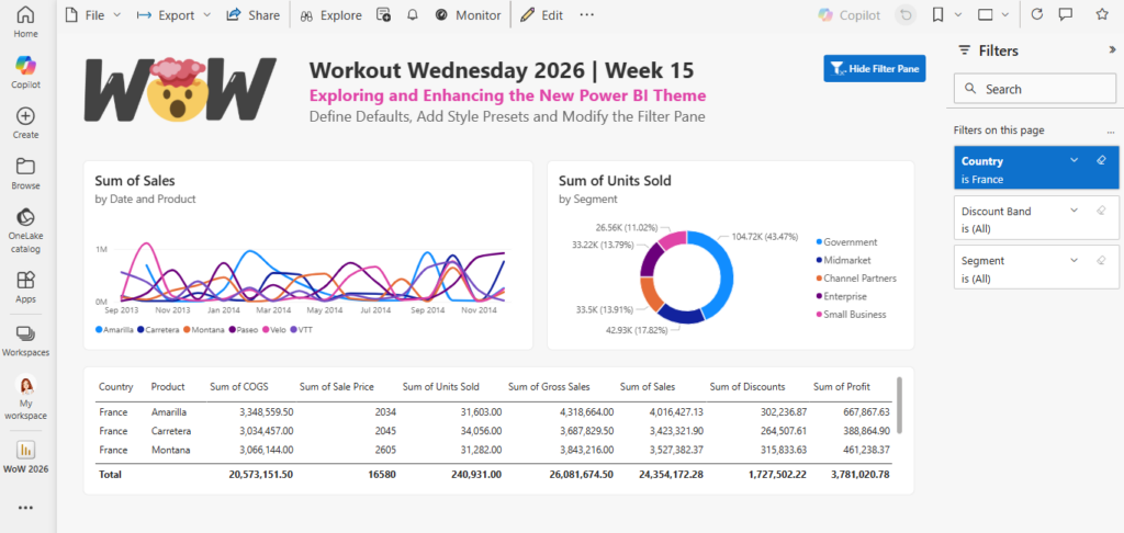
2026 Week 15 | Power BI: Exploring and Enhancing the new Theme

Introduction In this week’s challenge we are exploring the new Power BI Theme that is in Preview : https://powerbi.microsoft.com/en-us/blog/deep-dive-into-modern-visual-defaults-and-customizing-theme-improvements-preview/   The new theme comes with new chart defaults and additional Style Presets.   The challenge is to set your own defaults by downloading the JSON Theme file and modifying it.   You can use a

2026 Week 15 | Power BI: Exploring and Enhancing the new Theme Read More »

Power BI, Workout Wednesday