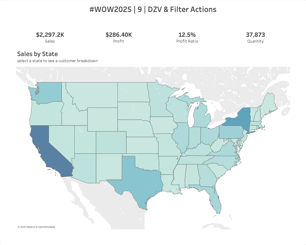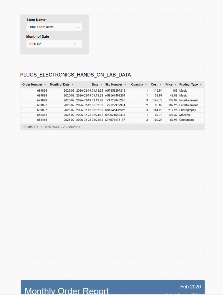
2026 Week 12 | Got Reports?
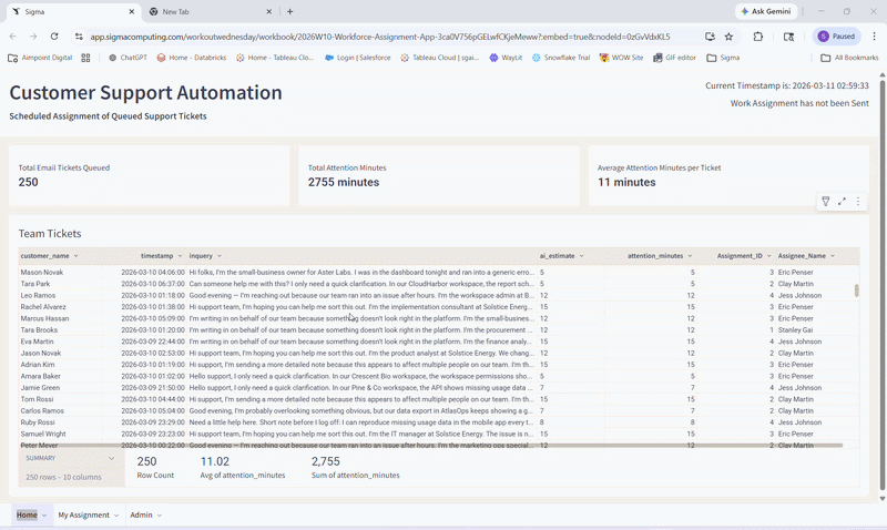
Introduction After years of being on the grid, we can finally break from it (and do some other cool stuff). Using Reports, a newly released pixel-perfect document editor for Sigma, we can add elements, layer elements, and dynamically expand tables. Combining reports with Email Bursting leads to some significant time savings, if your business has […]
2026 Week 12 | Got Reports? Read More »
Sigma, Workout Wednesday