2021 Week 34 | Power BI: Building a Network Diagram
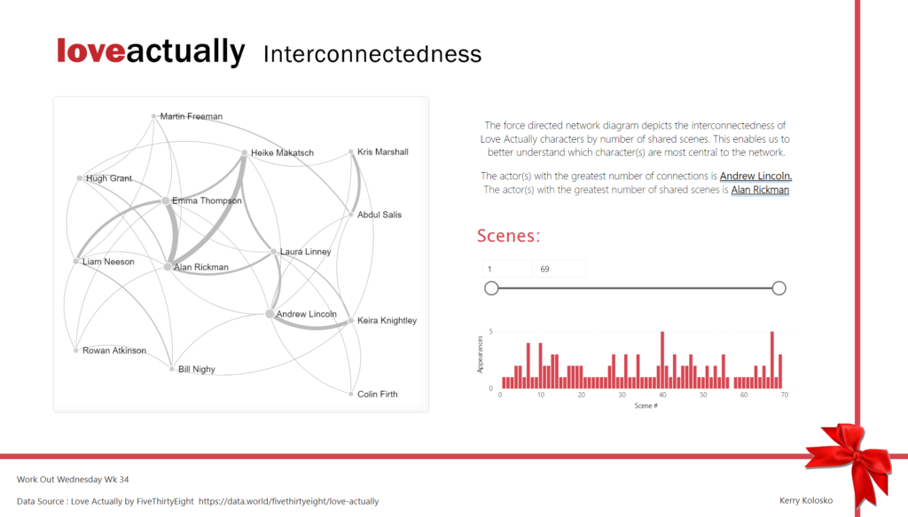
Introduction This week’s Workout Wednesday we will be creating a network diagram in Power BI. Network diagrams are useful to explore relational datasets and are often used to visualize such things as project interdependencies, and social networks. For this challenge we will be visualizing the interconnections of actors/characters of the Love Actually movie by number […]
2021 Week 34 | Power BI: Building a Network Diagram Read More »