CRM Analytics: Quasi-Histogram – SOLUTION
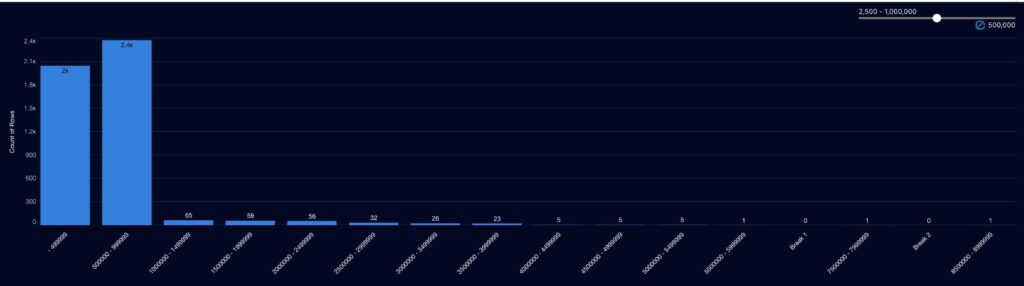
Introduction Last week the challenge was how to create a quasi-histogram in CRM Analytics. Here is my solution, hope you guys like it. If you used a different solution, share it with us in the comments. Solution Let’s start by getting any numeric value from our dataset. You can upload your dataset. I am using […]
CRM Analytics: Quasi-Histogram – SOLUTION Read More »