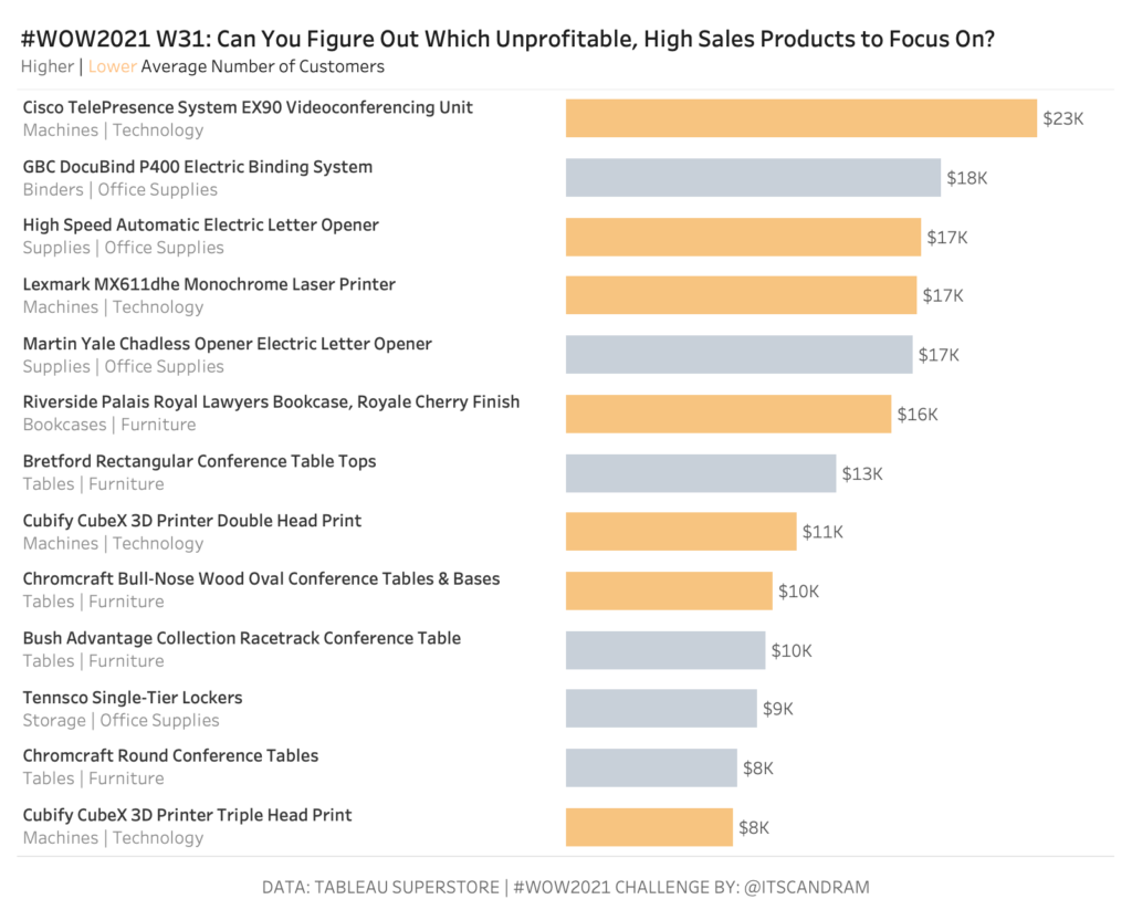
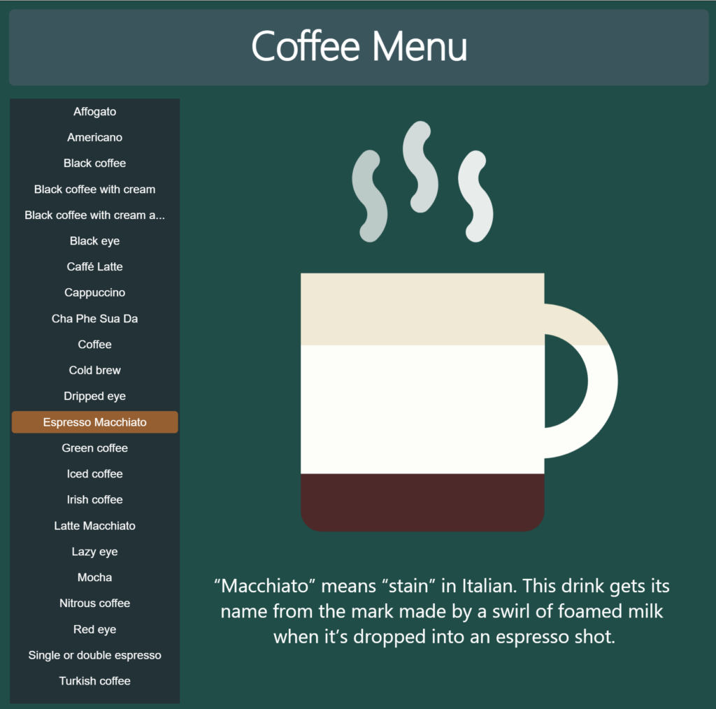
2021

2021 Week 35 – How Much Change Has Occurred?

Introduction September 2021 is community month. Every year since 2018 we’ve invited individuals to share challenges with the community. This year we’ll have some amazing challenges from the Tableau and Power BI communities. But before we get there I’ll be sharing the following challenge: We’ll make a modified dot plot comparing sales for the current

2021 Week 35 – How Much Change Has Occurred? Read More »

Workout Wednesday Power BI Week 34 2021

2021 Week 34 | Power BI: Building a Network Diagram

Introduction This week’s Workout Wednesday we will be creating a network diagram in Power BI.  Network diagrams are useful to explore relational datasets and are often used to visualize such things as project interdependencies, and social networks.  For this challenge we will be visualizing the interconnections of actors/characters of the Love Actually movie by number

2021 Week 34 | Power BI: Building a Network Diagram Read More »

Power BI Magic Tables

2021 Week 33 | Power BI: Create Magic Tables

Introduction Tables, tables, tables…Love them, or hate them, we, Power BI developers, can’t live without them. Our users too. However, who says that we must provide our users with “normal”, old-fashioned tables? This week, with little creativity and magic, we will push table visual experience to a whole new level! The report below shows data about

2021 Week 33 | Power BI: Create Magic Tables Read More »

2021 Week 33 | Tableau: Can you create a moving average chart with a focus on selected subcategories?

Introduction After the results of the community survey, the top ranked feature was Table Calculations, so guess what? Let’s do some Table Calculations! Click to open in Tableau Public Requirements Dashboard 600 x 600 ONE SHEET Table Calcs ONLY! Create a parameter controlled moving average by month for sales. Create a way to multi-select subcategories

2021 Week 33 | Tableau: Can you create a moving average chart with a focus on selected subcategories? Read More »

Deneb visual for Power BI

2021 Week 31 | Power BI: Declarative Visualization with Deneb

Introduction Over the course of Power BI’s Workout Wednesday challenges, you’ve had a chance to try several “custom” visuals. These are typically developed by third parties and may or may not appear on Microsoft’s AppSource marketplace. Generally, you don’t have much control over the visualization apart from whatever format options the developer creates. This week,

2021 Week 31 | Power BI: Declarative Visualization with Deneb Read More »

2021 Week 31: Can You Find the Needle in the Haystack?

Introduction The ability to efficiently find the proverbial needle in a haystack is worth its weight in gold.  How many times has a key stakeholder asked you to give them a shortlist of products (insert the focus of your analysis) to focus on for business improvement/optimization opportunities…and they’ve asked you to get back to them

2021 Week 31: Can You Find the Needle in the Haystack? Read More »