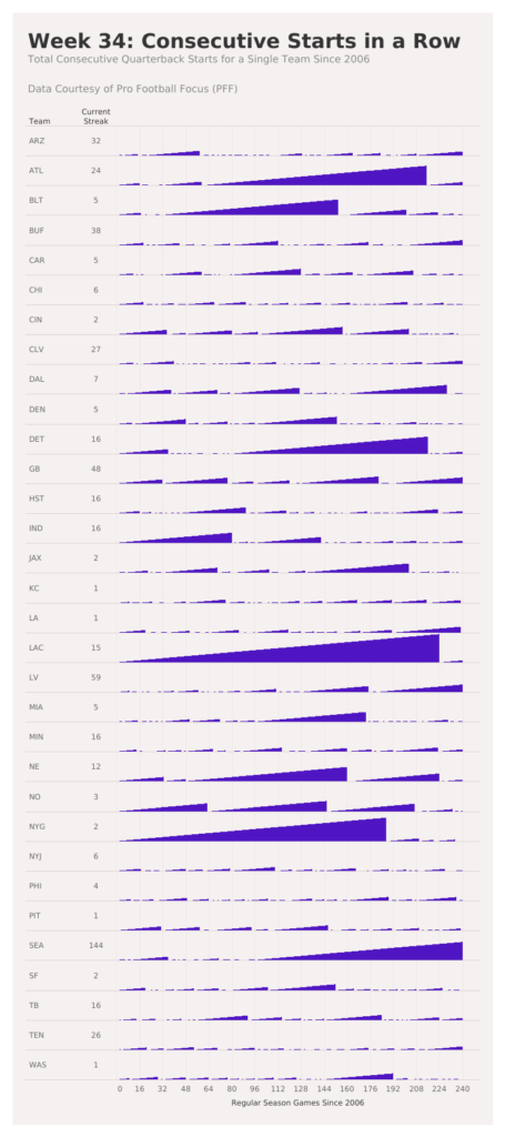
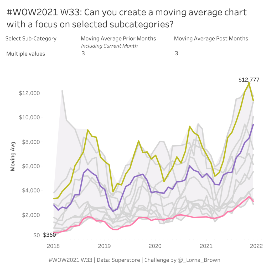
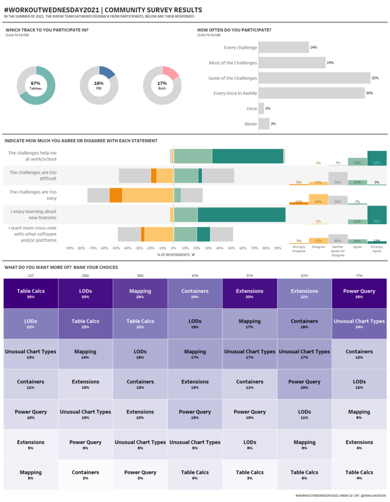
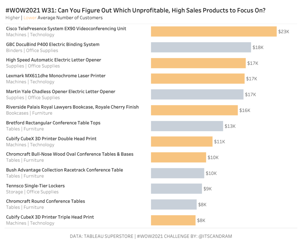
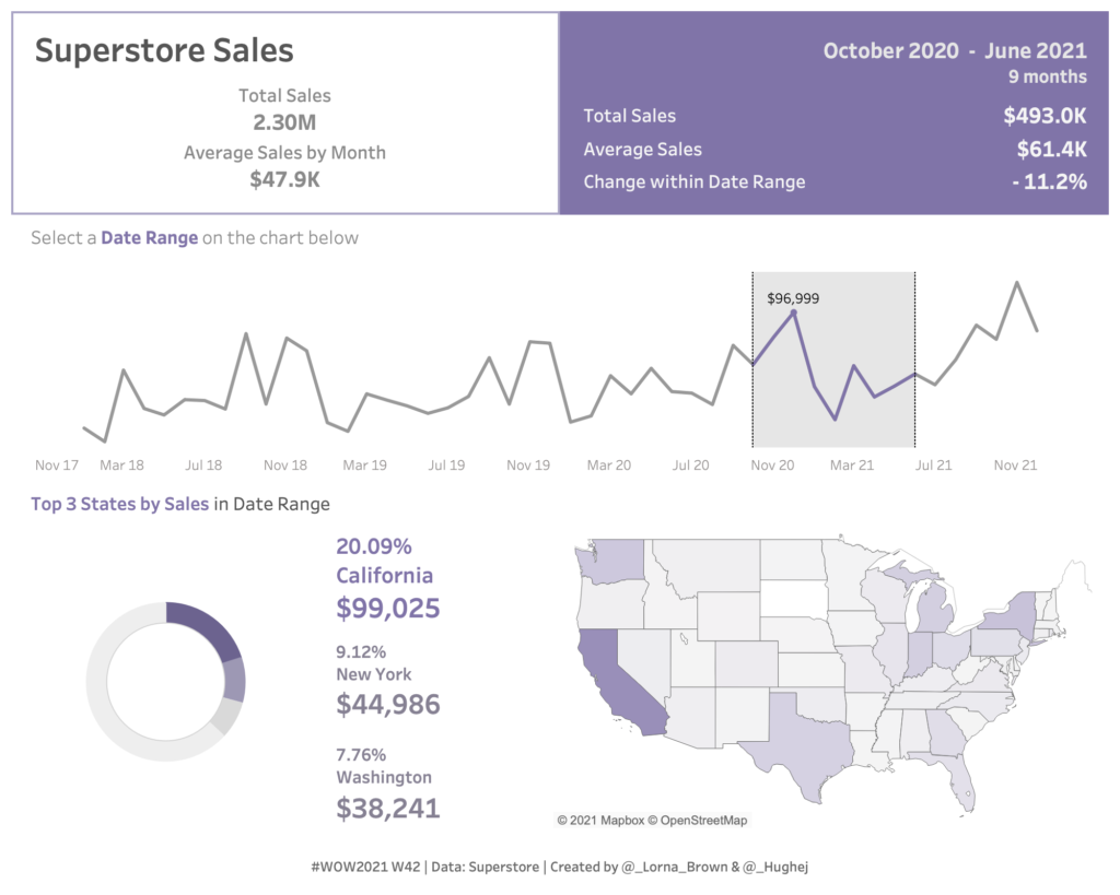
Tableau

2021 Week 33 | Tableau: Can you create a moving average chart with a focus on selected subcategories?

Introduction After the results of the community survey, the top ranked feature was Table Calculations, so guess what? Let’s do some Table Calculations! Click to open in Tableau Public Requirements Dashboard 600 x 600 ONE SHEET Table Calcs ONLY! Create a parameter controlled moving average by month for sales. Create a way to multi-select subcategories

2021 Week 33 | Tableau: Can you create a moving average chart with a focus on selected subcategories? Read More »

2021 Week 31: Can You Find the Needle in the Haystack?

Introduction The ability to efficiently find the proverbial needle in a haystack is worth its weight in gold.  How many times has a key stakeholder asked you to give them a shortlist of products (insert the focus of your analysis) to focus on for business improvement/optimization opportunities…and they’ve asked you to get back to them

2021 Week 31: Can You Find the Needle in the Haystack? Read More »

2021 Week 28 | Tableau: Can you build an app to visualize wildfires?

Introduction This week’s Workout Wednesday is brought to you by Josh Jackson.  For those who don’t know, Josh is my husband!  He typically prefers to stay in the background, but asked if he could borrow one of my weeks to share this challenge.  Here’s the challenge in his own words: This week is inspired by

2021 Week 28 | Tableau: Can you build an app to visualize wildfires? Read More »

2021 Week 26 – Tableau: Profitability with Dual Axis Charts

Introduction This week we are going to do two things:  look at alternative for the most common scatterplot I see in Tableau. use a very uncommon unsynchronized dual axis chart. First, the chart I always run into is this scatterplot of total sales and total profit by order. While we can see which orders were

2021 Week 26 – Tableau: Profitability with Dual Axis Charts Read More »