2021 Week 41 | Tableau: How Much Do Top Sub-Categories Contribute to Sales?

Introduction I hope everyone enjoyed Community Month!  I’m excited to be back and to share a fun challenge that highlights using pie charts (puns a plenty today!). This challenge is based on a request from a sales team – they wanted to understand how individual accounts contributed to their overall revenue.  The beauty of this […]

2021 Week 41 | Tableau: How Much Do Top Sub-Categories Contribute to Sales? Read More »

Tableau
Power Bi report with a line chart and map

2021 Week 40 | Power BI: Geocoding and Maps

Introduction We have declared October to be mapping month! This month, we will focus on maps and geospatial data. There are several different maps available in Power BI as default and custom (AppSource) visuals. This week we are going to start off simple and use the Map visual to make a bubble map.  When visualizing

2021 Week 40 | Power BI: Geocoding and Maps Read More »

Power BI, Workout Wednesday
2021 W40 | Tableau: Can You Make Stacked Bar Charts Easier to Compare?

Introduction I have a confession to make…I like stacked bar charts. Someone once referred to them as rectangular pie charts, which stung a little bit – so I’ve kept my affinity quiet. Stacked bar charts get a bad rap because it can be hard to compare the different components – in fact the only one

2021 W40 | Tableau: Can You Make Stacked Bar Charts Easier to Compare? Read More »

Tableau, Workout Wednesday
Workout Wednesday Week 39

2021 Week 39 | Power BI: Assist Your Data Exploration with AI

Introduction It can be challenging getting a new dataset and quickly finding something to focus on and tell a story about. Power BI has built in tools that help you quickly identify data points of interest, and provides visuals that can help tell the story. Have Power BI help you tell the story with your

2021 Week 39 | Power BI: Assist Your Data Exploration with AI Read More »

Power BI, Workout Wednesday
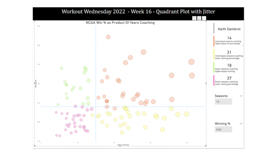
2021 W38 | Tableau: How Can You Quickly Tell the Net Change Between Two Dates? (Community Challenge)

Introduction This week’s challenge is by Will Perkins About Will: Will has been actively involved with the external Tableau Community over the past 3 years. He has spoken at Tableau Fringe Fests, multiple TUGs, and mentored various individuals in one-off questions or more long term instances. At work, he has helped build an internal global

2021 W38 | Tableau: How Can You Quickly Tell the Net Change Between Two Dates? (Community Challenge) Read More »

community, Tableau, Workout Wednesday

2021 Week 37 | Power BI: What-If Parameters

Introduction This week’s Workout Wednesday we will be using “What-If” Parameters to show Top N values based on user selection. What-If Parameters can allow your audience to have more self-service interaction with the dashboard. For this challenge, we will be visualizing the Top N Movies based on Worldwide sales, as well as leveraging conditional formatting to

2021 Week 37 | Power BI: What-If Parameters Read More »

Power BI, Workout Wednesday
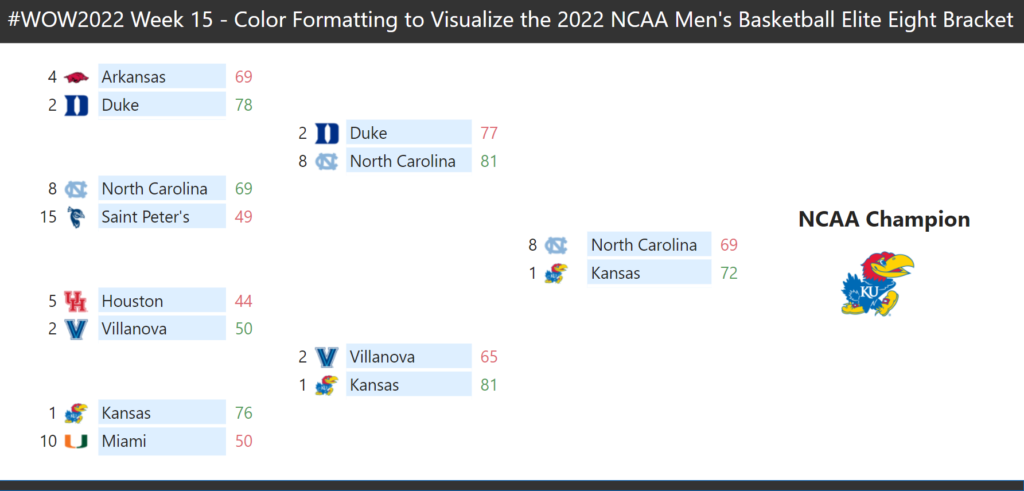
2021 Week 36 | Tableau: When do extracts run during the day?

Introduction This weeks community challenge is by Donna Coles. When I was approached by the #WOW crew to provide a guest challenge, I was a little unsure as to what I could do. I primarily work as a Tableau Server admin, so rarely have a need to build dashboards (which is why I like to do the

2021 Week 36 | Tableau: When do extracts run during the day? Read More »

Tableau, Workout Wednesday

2021 Week 35 – How Much Change Has Occurred?

Introduction September 2021 is community month. Every year since 2018 we’ve invited individuals to share challenges with the community. This year we’ll have some amazing challenges from the Tableau and Power BI communities. But before we get there I’ll be sharing the following challenge: We’ll make a modified dot plot comparing sales for the current

2021 Week 35 – How Much Change Has Occurred? Read More »

Tableau, Workout Wednesday