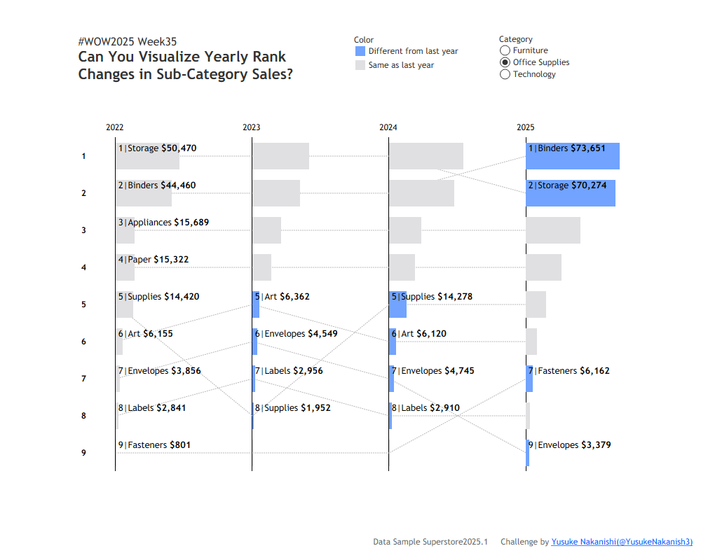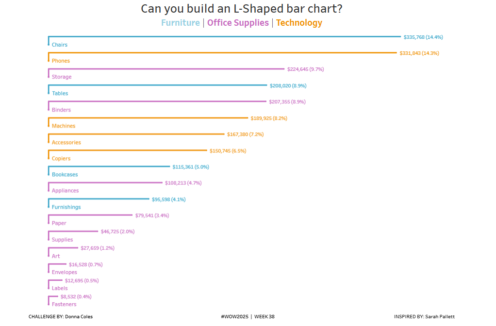
#WOW2025 | Week 38 | Can you build an L-Shaped bar chart?
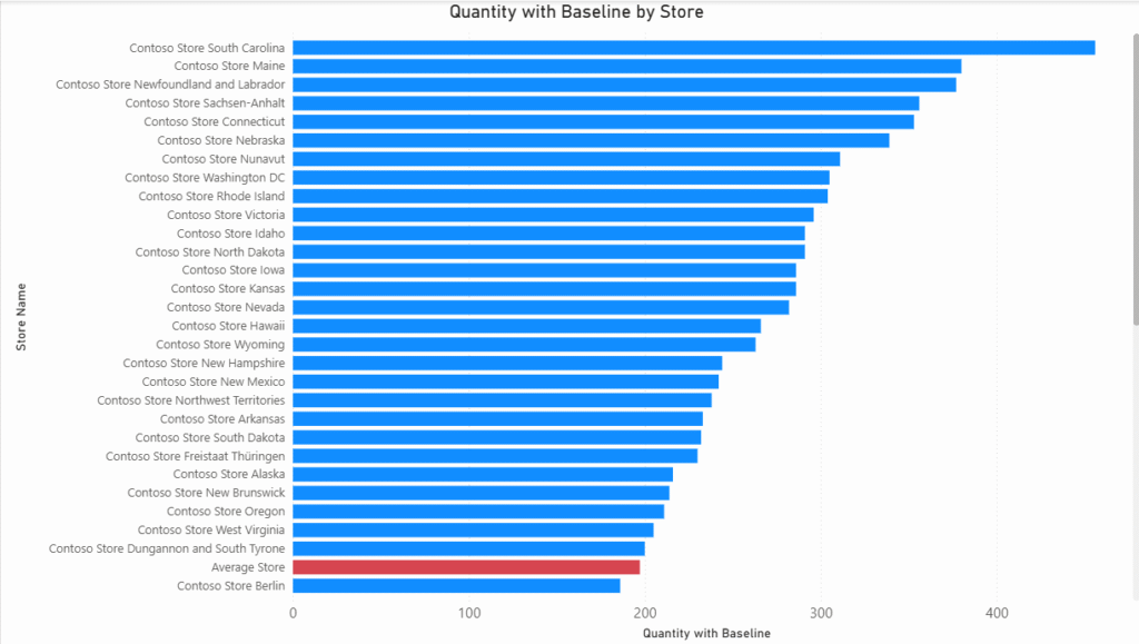
Introduction Sometime ago, I came across this post by Sarah Pallett ( X | LinkedIn ) introducing the idea of L-Shaped bar charts… … and I thought it would make a perfect WOW challenge (as it gave me an excuse to build a version myself). Click to open in Tableau Public Requirements Size 1000 x […]
#WOW2025 | Week 38 | Can you build an L-Shaped bar chart? Read More »
Tableau, Workout Wednesday