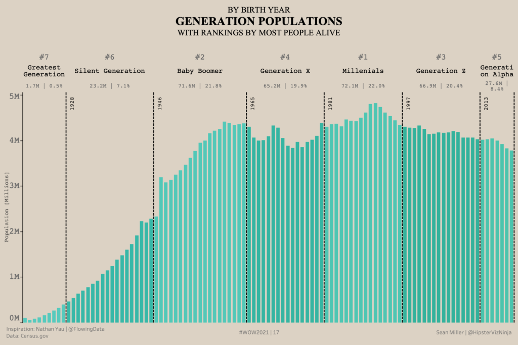
Week 17: Generation Population
When I came across Nathan Yau’s post, over on his site – Flowing Data, I instantly knew this would make a great #WorkoutWednesday challenge.
Week 17: Generation Population Read More »
When I came across Nathan Yau’s post, over on his site – Flowing Data, I instantly knew this would make a great #WorkoutWednesday challenge.
Week 17: Generation Population Read More »
Power BI Conditional Formatting using Background Color, Font Color, and Icons
2021 Week 14 | Power BI: Accessibility Enhancements Read More »
Power BI Conditional Formatting using Background Color, Font Color, and Icons
2021 Week 7 | Power BI: Conditional Formatting Read More »
Introduction Thanks to everyone who has participated in the first 5 weeks of Workout Wednesday for Power BI. We have a new dataset again this week to help us explore some useful features that are not familiar to all users. This week we are focused on making sure labels in our visuals are readable and
2021 Week 6 | Power BI: Long Labels Read More »
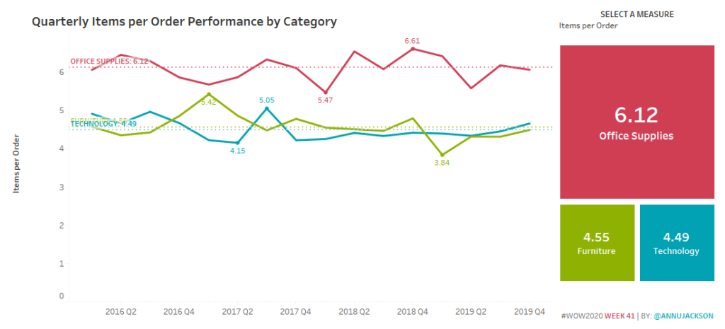
Introduction Happy TCish 2020! I can’t believe we’re already on week 41 of 2020 and in the midst of Tableau Conference. I don’t think any of the WOW team could have imagined that we would all be virtual and truly missing the company of the amazing Tableau community. For this week, I wanted to do
Can You Create a Reference Line for Each Dimension? Read More »
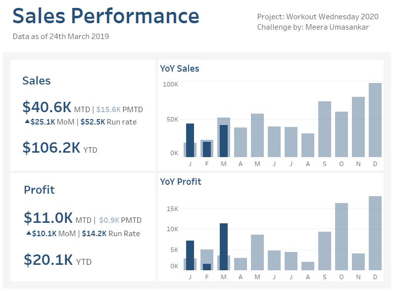
Introduction My first WorkoutWednesday challenge for the year! This week let’s create a simple Sales dashboard with some of the key KPI metrics. We will be using the superstore data set showing how the Sales and Profit are performing. Click to open in Tableau Public Requirements Dashboard Size: 800px by 600 px # of
2020 Week 13 Do you want to build a simple Sales dashboard? Read More »
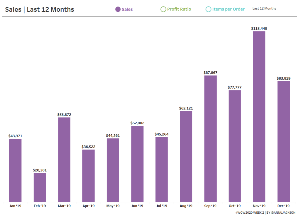
Introduction Happy New Year! I’m excited to be back for yet another year of Workout Wednesday. This year we’ve expanded the team and made a commitment to the community to provide solution videos. We’ve also got some great collaborations lined up, and a few exciting enhancements to come (custom color palette anyone?)! To get the
2020 Week 2: Can you build a beautiful and dynamic bar chart? Read More »
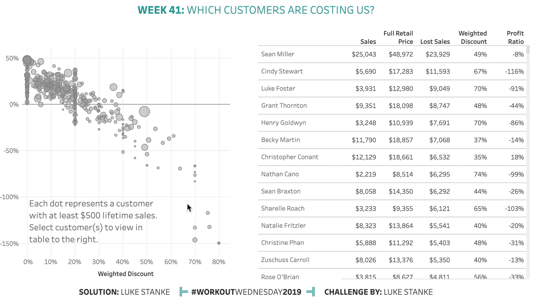
Once again, this week comes from a real life challenge. This real-life scenario involves a scatterplot of customers and a long, long table. The first requirement was to keep all the customers in the list, but also highlight those customers. After a round of feedback our stakeholder decided they wanted the selected customers to “surface
2019 Week 41: Which customers are costing us? Read More »
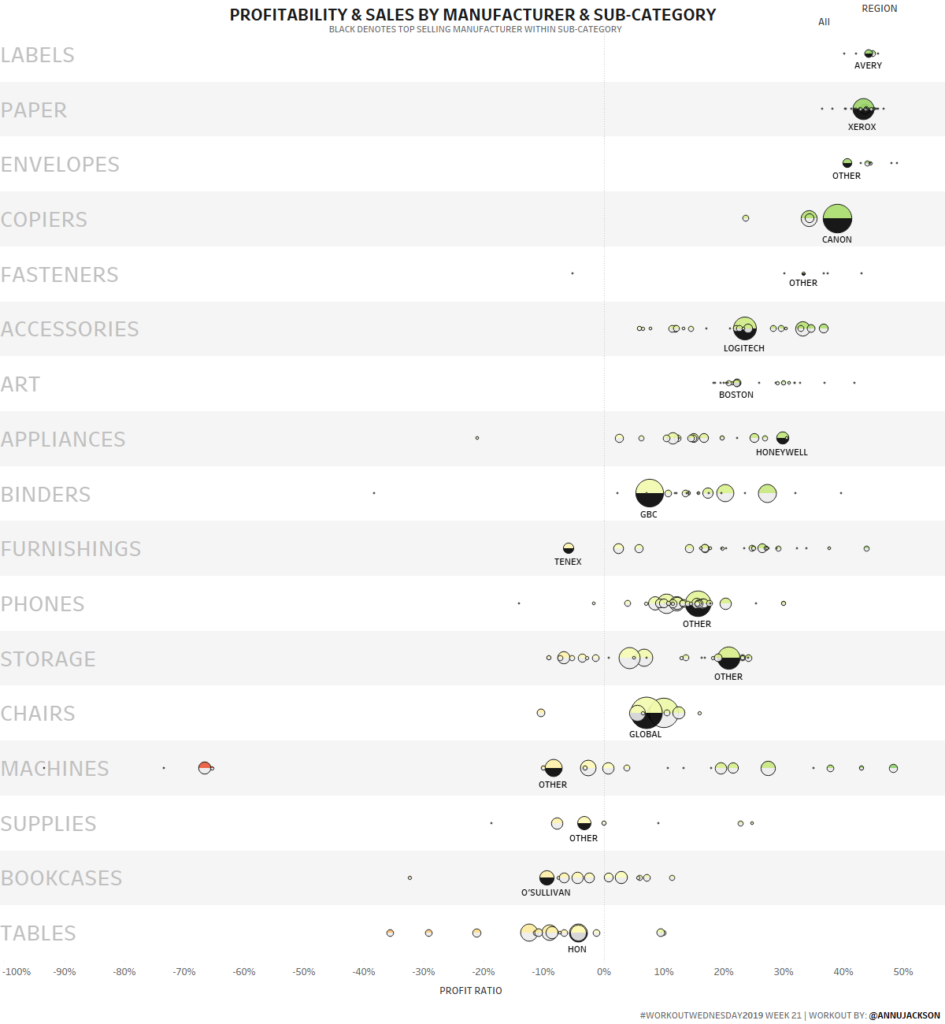
One of my favorite chart types is a dot plot/strip plot. There’s something really special about dots displayed across a single horizontal or vertical axis. They tend to work really well when you’re showing a lot of data and have the advantage of being able to compare spread and density across different categories within a
2019 Week 21: Profitability & Sales Dot Plot Read More »
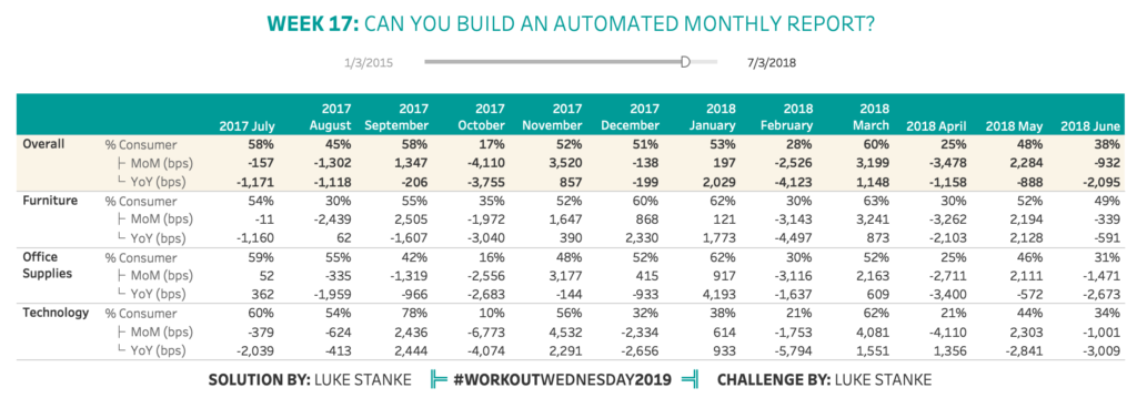
A few weeks ago I had this problem: I needed to create a dynamic table that showed the last 12 full months of sales for a particular channel/category of the business but I also needed to show the month-over-month and year-over-year totals. I didn’t know how to do it right away so I asked the
Week 17: Can you build an automated monthly report Read More »