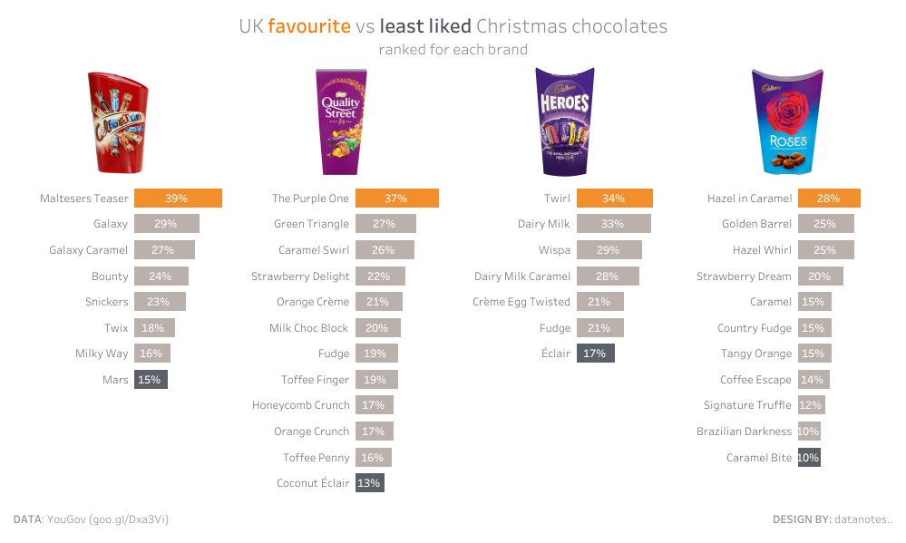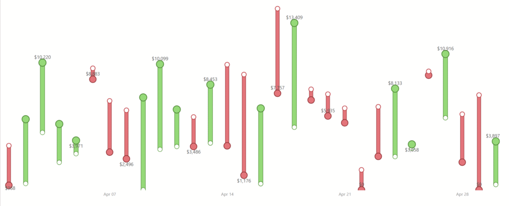
2025 Week 43 | Turning Numbers into a Story of Movement
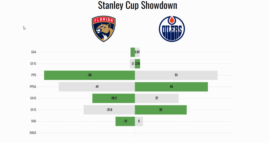
Introduction Welcome to Week 43 of 2025! This visual was built to make change visible. The goal was not just to show numbers, but to tell a quick, visual story of how performance moves from one point to another. Each line represents a small comparison between two dates or periods. When the line is green, […]
2025 Week 43 | Turning Numbers into a Story of Movement Read More »
Power BI, Workout Wednesday