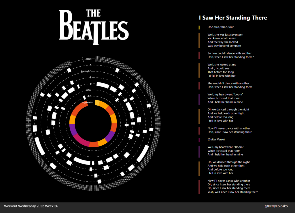
2022 Week 26 | Power BI: Polar Plots with Charticulator
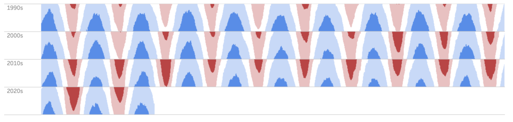
Introduction June is Music Month and this week we are getting arty with Charticulator. In our previous Charticulator challenges, we designed with cartesian plots, spiral plots and tried our hand at nested charts. For this challenge we use a Polar Scaffold to visualise songs segments by time/duration. This challenge presumes some Power Query experience. […]
2022 Week 26 | Power BI: Polar Plots with Charticulator Read More »
Power BI, Workout Wednesday