2026 Week 10 | Power BI: Dynamic visibility of visuals
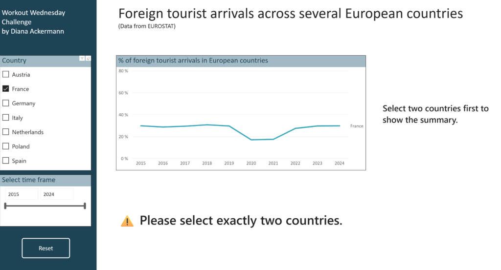
Introduction This challenge focuses on a powerful Power BI technique: conditional visibility using overlapping visuals and dynamic transparency. Instead of hiding visuals entirely, you’ll learn to control visibility through background color transparency – making elements appear and disappear based on user selections. Based on the selection of countries, we are looking at differences in foreign […]
2026 Week 10 | Power BI: Dynamic visibility of visuals Read More »