Workout Wednesday

#WOW2025 | Week 32 | Can you use Dynamic Spatial Parameters?

Introduction Tableau has released several spatial capabilities over the last year, and they continued that trend in 2025.2, adding dynamic spatial parameters, which allow you to filter data by map viewport, among other things.   We’ll go back to the US school data I’ve used for the other spatial challenges we’ve done this year, so this one […]

#WOW2025 | Week 32 | Can you use Dynamic Spatial Parameters? Read More »

Tableau, Workout Wednesday

2025 Week 32 | Build a Waffle Chart using Core Visuals

Introduction This week, we’re cooking up something a little different – waffle charts! Your challenge is to build a report that compares actual sales to a dynamic monthly target and visualizes progress in a clean, impactful way. Requirements Get and Prepare Data Start by downloading the CSV file provided. It contains 8 columns: ORDERNUMBER QUANTITYORDERED

2025 Week 32 | Build a Waffle Chart using Core Visuals Read More »

Power BI, Workout Wednesday

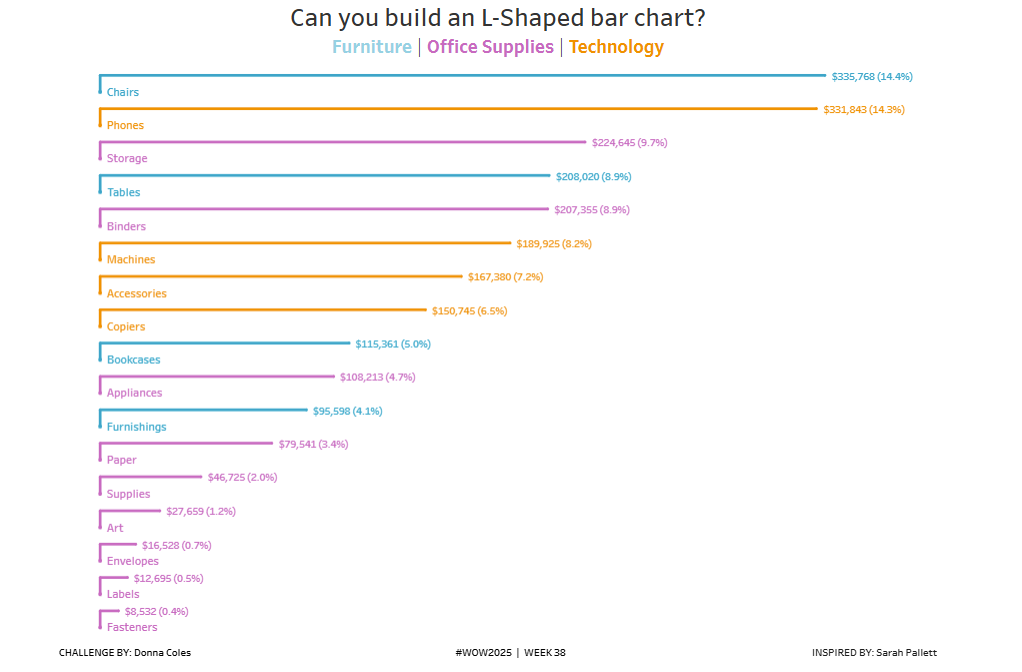
#WOW2025 | Week 31 | Can you build an alternative to a stacked bar chart?

Introduction I often use the #datafam community as inspiration for my #WOW challenges, as it gives me the perfect opportunity to try out a particular technique or visualisation style, which I hope you all then benefit from too 🙂 This week’s challenge was inspired by this blog post by the Flerlage Twins, which in turn

#WOW2025 | Week 31 | Can you build an alternative to a stacked bar chart? Read More »

Tableau, Workout Wednesday
Screenshot of Aanor's winning Power BI report, which includes a birthday cake and a happy 10th birthday to Power BI

2025 Week 31 | Recreate a winning #PBI10 entry

Introduction This week we’re challenging you to recreate a single visual element from one of the winning reports from the #PBI10 dataviz championship. The contest took place over the past month and there were four winners, so, you have four reports to choose from! The entries in this challenge represent a wide range of visual styles, analysis,

2025 Week 31 | Recreate a winning #PBI10 entry Read More »

Power BI, Workout Wednesday

2025 Week 30 | Power BI: Bar chart with built-in scales ????

Introduction Happy Workout Wednesday, data fam! This week, we’re taking bar charts to the next level—with built-in scales that visually speak for themselves! We all love a good bar chart, but sometimes you want to show progress toward a goal or segment values into performance zones – without extra visuals, DAX trickery, or custom backgrounds. Just

2025 Week 30 | Power BI: Bar chart with built-in scales ???? Read More »

Power BI, Workout Wednesday

2025 Week 29 | Next level tooltip

Introduction Welcome back to Workout Wednesday!  This week we’re building a special tooltip.It will include flags, and some special custom formatting. Want to learn, how to create a tooltip like this?Let’s do it! Requirements Download the sample data from the Data World Website – part 1 and part 2. [Note: Data.World requires you to create a

2025 Week 29 | Next level tooltip Read More »

Power BI, Workout Wednesday

2025 Week 29 | Sigma : Gantt Touch This

Introduction Welcome to Week 29 of 2025! This week’s challenge is all about bringing back a tried-and-true classic: the Gantt chart. Whether you’re mapping out project timelines or visualizing task dependencies, this is your chance to put a clean, modern spin on one of the original BI visuals. Build something in Sigma that’s as functional

2025 Week 29 | Sigma : Gantt Touch This Read More »

Sigma, Workout Wednesday
#WOW2025 | Week 29 | Competitor Comparison

Introduction This week’s challenge was inspired by a question from a colleague. They were looking for ideas for how to manage a chart with multiple lines and mulitple metrics. My colleague started with the idea of highlighting a single line in each chart, to show how the company compared to its competitors – a simple

#WOW2025 | Week 29 | Competitor Comparison Read More »

community, Tableau, Workout Wednesday