2026 Week 13 | Power BI: Tile Map with 3D Effect
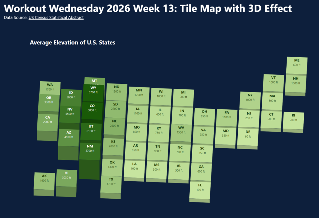
Introduction I noticed this map from Visual Capitalist the other day. I like the idea of showing elevation using height, but since it’s a state average, it seems weird to show the spacial area of the state. I decided to try to make a tile map with the same information. While we could just use color […]
2026 Week 13 | Power BI: Tile Map with 3D Effect Read More »