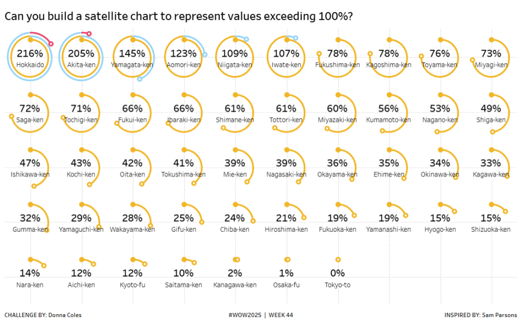
#WOW2025 | Week 44 | Can you build a satellite chart to represent values exceeding 100%?
Introduction Some time ago the brilliant Sam Parsons, developed a “Satellite” or “Spiral” Chart as an alternative way to visualise a donut that exceeded 100%.https://public.tableau.com/app/profile/sparsonsdataviz/viz/SpiralingSatelliteCharts/SpiralingSatelliteCharts. As with many things Sam comes up with, I always want to see if I can build it, and once again it’s a great excuse for a #WOW challenge. Back […]
#WOW2025 | Week 44 | Can you build a satellite chart to represent values exceeding 100%? Read More »