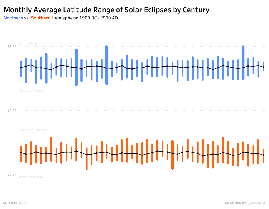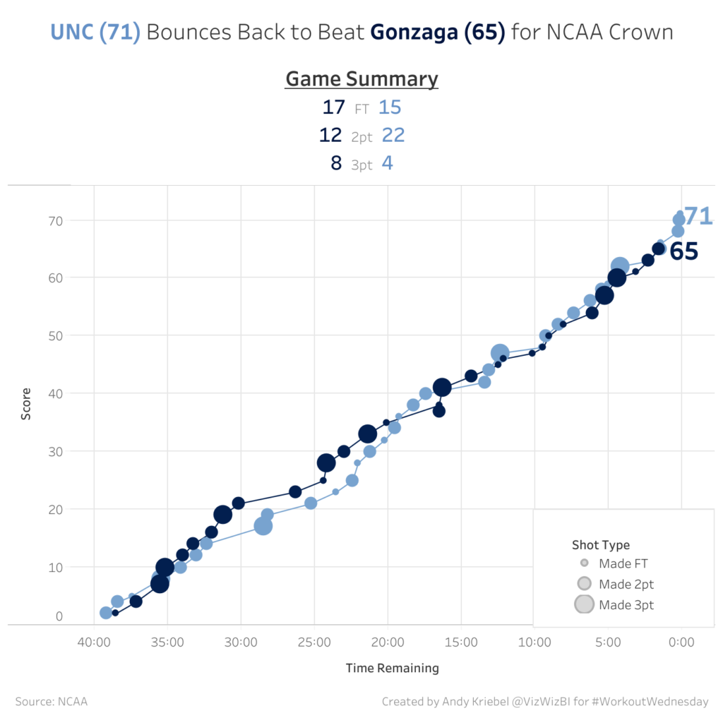
line chart

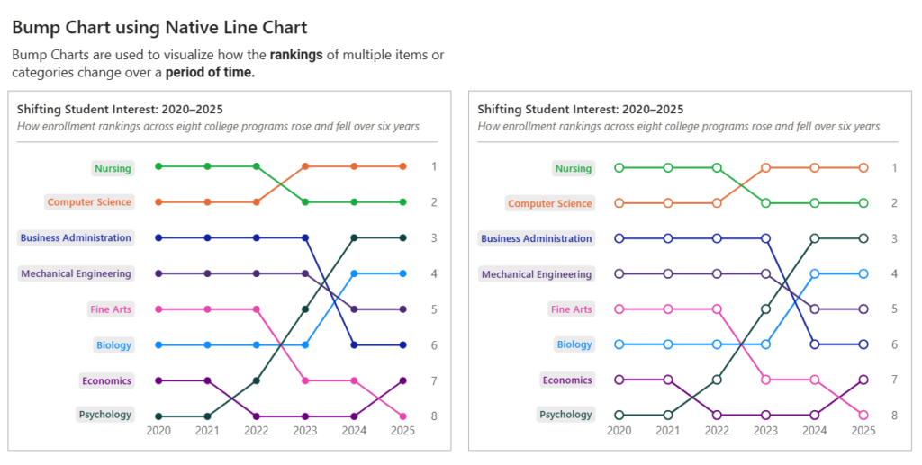
bump chart

2026 Week 33 | Power BI: Bump Chart using Native Line Chart

Introduction A bump chart is a fun way to see how rankings change over time. It makes those ups and downs really easy to follow, without getting lost in a bunch of numbers. You can quickly spot who’s moving up, who’s dropping down, and who’s staying consistent. Think of it as turning rankings into a […]

2026 Week 33 | Power BI: Bump Chart using Native Line Chart Read More »

Power BI, Workout Wednesday
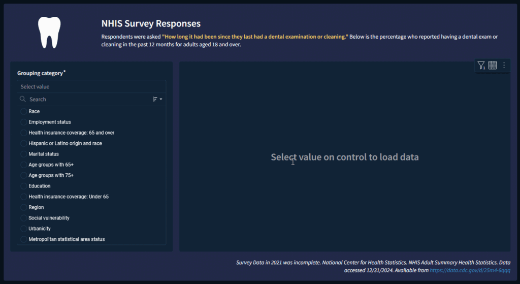
an image of a user interface with a line chart.

2025 Week 01 | Sigma: Can you visualize NHIS data?

Introduction Welcome to year 2 of Workout Wednesday, we’re here to help you keep good on your New Year’s resolutions of learning new skills and getting your teeth cleaned. The data for this week comes from the National Health Interview Survey (NHIS) website, which has a lot of interesting survey data to explore. They have

2025 Week 01 | Sigma: Can you visualize NHIS data? Read More »

Sigma, Workout Wednesday

#WOW2017 | 35 | Solar eclipse

Introduction This challenge is hosted on Andy’s website – check it out here  Click to open in Tableau Public Attribute When you publish your solution on Tableau Public make sure to take the time and include a link to the original inspiration.  Also include the hashtag #WOW2017 in your description to make it searchable! Share After

#WOW2017 | 35 | Solar eclipse Read More »

community, Tableau, Workout Wednesday