
Introduction
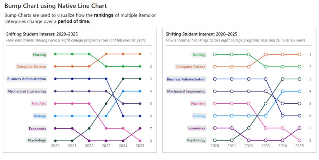
A bump chart is a fun way to see how rankings change over time. It makes those ups and downs really easy to follow, without getting lost in a bunch of numbers. You can quickly spot who’s moving up, who’s dropping down, and who’s staying consistent.
Think of it as turning rankings into a simple visual story! And the best part? You don’t need a fancy custom visual— you can actually tweak a native line chart in Power BI to achieve this.
Dataset
The dataset is a single Excel file found on GitHub at:
https://github.com/SLakshmiP07/WorkoutWednesdayPowerBI/blob/main/Bump%20Chart/College%20Enrollment%20Dataset.xlsx
Requirements
- (Create the Program Rank measure using RANKX.
- Build the line chart ( Year to the X-axis, Program Name to the Y-axis, and the Program Rank measure to the Legend)
- Turn on Series Labels so you can see the program names directly on the chart. Set the label position to Left.
- Move the rank to the right by switching the Y-axis position.
- Add markers.
- Sort the visual based on the ranking. (Invert the Y-axis range so that Rank 1 appears at the top).
- Clean up the formatting.(Get rid of unwanted gridlines, axis labels.. anything that adds clutter)
Share
After you finish your workout, share on BlueSky or LinkedIn using the hashtags #WOW2026 and #PowerBI, and tag @MMarie, @shan_gsd, @KerryKolosko (on BlueSky). Tag Lakshmi Ponnurasan on LinkedIn.