Intermediate

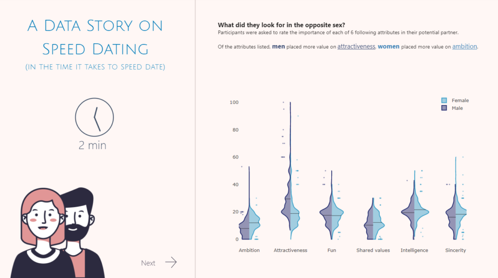
2022 Week 36 | Power BI: Split Violin Plot and HTML

Introduction Another PlotlyJS visual this week – creating a split violin plot. We’ll be comparing male and female dating preferences collected from speed dating events between 2002-2004. EXTRA CREDIT – For those with a little more time on their hands, an extended workout challenge is included; conduct your own data analysis and create a data […]

2022 Week 36 | Power BI: Split Violin Plot and HTML Read More »

Power BI, Workout Wednesday
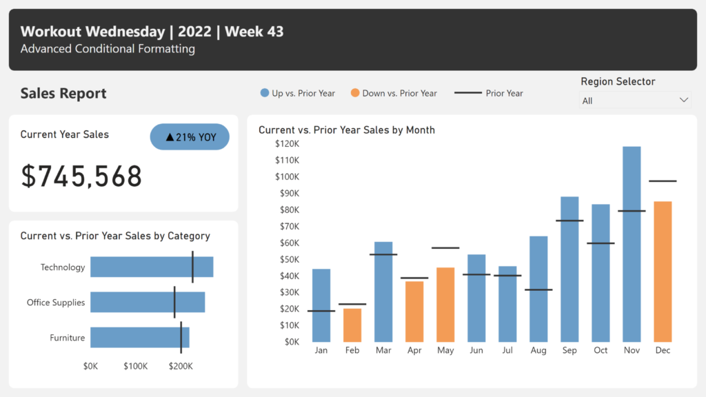
2022 Week 34 | Power BI: Calculation Groups

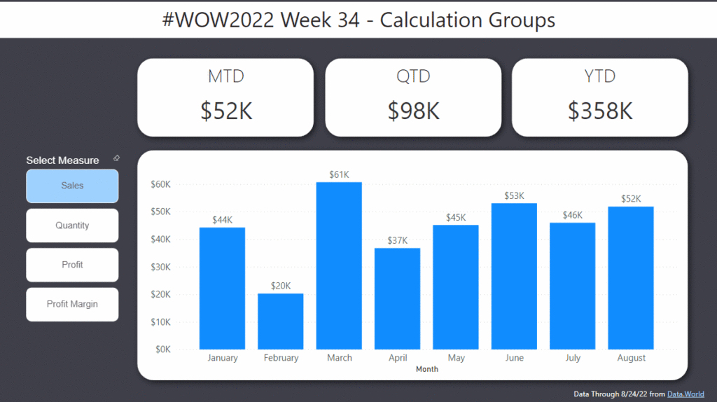
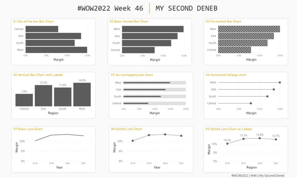
Introduction Calculation Groups in Power BI essentially allow you to apply logic or formatting to a variety of measures at the same time.  For example, let’s say you were looking to create a Month-To-Date, Quarter-To-Date, and Year-To-Date view across Revenue, Orders, and Units.  This would require you to create a calculation for each of the

2022 Week 34 | Power BI: Calculation Groups Read More »

Power BI, Workout Wednesday
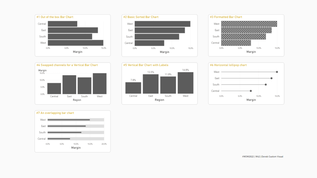
2022 Week 33 | Power BI: Compare two series of values

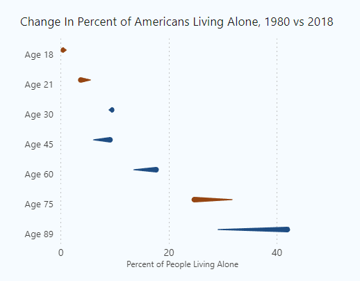
Introduction Welcome back to Workout Wednesday! This week we’re visualizing two series of values in a take on last week’s Tableau challenge! This week’s challenge uses youth cellphone data and gives you the opportunity to either build a dumbbell chart using Charticulator or to build a lipstick column chart using a custom visual. Complete one or both

2022 Week 33 | Power BI: Compare two series of values Read More »

Power BI, Workout Wednesday
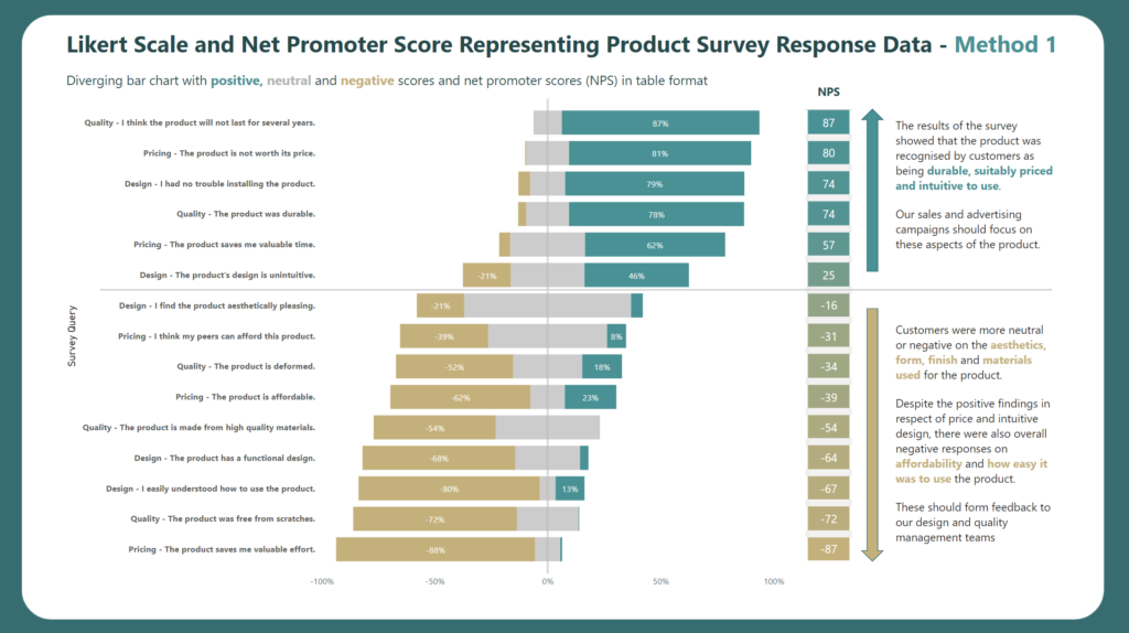
2022 Week 32 | Leverage Field Parameters in Measures

Introduction My name is Spencer Hamilton, Analytics Consultant with phData, and I’ll be guest hosting this week’s challenge! For the challenge, we’re going to look at one of Power BI’s newer features, Field Parameters, and create some calculations that dynamically change based on the selected parameter value. In this specific example we’re looking at Sample

2022 Week 32 | Leverage Field Parameters in Measures Read More »

Power BI, Workout Wednesday
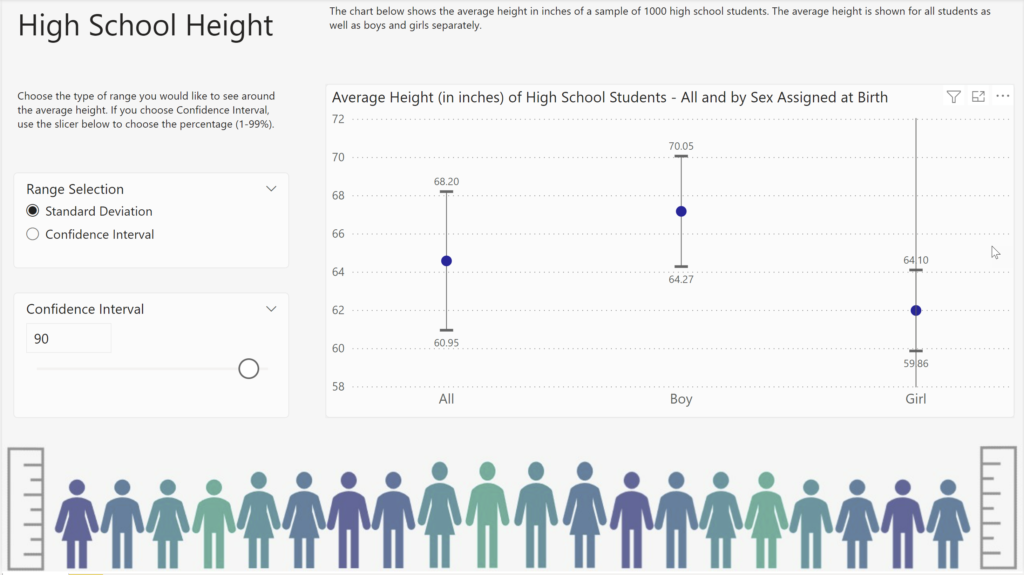
2022 Week 25 | Power BI: Visualizing Music

Introduction June is still music month, so for this week’s challenge we’re going to visualize music. Sometimes the simple visualizations tell the best stories. That is definitely the case for the “warming stripes” visualization which was used to show the change of global temperature over time. Using this as motivation, what if we created a

2022 Week 25 | Power BI: Visualizing Music Read More »

Power BI, Workout Wednesday
2022 Week 24 | Scatterplot with custom marker

Introduction For this workout, we are visualizing data in a scatterplot in a bit of a non-traditional manner. This week marks 26 years since Ella Fitzgerald, the “Queen of Jazz”, passed away. So we are visualizing melodies to a few of her songs. My approach is a bit abstract – not quite sheet music but

2022 Week 24 | Scatterplot with custom marker Read More »

Power BI, Workout Wednesday