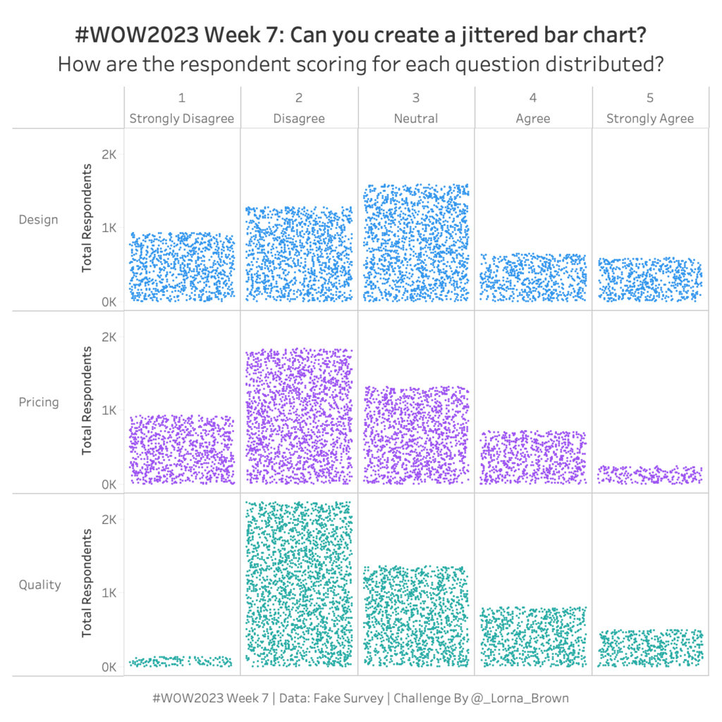
#WOW2023 Week 7: Can you create a Jittered Bar Chart?
NPS Survey data can be tricky to wrangle and work with. Check out this week’s Tableau #WorkoutWednesday and see if you can do it!
#WOW2023 Week 7: Can you create a Jittered Bar Chart? Read More »
NPS Survey data can be tricky to wrangle and work with. Check out this week’s Tableau #WorkoutWednesday and see if you can do it!
#WOW2023 Week 7: Can you create a Jittered Bar Chart? Read More »
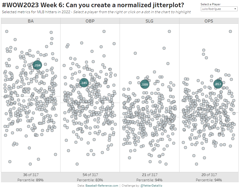
Introduction As Donna mentioned last week, this month we’re focusing on alternative chart types. This jitterplot is a fun one inspired by one of Steve Wexler‘s charts in The Big Book of Dashboards. I like jitterplots because they allow you to easily see how an individual compares to the rest of the group via distribution,
#WOW2023 | Week 6 | Can you create a normalized jitterplot? Read More »
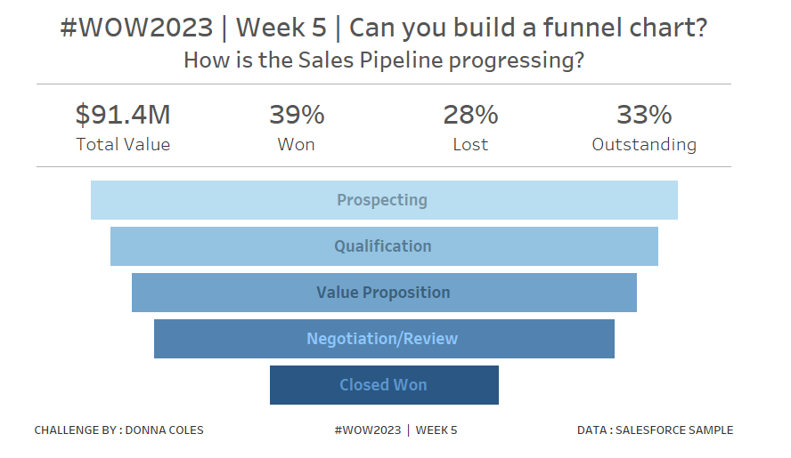
Introduction Hi everybody. It’s now my turn to set my first challenge as part of the official #WOW crew – eeek!. For those of you who don’t know me, I’ve been completing these challenges since the program was launched in 2017, and I blog solution guides on my personal blog at https://donnacoles.home.blog/. I’ve been approached
#WOW2023 | Week 5 | Can you build a funnel chart? Read More »
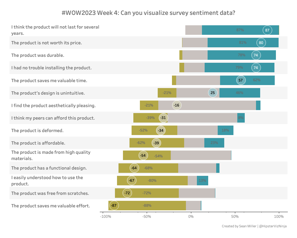
NPS Survey data can be tricky to wrangle and work with. Check out this week’s Tableau #WorkoutWednesday and see if you can do it!
#WOW2023 | Week 4: Can you visualize survey data? Read More »
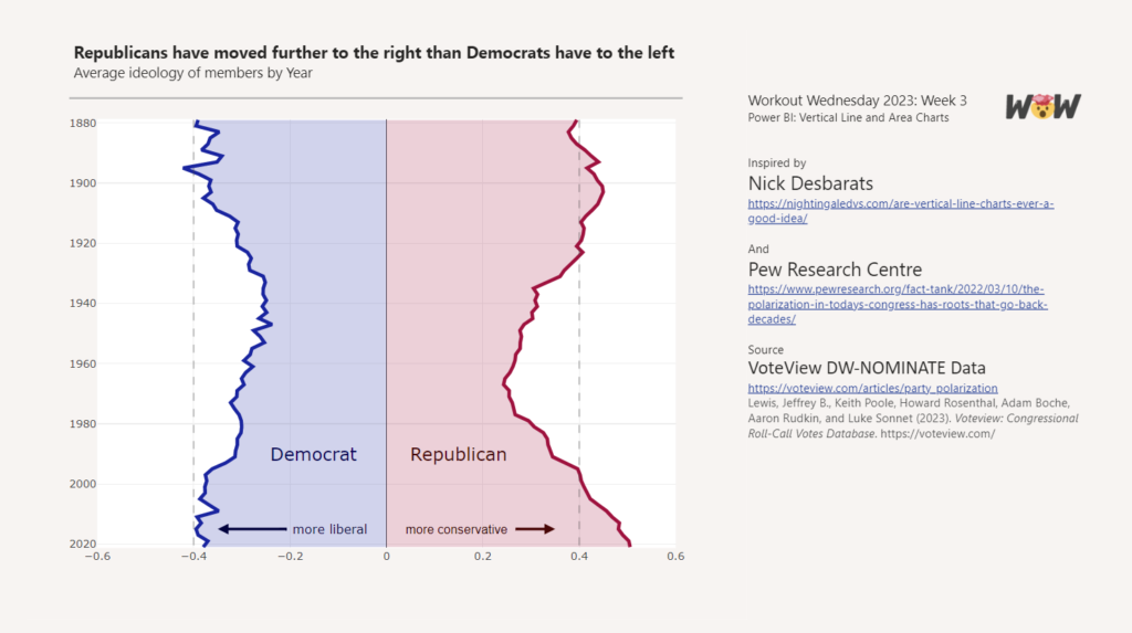
Introduction Howdy All! We’re all topsy-turvey this week turning line charts on their side! ⇩ This weeks challenge was inspired by Nick Desbarats article Are Vertical Line Charts Ever a Good Idea? Can you find some other examples where vertical line charts may be a good idea? ⋟^◕ܫ◕^⋞ Happy Vizzing Requirements Power Query Obtain the voteview_polarization_data.csv
2023 Week 03 | Power BI: Vertical Area Chart Read More »
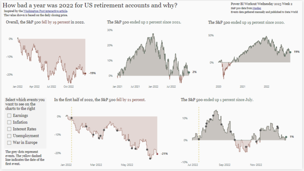
Introduction For our second week of Workout Wednesday 2023 Power BI Edition, we are taking inspiration from a recent Washington Post interactive story titled “See just how bad a year it was for your retirement account — and why”. The article looks at the closing price of the S&P 500, comparing the value at the
2023 Week 02 | Power BI: Create layered line/area charts with labels and annotations Read More »
Introduction Welcome to Workout Wednesday 2023, Power BI edition! If this is your first time joining us, we’re happy you’re here. The goal of this initiative is to help you build your Power BI skills. We provide the data and the instructions, and you build the visuals! We hope you have fun and learn a new
2023 Week 01 | Power BI: Use DAX to control visual display Read More »
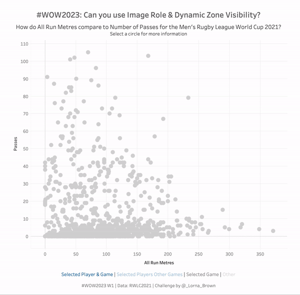
Introduction Can you believe it’s 2023 already? No me neither, but we have a cracking line up for this year that makes me excited to still be apart of the Workout Wednesday Team. If this is your first time here, Welcome to #WOW2023. The aim of this community initiative is to rebuild the visualisation using a
#WOW2023 Week 1: Can you use Image Role & Dynamic Zone Visibility? Read More »

Introduction “Hot days, warm nights, beaches, backyard cricket and Christmas celebrations are all part of summer in the Southern Hemisphere.” This week we will be connecting to a public flickr photo gallery from the State Library of South Australia, to create an image carousel using a custom visual from AppSource. Requirements Power Query Connect to the
2022 Week 52 | Power BI: Image Carousel Read More »
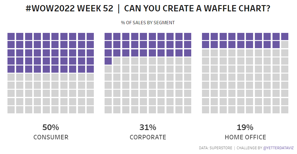
Introduction What a year 2022 has been! For the last challenge of 2022 we’ll build some waffle charts showing % of sales by segment. Even though I knew the general principle of waffle charts, it was some good practice for me making this one. Hopefully it’ll be some helpful practice for you all as well.
#WOW2022 | Week 52 | Can you create a waffle chart? Read More »