#WOW2026 week 8: DZV and Filter Actions
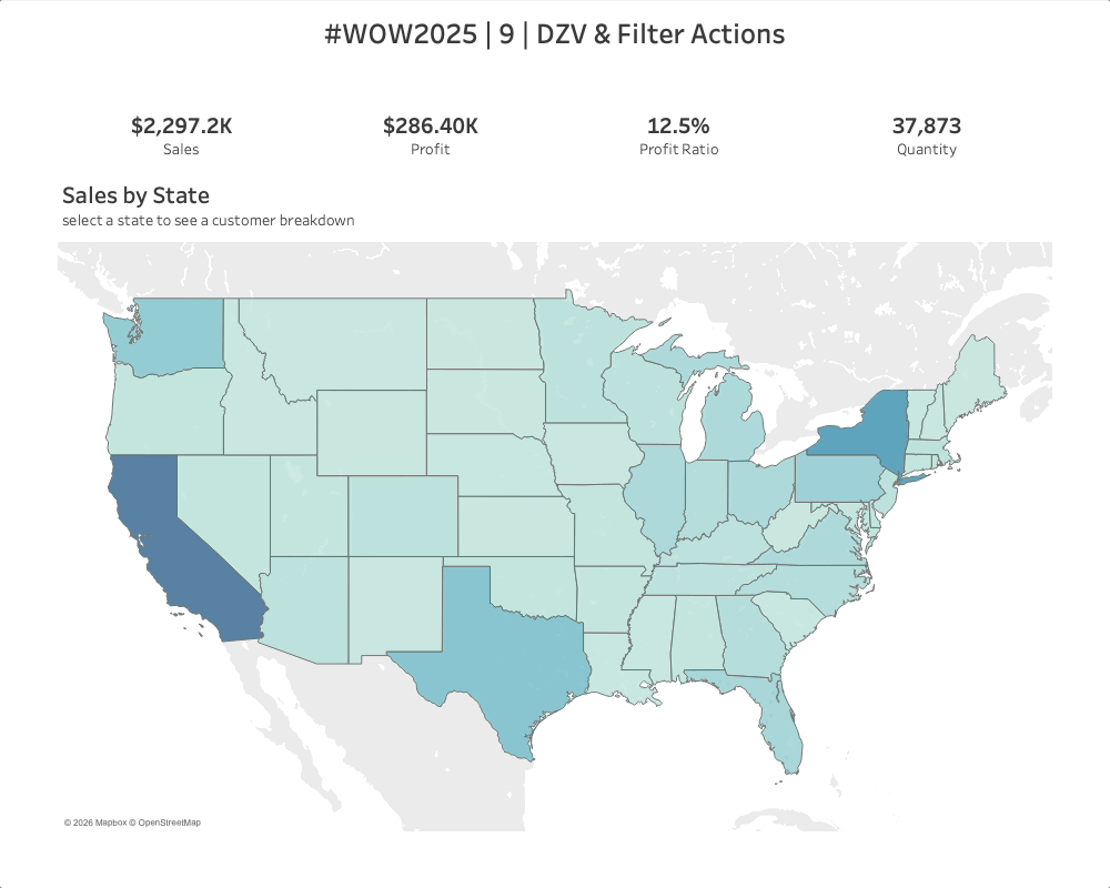
Introduction Welcome to week 9! I recently had a client reach out about some advanced navigation and filtering requests for their dashboard. It combined elements of Dynamic Zone Visibility and different types of filter actions. And I thought it was the perfect challenge for this week so here ya go! Click to open in Tableau […]
#WOW2026 week 8: DZV and Filter Actions Read More »
community, Tableau, Workout Wednesday