Power BI

2023 Week 34 | Power BI: Use core visuals with dynamic titles

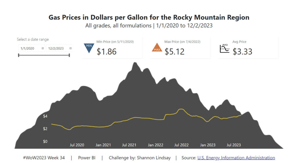
Introduction Welcome back to Workout Wednesday! This week we’re building some basic visuals and use dynamic titles to visualize gas prices in the Rocky Mountain Region of the US (where I live!) over the past 3 years from the U.S. Energy Information Administration. Be sure you’re using the June 2023 version of Power BI desktop or later […]

2023 Week 34 | Power BI: Use core visuals with dynamic titles Read More »

Power BI, Workout Wednesday

2023 Week 33 | Power BI: Date Slicer

Introduction Welcome to the Workout Wednesday Week 32! This week’s challenge will focus on how to create an advanced date slicer in the Power BI report. A user-friendly and modern-looking slicer to level up your dashboards. You can create your own designs, share them with colleagues and control the preview.   To re-create, I am

2023 Week 33 | Power BI: Date Slicer Read More »

Power BI, Workout Wednesday
SVG Pictrogram

2023 Week 32 | Power BI: SVG Pictogram

Introduction This week’s challenge was inspired by FiveThirtyEight’s Nobody had more style than Jay Wright created by Ryan Best For this week’s challenge we will be creating SVGs with shape elements that are coloured dynamically based on field values. Create your own SVG and add your own flair to this design. Requirements Obtain the source data

2023 Week 32 | Power BI: SVG Pictogram Read More »

Power BI, Workout Wednesday

2023 Week 31 | Power BI: Create a Marimekko chart

Introduction Inspired by a Tableau Workout Wednesday from last year, we are going to make a Marimekko chart. A Marimekko chart, also known as a Mekko chart or mosaic plot, is used to visualize categorical data across two variables. Both axes use a percentage scale that determines the width or height of a bar. Think

2023 Week 31 | Power BI: Create a Marimekko chart Read More »

Power BI, Workout Wednesday

2023 Week 30 | Power BI: Build a smooth line chart

Introduction Welcome back to Workout Wednesday! This week we’re building a line chart using the new smoothing feature that was released this month! This week’s challenge was inspired by Andy Kreibel’s Makeover Monday challenge. We’re exploring the disappearing sea ice in the Antarctic using a line chart, looking at the extent of sea ice in millions of

2023 Week 30 | Power BI: Build a smooth line chart Read More »

Power BI, Workout Wednesday
Waffle chart created with core visuals

2023 Week 29 | Power BI: Core Visual Waffle Chart

Introduction If you’re as old as I am, you might remember MacGyver. For eight-year-old me, he was simply the coolest person who ever lived: he was a brilliant thinker and could get out of any situation with a Swiss Army knife and whatever was lying around. These days, to “MacGyver something” is a homage to

2023 Week 29 | Power BI: Core Visual Waffle Chart Read More »

Power BI, Workout Wednesday
Project timeline Visual

2023 Week 28 | Power BI: Project Timeline

Introduction This week’s challenge was inspired by Bas. We are creating a Timeline Visual using the Line Chart and measure-driven data labels. For this project timeline, we will be adding a today line, highlighting completed milestones, and milestones that are off-track. We will be adding descriptors to the milestones and truncating the descriptors to a

2023 Week 28 | Power BI: Project Timeline Read More »

Power BI, Workout Wednesday

2023 Week 27 | Power BI: Power Query Simple Pagination and a Treemap

Introduction This week we are going to have some fun with Power Query to obtain data from a website that spans multiple pages and then visualize the data in a treemap. Treemaps are meant to display hierarchical data as a set of nested rectangles. They aren’t a great replacement for bar charts when minor differences

2023 Week 27 | Power BI: Power Query Simple Pagination and a Treemap Read More »

Power BI, Workout Wednesday

2023 Week 26 | Power BI: Display metrics with the new card visual

Introduction Welcome back to Workout Wednesday! This week we’re exploring the new card visual that was released in preview this month. Key metrics are frequently displayed in reports, and in the past it took a combination of cards, images, and other visuals. Thanks to the new card visual, we now have more flexibility, options for

2023 Week 26 | Power BI: Display metrics with the new card visual Read More »

Power BI, Workout Wednesday
Bubble Chart Variants

2023 Week 25 | Power BI: Bubble Chart Variants with Charticulator

Introduction This week we are continuing our viz efforts inspired by the 1 dataset 100 visualizations project, presented by the Data Viz Project. Last week, Meagan challenged us to create as many visuals as possible using the Deneb custom visual available in Power BI AppSource. The week before, Shannon challenged us to make as many visuals as

2023 Week 25 | Power BI: Bubble Chart Variants with Charticulator Read More »

Power BI, Workout Wednesday