Introduction
This week, we have another new contributor to Workout Wednesday for Power BI: Nabha Ahmed. Give Nabha’s challenge a try!
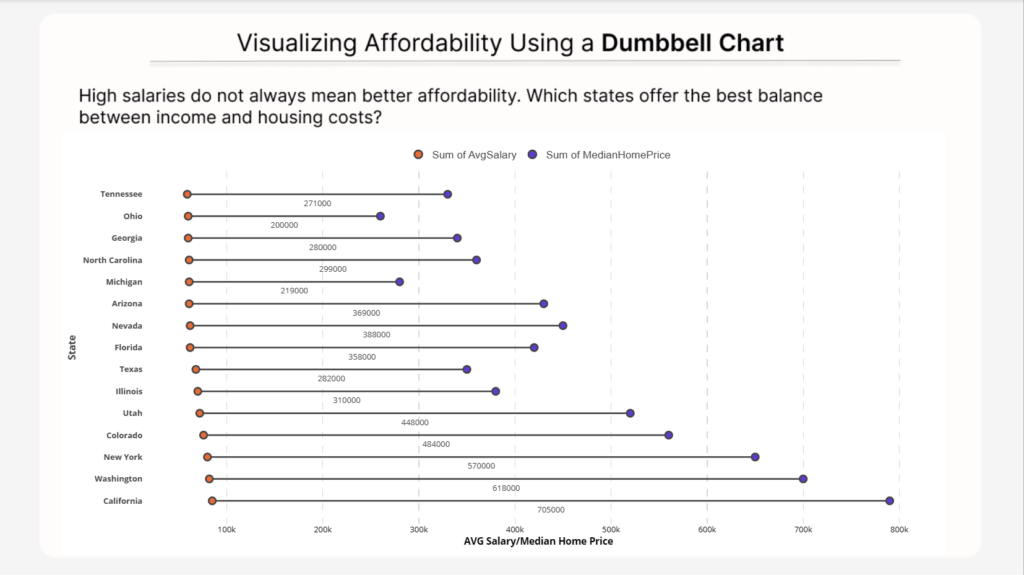
In this challenge, we explore a data visualization technique called a dumbbell chart.
A dumbbell chart is used to compare two related values within the same category. It displays both values as points connected by a line, making it easy to visualize the gap between them. This visual is especially useful when comparing two contrasting metrics—like income versus cost—or any scenario where you want to understand the relationship between two values across different categories.
For this challenge, you will use a dumbbell chart to compare average salaries and median home prices across U.S. states to explore affordability and cost-of-living differences. The goal is to help identify which states offer the best financial balance between income and housing costs.
The example below uses the Dumbbell Bar Chart (standard) custom visual which currently offers a free trial for Power BI Desktop. You do not have to use that custom visual. Other good (and completely free) options include:
Dataset
The dataset was curated from publicly available economic indicators and simplified into a single table for visualization purposes. You can copy and paste it into Power BI or connect to the table using the Web connector.
| State | AvgSalary | MedianHomePrice | MedianRent | CostOfLivingIndex | StateIncomeTax |
|---|---|---|---|---|---|
| Texas | 68000 | 350000 | 1500 | 92 | 0 |
| California | 85000 | 790000 | 2400 | 149 | 13.3 |
| New York | 80000 | 650000 | 2200 | 139 | 10.9 |
| Florida | 62000 | 420000 | 1800 | 102 | 0 |
| Arizona | 61000 | 430000 | 1700 | 98 | 2.5 |
| Nevada | 62000 | 450000 | 1750 | 101 | 0 |
| Colorado | 76000 | 560000 | 2000 | 110 | 4.4 |
| Georgia | 60000 | 340000 | 1450 | 95 | 5.4 |
| North Carolina | 61000 | 360000 | 1500 | 94 | 4.5 |
| Tennessee | 59000 | 330000 | 1400 | 90 | 0 |
| Washington | 82000 | 700000 | 2100 | 118 | 0 |
| Illinois | 70000 | 380000 | 1650 | 103 | 4.95 |
| Ohio | 60000 | 260000 | 1300 | 89 | 3.5 |
| Michigan | 61000 | 280000 | 1350 | 91 | 4.25 |
| Utah | 72000 | 520000 | 1800 | 105 | 4.65 |
Data Sources:
- U.S. Bureau of Labor Statistics (Income data)
- Zillow Research (Housing data)
- Tax Foundation (State taxes)
Requirements
- Use the provided dataset to build your visual.
- Create a dumbbell chart comparing Average Salary and Median Home Price by state.
- Display the difference between the two metrics as a data label on the chart.
- Sort the states by the affordability gap to highlight the contrast.
- Include an informative tooltip to provide participants with deeper context when hovering over the data points.
- Add alt text for the visual.
- Use sufficient color contrast.
- Ensure labels are readable.
Share
After you finish your workout, share on BlueSky or LinkedIn using the hashtags #WOW2026 and #PowerBI, and tag @MMarie, @shan_gsd, @KerryKolosko (on BlueSky). Tag Nabha Ahmed on Linkedin.