2025 Week 14 | Power BI: Create a nullity matrix
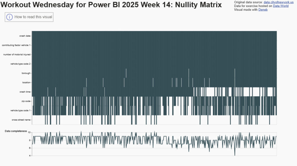
Introduction This week we are building a nullity matrix, a tabular visual that helps us to easily see which rows and columns have null data. There is a library for this in Python, but you need to “roll your own” in Power BI. I found the Python library and liked the idea of visualizing null […]
2025 Week 14 | Power BI: Create a nullity matrix Read More »
Power BI, Workout Wednesday