Introduction
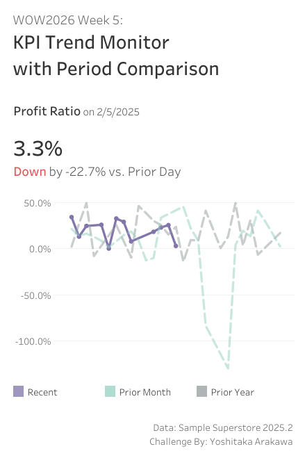
Thanks to tools like Tableau MCP, AI can now handle deep-dive data analysis for us. Ask it “why is this metric dropping?” and you’ll get a pretty solid answer. But before that step — noticing that something looks off in the first place — that’s still on us, looking at a dashboard. This week, let’s build a dashboard that helps you quickly spot KPI movements and think “hmm, maybe I should look into this” — a trigger for deeper analysis.
We’re still early in 2026, so I’ve kept this one quick and light. I hope you have fun with it!
Requirements
- Dashboard size: 400 x 600 px
- 2 sheets
- Build a KPI card (BAN) for Profit Ratio:
- Display the Profit Ratio on the base date
- Show the change from the prior day
- Color-code Up / Down
- Overlay three lines on a trend chart (14-day window around the base date):
- Recent: the base date and 14 days prior (e.g. 1/22 – 2/5)
- Prior Month: ±14 days around the same day last month (e.g. 12/22 – 1/19)
- Prior Year: ±14 days around the same day last year (e.g. 1/22 – 2/19)
- The Recent line should end at the base date, while the Prior Month and Prior Year lines continue beyond it
- Display the X-axis as relative days from the base date
- Match the tooltips and formatting as closely as possible
Dataset
This challenge users Sample Superstore 2025.2 data. You can download the data here (Google Drive).
Attribute
When you publish your solution on Tableau Public make sure to take the time and include a link to the original inspiration. Also include the hashtag #WOW2026 in your description to make it searchable!
Share
- On X using the hashtag #WOW2026 #Tableau and tag @WorkoutWednsday and @yoshi_dataviz
- On LinkedIn using the tag Workout Wednesday, Tableau, and Yoshitaka Arakawa
