Introduction
Frequent Workout Wednesday participant Jack Hineman reached out to me last week saying he had just come up with something at work he thought would make a good WOW challenge. He sent it to me and it looked really interesting, so we’ve got a guest challenge this week. Here’s Jack:
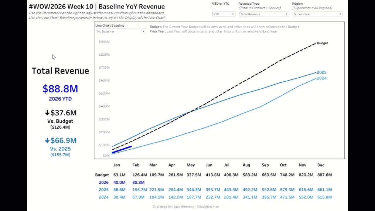
I have been debating how to clean up a chart that my company has been using for years. The chart shows Year over Year Revenue for the Current Year, plus the past 2 years, plus the current year budget. It is most often displayed using Year-to-Date values, which means that the lines get very close together. To compound the issue, the chart is most often created with all labels shown, so it gets very busy. I wanted to clean up this chart, but also try to “zoom in” on the actual variances. Maybe someone already invented this, and there is a proper name, but for now, I am calling my solution a “Baseline” chart.
Requirements
- Dashboard Size: 1200×800
- Sheets: as many as you want
- For all Charts: Allow the user to select
- YTD or MTD for the Line Chart which should flip between the YTD Value and MTD Value (YTD Value has already been calculated, so no need for table calcs)
- Region: Note that the data has been densified and Superstore = All Regions
- Revenue Type: (Account Field) – Note that data has been densified and Total Revenue = Contract + Service Revenue
- Create a Line Chart showing YoY Revenue
- Allow the user three options to select as a “Baseline” for the line chart
- “No Baseline” – Shows the typical line chart
- “Budget” – The current year Budget becomes 0, and the other lines become relative to the Current Year Budget
- “Prior Year” – The Prior Year Actual Revenue becomes 0, and the other lines become relative to Prior Year
- Set Animation Speed to 2 seconds for this sheet only
- Make the Budget Line dashed/dotted, Actuals should be solid lines
- Label the Right End of the line with “Budget” for Budget or the Year for Actuals (ensure this is to the right of the line)
- Ensure there is no “marker” (dot) at the end of the lines
- Choose whatever colors you would like for Budget and each year of actuals
- Allow the user three options to select as a “Baseline” for the line chart
- Show a Crosstab at the bottom showing the MTD/YTD Revenue based on the Parameter (the months in the Crosstab should align with the Months on the line chart
- Apply the same colors as the line chart
- Include Row Headers for Crosstab that match the colors of the line chart and the Crosstab
- Display the months between the Line Chart and the Crosstab
- Months should align with both the Line Chart and the Crosstab
- Show BANs on the left with the MTD/YTD value as of the current month (the max month that has values for Actuals)
- Show the current MTD/YTD Value based on the Parameter
- Show the variance (with arrows) vs the Current Year Budget along with the Current Budget Amount
- Show the variance (with arrows) vs Prior Year Actual and the Prior Year Actual Amount
Dataset
Available from here.
Attribute
When you publish your solution on Tableau Public make sure to take the time and include a link to the original inspiration. Also include the hashtag #WOW2026 in your description to make it searchable!

Share
After you finish your workout, share on Twitter and/or LinkedIn using the hashtag #WOW2026 #Tableau and tag @WorkoutWednsday
Solution
Interactive
