I’ve had a post-it note on my desk since TCish 2020, someone asked me how to make a Clustered Histogram in Tableau and I froze. I know how to make packed bar charts, and I know how to make a histogram, but the idea of a clustered histogram – a TRUE clustered histogram with a continuous axis didn’t immediately jump out to me as easy to build.
So that’s the challenge. Build a clustered histogram where there’s a bar for each Segment and a continuous axis showing tick marks at the appropriate bin spots. And since I can’t ever make anything easy, there are some nuanced tooltips you’ll want to make sure you match.
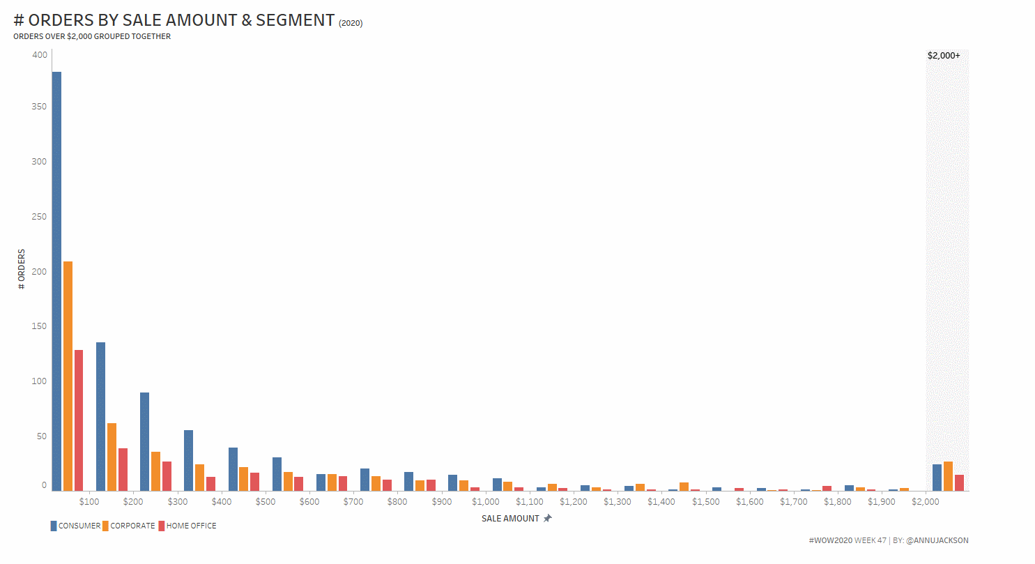
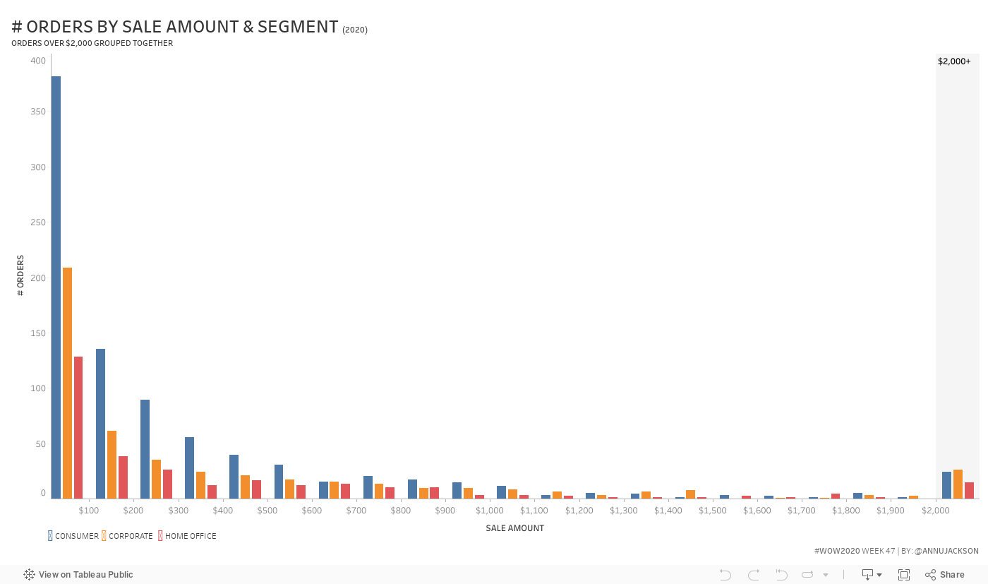
Create a clustered histogram of # Orders by Sales Amount by Segment
Bins are every $100
Data is limited to 2020
# Orders $2,000+ are lumped together at the end
Match tooltips
When it is between two values tooltip says “between $X – $Y”
When it is $2,000+ it simply says $2,000+
Legend – this needs to be in all caps
Dataset
This week uses the superstore dataset shipped in Tableau 2020.3.
I’m pretty sure this still matches the data set available here: data.world
Attribute
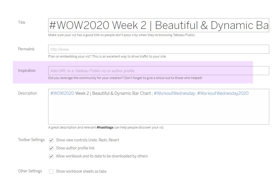
When you publish your solution on Tableau Public make sure to take the time and include a link to the original inspiration. Also include the hashtag #WOW2020 in your description to make it searchable!
Can you please share the solution?