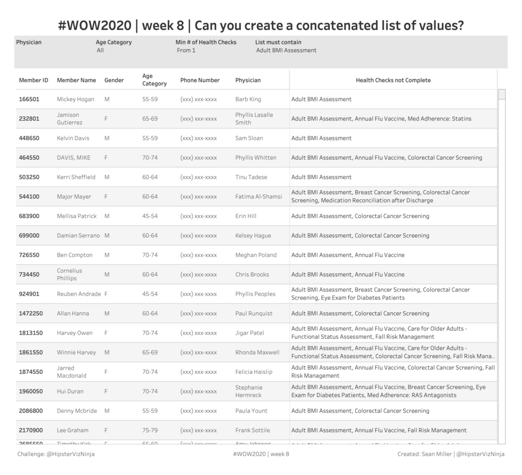
table calculations

Week 42: Can you build a comparative line chart with dynamic inputs?

This week’s challenge is taken directly from a situation I recently had on a project.  The goal of the project was to be able to isolate out time periods of a specific length and compare it to the time period directly before it.  So as an example, if it’s October 2019, I want to look […]

Week 42: Can you build a comparative line chart with dynamic inputs? Read More »

Week 38: Can you build a sales comparison chart with performance indicators?

This week I’m tackling a topic that nearly everyone has been asked – visualizing good/bad as performance indicators that are red or green.  At least here in the western world, the busy executive tends to think about things in terms of traffic lights.  So this week your task is to create something that satisfies their

Week 38: Can you build a sales comparison chart with performance indicators? Read More »

2019 Week 10: How Has Our Profit Ratio Changed Nationally?

This week’s challenge is plucked directly from #IronQuest.  If you’re not aware of what #IronQuest is, it’s a monthly challenge during the off season of Tableau Public’s Iron Viz feeder contest.  It’s run by Sarah Bartlett and each month a different theme is chosen.  Participants are allowed to submit for feedback (the idea is to

2019 Week 10: How Has Our Profit Ratio Changed Nationally? Read More »