2021 Week 11 | Tableau : Can you recreate the work of Hans Rosling?
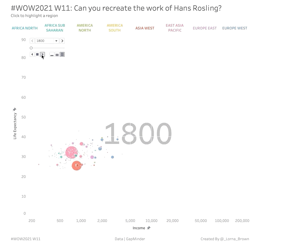
Introduction This week I wanted to throw it back to an old classic chart by Hans Rosling, if you haven’t seen the TED talk I highly recommend watching it. Hans shows how fertility rate and life expectancy has changed over the years. With this example we are going to look at Income per GDP and […]
2021 Week 11 | Tableau : Can you recreate the work of Hans Rosling? Read More »
Tableau, Workout Wednesday