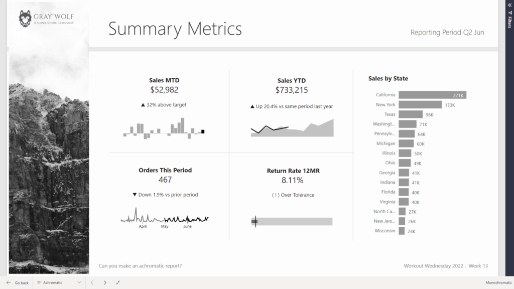
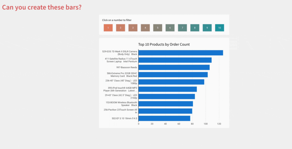
Design

2025 Week 14 | Sigma: Can you Create a Small Multiples chart?

Can you make a small multiples chart? Introduction Edward Tufte, often called the godfather of data visualization, brought a minimalist, no-nonsense approach to presenting information. In his seminal 1983 book The Visual Display of Quantitative Information, he introduced a now-iconic concept: small multiples — a simple but powerful way to show data through repetition and

2025 Week 14 | Sigma: Can you Create a Small Multiples chart? Read More »

Style Guide App

2023 Week 34 | User Experience, Design & Templates

Introduction This week we are exploring user experience and design for CRM Analytics dashboards. Design foundations are the key visual elements to create a consistent interface. This includes guidance on color, type scale and fundamental navigation patterns. Using the Design Style Guide template app gives you a starting point for consistent and best practice design

2023 Week 34 | User Experience, Design & Templates Read More »

2022 Week 17 | Power BI : Create a Custom Theme

Introduction Welcome back to color month! It’s our 4th color-focused challenge and in stark contrast to Kerry’s week 14 challenge, we’re using loads of bright colors! This week we’re creating a custom theme using the color palette of the United Nations Sustainable Development Goals. This challenge was inspired by a Makeover Monday challenge – take a look

2022 Week 17 | Power BI : Create a Custom Theme Read More »

2022 Week 14 | Power BI: Create an achromatic report

Introduction April is colour month for Power BI Workout Wednesday 2022. First up we are going to try our hand at creating reports WITHOUT hue. Using a file from a previous challenge, can you create an achromatic report that uses contrast and lightness effectively? There will be some creative freedom involved in this challenge, no

2022 Week 14 | Power BI: Create an achromatic report Read More »