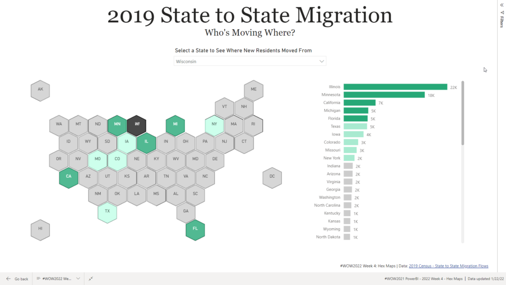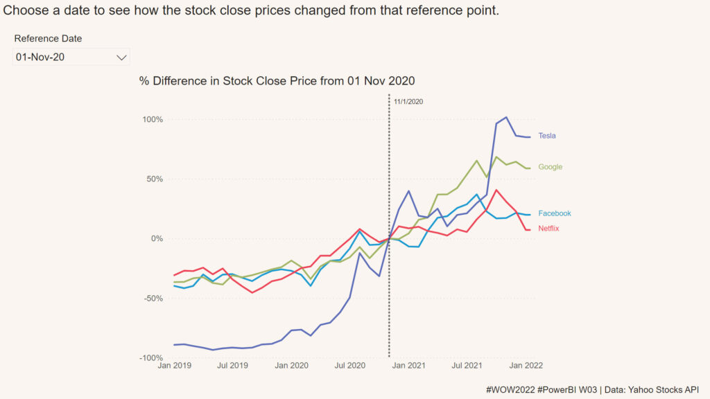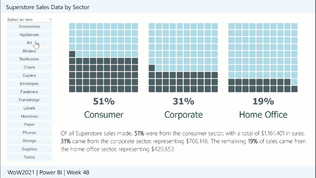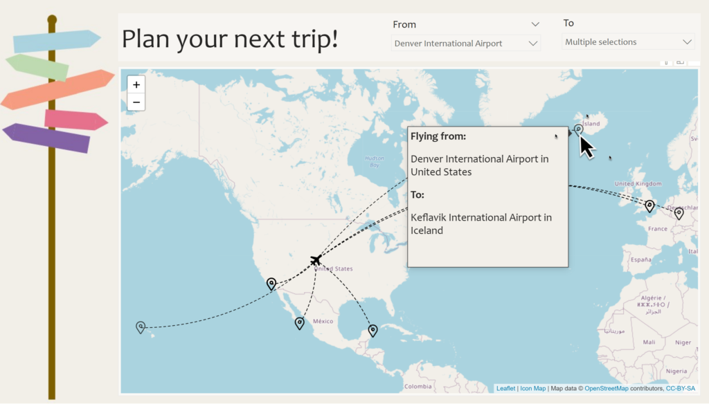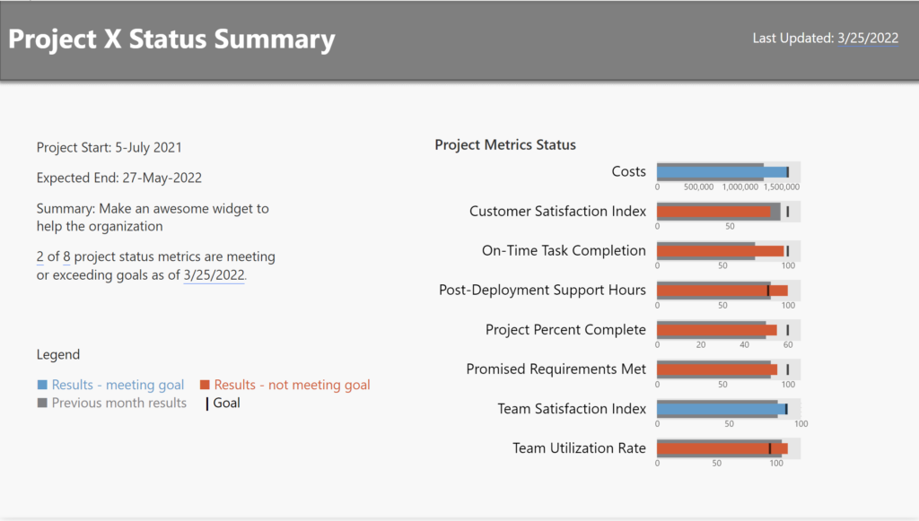
2022 Week 13 | Power BI: Build a Bullet Chart with Deneb
Introduction For this last week of March, we are continuing our project management theme. The challenge this week is to use Deneb to build bullet charts using the provided data. Bullet charts were created by Stephen Few to offer an alternative to clunky gauges. Bullet charts are used to compare a featured measure to one or […]
2022 Week 13 | Power BI: Build a Bullet Chart with Deneb Read More »
Power BI, Workout Wednesday