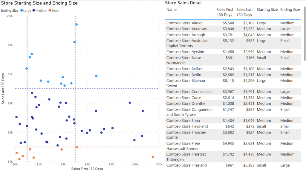
Beginner

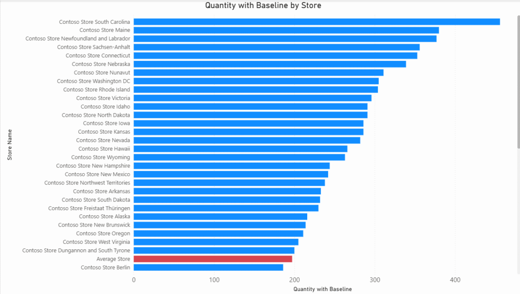
2025 Week 37 | Power BI: Adding a baseline bar in a bar chart

Introduction In this challenge, we are looking to add a bar with custom logic to a bar chart. Sometimes when I’m working with a customer, they want a baseline, total, or reference point to be included in the column of a column chart or the row of a table. If it’s just a matter of […]

2025 Week 37 | Power BI: Adding a baseline bar in a bar chart Read More »

Power BI, Workout Wednesday

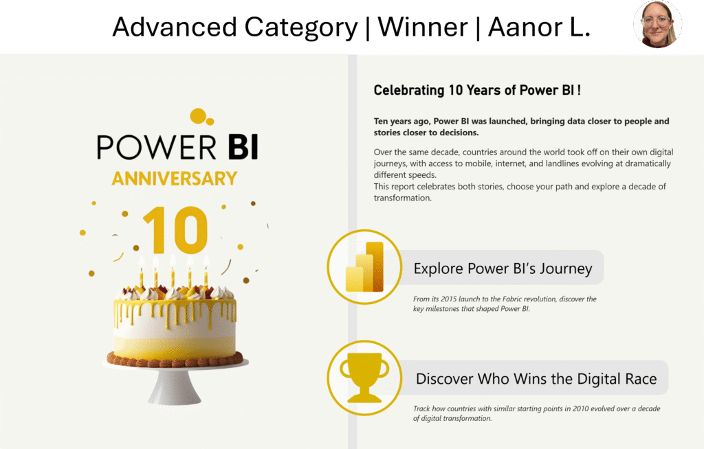
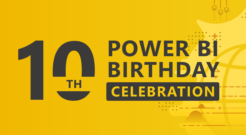
Screenshot of Aanor's winning Power BI report, which includes a birthday cake and a happy 10th birthday to Power BI

2025 Week 31 | Recreate a winning #PBI10 entry

Introduction This week we’re challenging you to recreate a single visual element from one of the winning reports from the #PBI10 dataviz championship. The contest took place over the past month and there were four winners, so, you have four reports to choose from! The entries in this challenge represent a wide range of visual styles, analysis,

2025 Week 31 | Recreate a winning #PBI10 entry Read More »

Power BI, Workout Wednesday
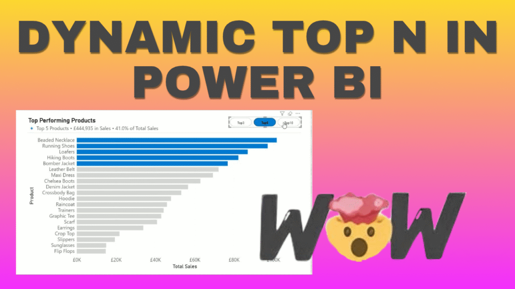
2025 Week 29 | Next level tooltip

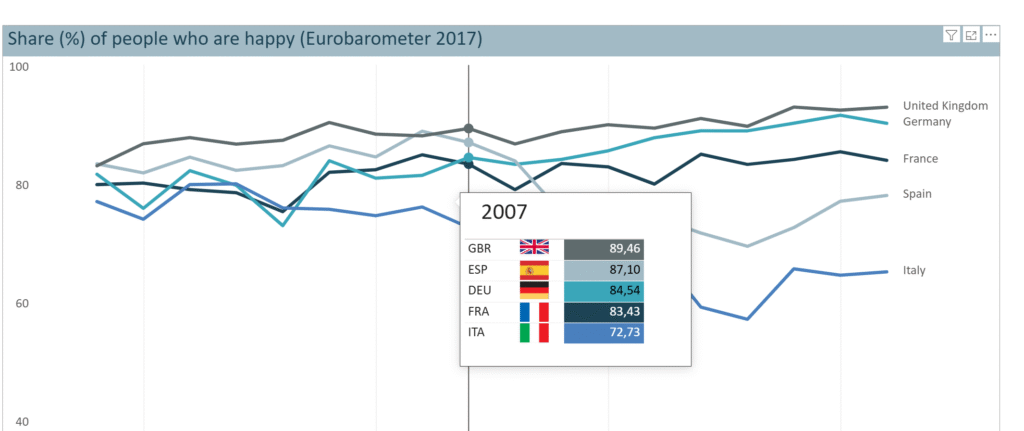
Introduction Welcome back to Workout Wednesday!  This week we’re building a special tooltip.It will include flags, and some special custom formatting. Want to learn, how to create a tooltip like this?Let’s do it! Requirements Download the sample data from the Data World Website – part 1 and part 2. [Note: Data.World requires you to create a

2025 Week 29 | Next level tooltip Read More »

Power BI, Workout Wednesday
2025 Week 28 | Join the #PBI10 Dataviz Contest

Introduction This week we’re challenging you to join the official Power BI 10th birthday celebration! Microsoft is celebrating by hosting a dataviz contest, and we’d love to see you join! You can find all of the details on the Fabric/Power BI Community Site, and we’ll paraphrase the challenge here below. Contest Timeline Start Date: Tuesday,

2025 Week 28 | Join the #PBI10 Dataviz Contest Read More »

Power BI, Workout Wednesday
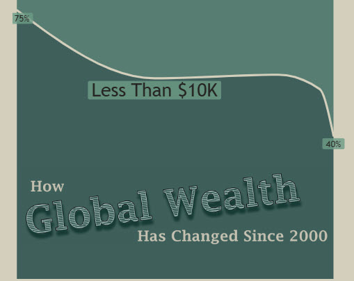
2025 Week 27 | Recreate This Wealth Infographic

Introduction Recreating visuals you find online helps you build visual design skills and find workarounds to common problems or feature gaps in Power BI. This week, we are recreating this infographic from Visual Capitalist about the change in global wealth. The original is shown below, followed by my version in Power BI. Requirements Create a

2025 Week 27 | Recreate This Wealth Infographic Read More »

Power BI, Workout Wednesday
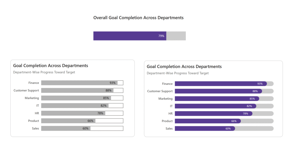
Screenshot of progress bars made in Power BI.

2025 Week 26 | Power BI: Progress Bars

Introduction Happy Wednesday Power BI Folks! This week on Workout Wednesday, I’m excited to be back with a fresh challenge and it’s all about progress bars! No custom visuals. No add-ons. Just creativity and some Power BI magic.  Why Progress Bars? Progress bars are a great visual tool used to represent progress toward a goal/target

2025 Week 26 | Power BI: Progress Bars Read More »

Power BI, Workout Wednesday
Screenshot of a box plot created using Power BI.

2025 Week 24 | Power BI: Core Visuals Box Plot

Introduction It’s nice to be invited back by the team, and thanks for having me! While it’s tempting for me to think of something for you explore with the Deneb or HTML Content custom visuals (and I’d still encourage that!), I’d like to continue some of the other threads we’ve recently seen around what we

2025 Week 24 | Power BI: Core Visuals Box Plot Read More »

Power BI, Workout Wednesday
Screenshot of a lollipop chart created using Power BI

2025 Week 22 | Power BI: Create a lollipop chart

Introduction Happy Wednesday Power BI Folks! This is my first time creating a Power BI Workout Wednesday exercise, and I’m excited (and a little nervous) to share it with you all! Thank you for being part of my learning and teaching journey. Let’s grow together! Have you ever wanted to create a Lollipop Chart in Power BI

2025 Week 22 | Power BI: Create a lollipop chart Read More »

Power BI, Workout Wednesday