Workout Wednesday

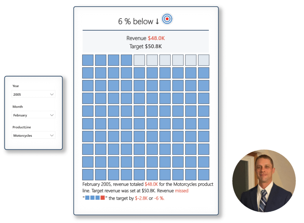
2025 Week 32 | Build a Waffle Chart using Core Visuals

Introduction This week, we’re cooking up something a little different – waffle charts! Your challenge is to build a report that compares actual sales to a dynamic monthly target and visualizes progress in a clean, impactful way. Requirements Get and Prepare Data Start by downloading the CSV file provided. It contains 8 columns: ORDERNUMBER QUANTITYORDERED […]

2025 Week 32 | Build a Waffle Chart using Core Visuals Read More »

Power BI, Workout Wednesday
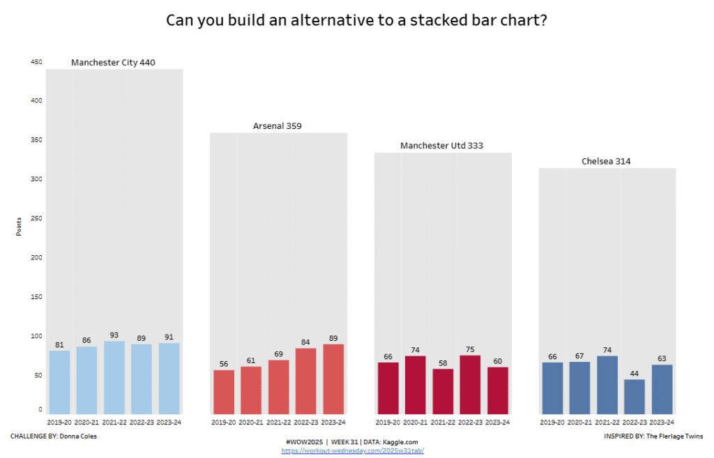
#WOW2025 | Week 31 | Can you build an alternative to a stacked bar chart?

Introduction I often use the #datafam community as inspiration for my #WOW challenges, as it gives me the perfect opportunity to try out a particular technique or visualisation style, which I hope you all then benefit from too 🙂 This week’s challenge was inspired by this blog post by the Flerlage Twins, which in turn

#WOW2025 | Week 31 | Can you build an alternative to a stacked bar chart? Read More »

Tableau, Workout Wednesday
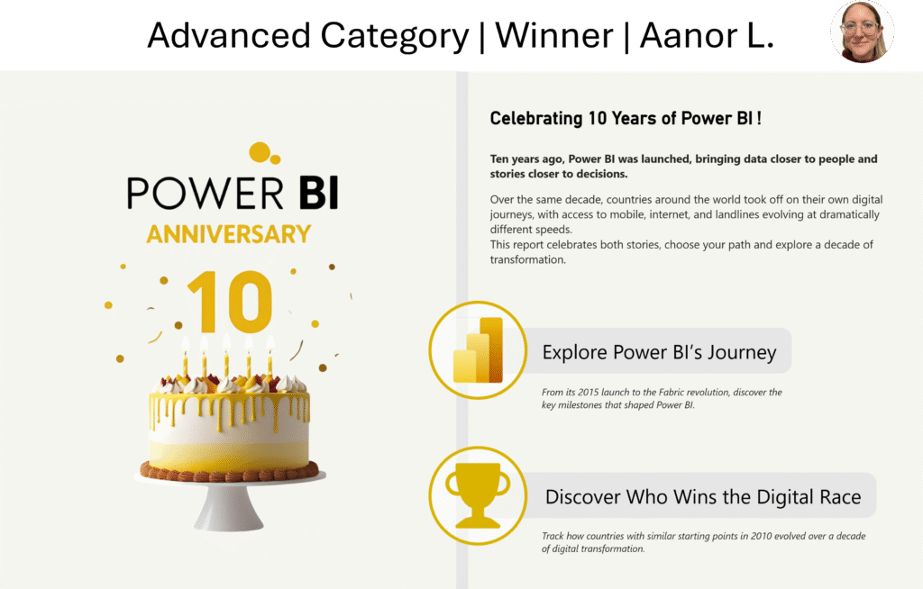
Screenshot of Aanor's winning Power BI report, which includes a birthday cake and a happy 10th birthday to Power BI

2025 Week 31 | Recreate a winning #PBI10 entry

Introduction This week we’re challenging you to recreate a single visual element from one of the winning reports from the #PBI10 dataviz championship. The contest took place over the past month and there were four winners, so, you have four reports to choose from! The entries in this challenge represent a wide range of visual styles, analysis,

2025 Week 31 | Recreate a winning #PBI10 entry Read More »

Power BI, Workout Wednesday
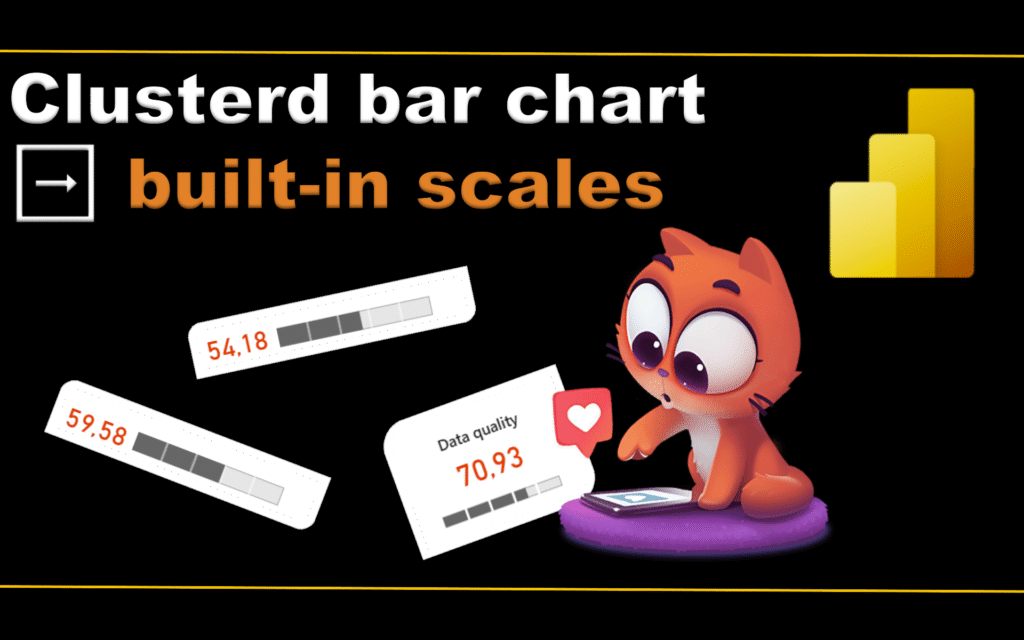
2025 Week 30 | Power BI: Bar chart with built-in scales ????

Introduction Happy Workout Wednesday, data fam! This week, we’re taking bar charts to the next level—with built-in scales that visually speak for themselves! We all love a good bar chart, but sometimes you want to show progress toward a goal or segment values into performance zones – without extra visuals, DAX trickery, or custom backgrounds. Just

2025 Week 30 | Power BI: Bar chart with built-in scales ???? Read More »

Power BI, Workout Wednesday
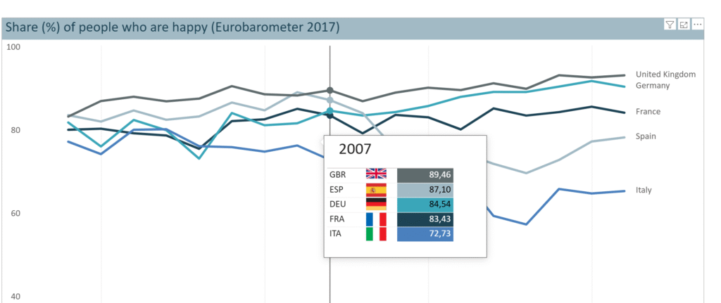
2025 Week 29 | Next level tooltip

Introduction Welcome back to Workout Wednesday!  This week we’re building a special tooltip.It will include flags, and some special custom formatting. Want to learn, how to create a tooltip like this?Let’s do it! Requirements Download the sample data from the Data World Website – part 1 and part 2. [Note: Data.World requires you to create a

2025 Week 29 | Next level tooltip Read More »

Power BI, Workout Wednesday
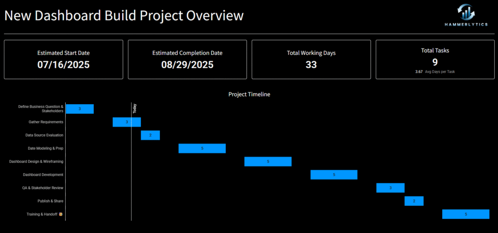
2025 Week 29 | Sigma : Gantt Touch This

Introduction Welcome to Week 29 of 2025! This week’s challenge is all about bringing back a tried-and-true classic: the Gantt chart. Whether you’re mapping out project timelines or visualizing task dependencies, this is your chance to put a clean, modern spin on one of the original BI visuals. Build something in Sigma that’s as functional

2025 Week 29 | Sigma : Gantt Touch This Read More »

Sigma, Workout Wednesday

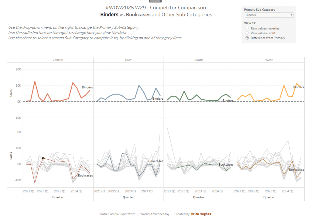
#WOW2025 | Week 29 | Competitor Comparison

Introduction This week’s challenge was inspired by a question from a colleague. They were looking for ideas for how to manage a chart with multiple lines and mulitple metrics. My colleague started with the idea of highlighting a single line in each chart, to show how the company compared to its competitors – a simple

#WOW2025 | Week 29 | Competitor Comparison Read More »

community, Tableau, Workout Wednesday

2025 Week 28 | Join the #PBI10 Dataviz Contest

Introduction This week we’re challenging you to join the official Power BI 10th birthday celebration! Microsoft is celebrating by hosting a dataviz contest, and we’d love to see you join! You can find all of the details on the Fabric/Power BI Community Site, and we’ll paraphrase the challenge here below. Contest Timeline Start Date: Tuesday,

2025 Week 28 | Join the #PBI10 Dataviz Contest Read More »

Power BI, Workout Wednesday