Power BI

Line chart with vertical reference line

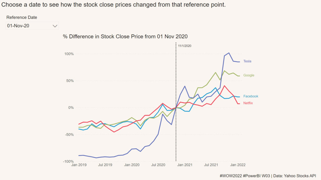
2022 Week 03 | Power BI: Can you visualize percent difference from a selected date?

Introduction This week we are taking a page from the Tableau team and looking at how a metric has changed from the value at a specified reference date.  Requirements Create a line chart showing percent change of the close price from a selected date.  Use a slicer or other visual to allow users to change

2022 Week 03 | Power BI: Can you visualize percent difference from a selected date? Read More »

Power BI, Workout Wednesday
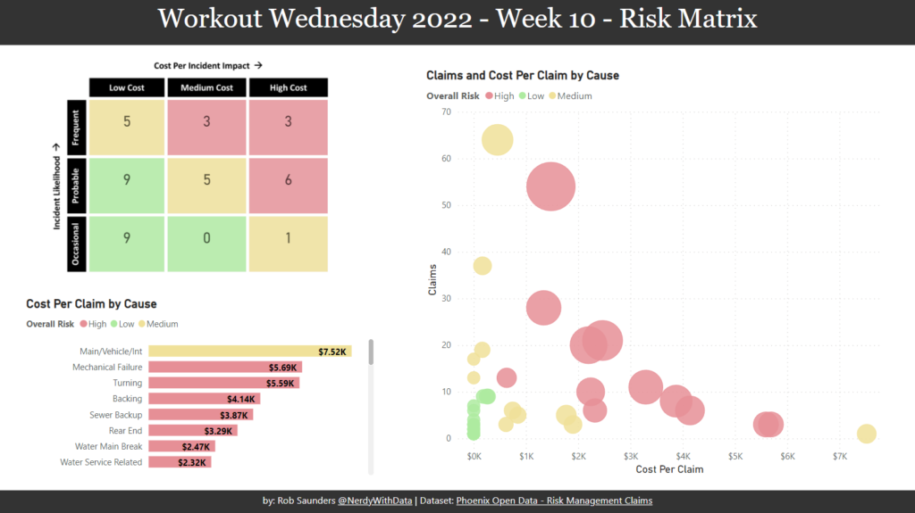
2022 Week 02 | Power BI: Simplified Custom Page Navigation

Introduction Welcome back to Power BI #WorkoutWednesday – week 2! We had incredible participation last week and are so excited to dive in this week with custom page navigation. If this sounds familiar, it’s because we did a similar navigation challenge back in November 2021. In a fortunate turn of events, the Power BI team

2022 Week 02 | Power BI: Simplified Custom Page Navigation Read More »

Power BI, Workout Wednesday
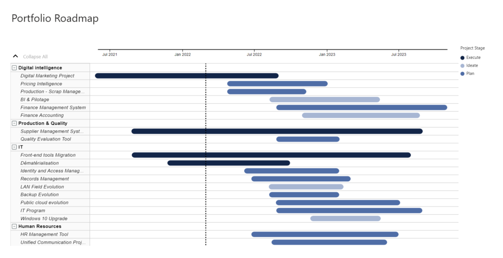
2022 Week 01 | Power BI: Sparklines!

Introduction Welcome back to another year of Power BI #WorkoutWednesday! We hope you enjoy the challenges that we are going to present you this year. To get this year started off right, this week’s challenge will be introducing you to a feature that was released in the December 2021 Power BI Desktop release, sparklines. I’ve

2022 Week 01 | Power BI: Sparklines! Read More »

Power BI, Workout Wednesday
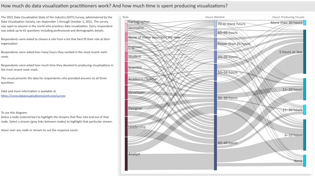
Power BI Advent Calendar

2021 Week 49 – 51 | Power BI: Advent Calendar with Holiday Challenges

Introduction As holiday season is upon us, we have created a Power BI Advent Calendar for you to enjoy. Select each day to open a surprise. The surprise for each day will not be available until we reach that day (in UTC time). If you try to open a gift before we have reached the

2021 Week 49 – 51 | Power BI: Advent Calendar with Holiday Challenges Read More »

Power BI, Workout Wednesday

2021 Week 48 | Power BI: Create a Waffle Chart

Introduction This week we are continuing our design theme and using the waffle chart custom visual.  Waffle charts show progress toward a whole or a target percentage, and can be used as an alternative to bar and/or pie charts. The Waffle Chart custom visual in Power BI allows us to customize the icon (here we

2021 Week 48 | Power BI: Create a Waffle Chart Read More »

Power BI, Workout Wednesday
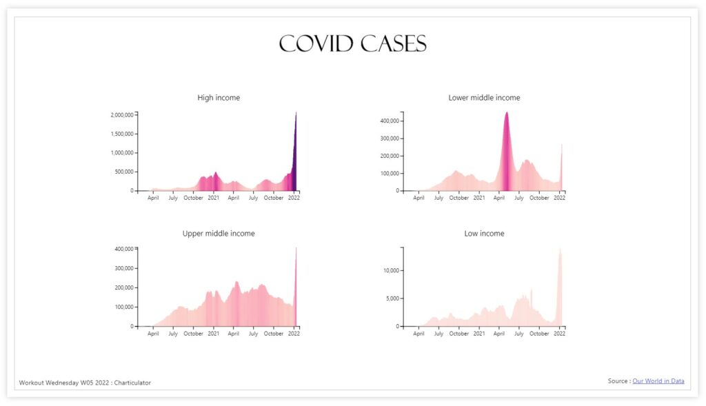
2021 Week 47 | Power BI: Custom Line Chart Formatting

Introduction This week we are continuing our design theme by working through a custom formatting hack for line charts. Conditional formatting in Power BI can be tricky at times, especially when trying to format different chart types.  If you are familiar with conditionally formatting a line chart, you’ll know that in the Data Colors section

2021 Week 47 | Power BI: Custom Line Chart Formatting Read More »

Power BI, Workout Wednesday
A power bi report that calculates contrast ratio between two colors

2021 Week 46 | Power BI: Create a Color Contrast Calculator

Introduction This week we are continuing our design theme by making a report about report design. Color is a very important element in report design. Color contrast is not only important for accessibility, it’s also an element of visual hierarchy. You can also use color contrast as a way to make elements on your report

2021 Week 46 | Power BI: Create a Color Contrast Calculator Read More »

Power BI, Workout Wednesday