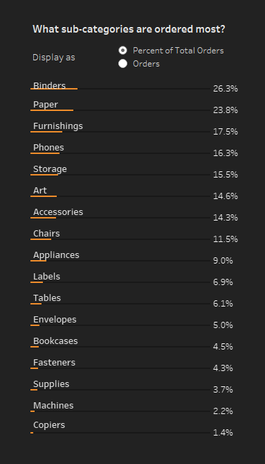
Week 27: How do current year sales compare to previous?

For this week’s workout I’ve decided to keep things simple and focus on creating one powerful alternative visualization for comparison over time.  I think we all tend to get stuck in a bar chart rut and struggle to find ways to spice things up.  I tend to do this a lot, especially when I am

Week 27: How do current year sales compare to previous? Read More »

Tableau, Workout Wednesday

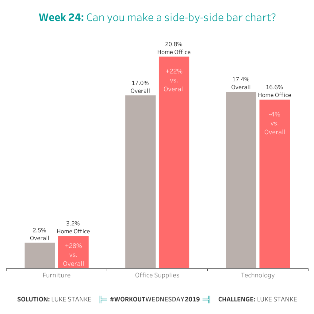
Week 24: Do customers spend more on their first or second purchase?

This week I’m taking Workout Wednesday to the next level by including Tableau Prep in the equation!  If you don’t have Tableau Prep, go get the 30 day trial from here. Prep was released just over a month ago, so it’s the perfect opportunity for us to ensure we’re strengthening our visualization skills and including

Week 24: Do customers spend more on their first or second purchase? Read More »

Tableau, Workout Wednesday

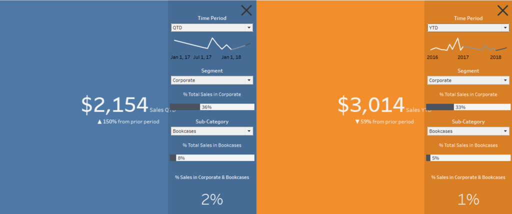
Week 23: How do Sales compare in the Current Period to the Previous

I’m back after a semi-extended leave, but hoping I have a good challenge for everyone. I love working with Dates, and have come across all sorts of use cases for comparing like-wise periods of time. The challenge below covers a use-case of trying to compare a Custom Date range, to the same number of days

Week 23: How do Sales compare in the Current Period to the Previous Read More »

Tableau, Workout Wednesday

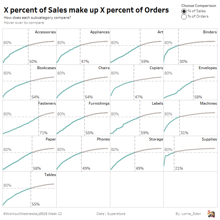
Week 22: Which city contributes the most sales to each state?

He’s back again! Andy Kriebel shares with a problem that you can only use table calculations to solve Requirements Use only table calculations The bar length is the total sales of each state City must be included in the view. Display only one mark per state. Label each bar by the city with the highest

Week 22: Which city contributes the most sales to each state? Read More »

Tableau, Workout Wednesday

Week 21: Profit and Sales Cat Emoji Map

This week’s Workout Wednesday is an emoji map. The original idea comes from a Dark Sky emoji map of the weather. This worksheet has several major elements you’ll have to work through: Data modeling Percentiles Hex bins of geospatial data Working with emojis Customized “legend” Requirements Dashboard size: 600 x 600, 2 sheets (floating and

Week 21: Profit and Sales Cat Emoji Map Read More »

Tableau, Workout Wednesday