Introduction
This week’s challenge may not be too difficult for some of you, but I created it in order to bring attention to an essential skill – calculating weighted averages. As data analysts, it’s our responsibility to ensure that the data we display is not misleading or innacurate.
I didn’t spend too much time explaining WHY we need to use a weighted average, so if you’re not familiar with this, then I urge you to spend some of your challenge time reading and understanding this important concept, before applying it in the visualisation below.
Requirements
- Dashboard size: 1300 x 800
- Filter your data set to a single quarter (I used October, November, December of the lastest year in my data set).
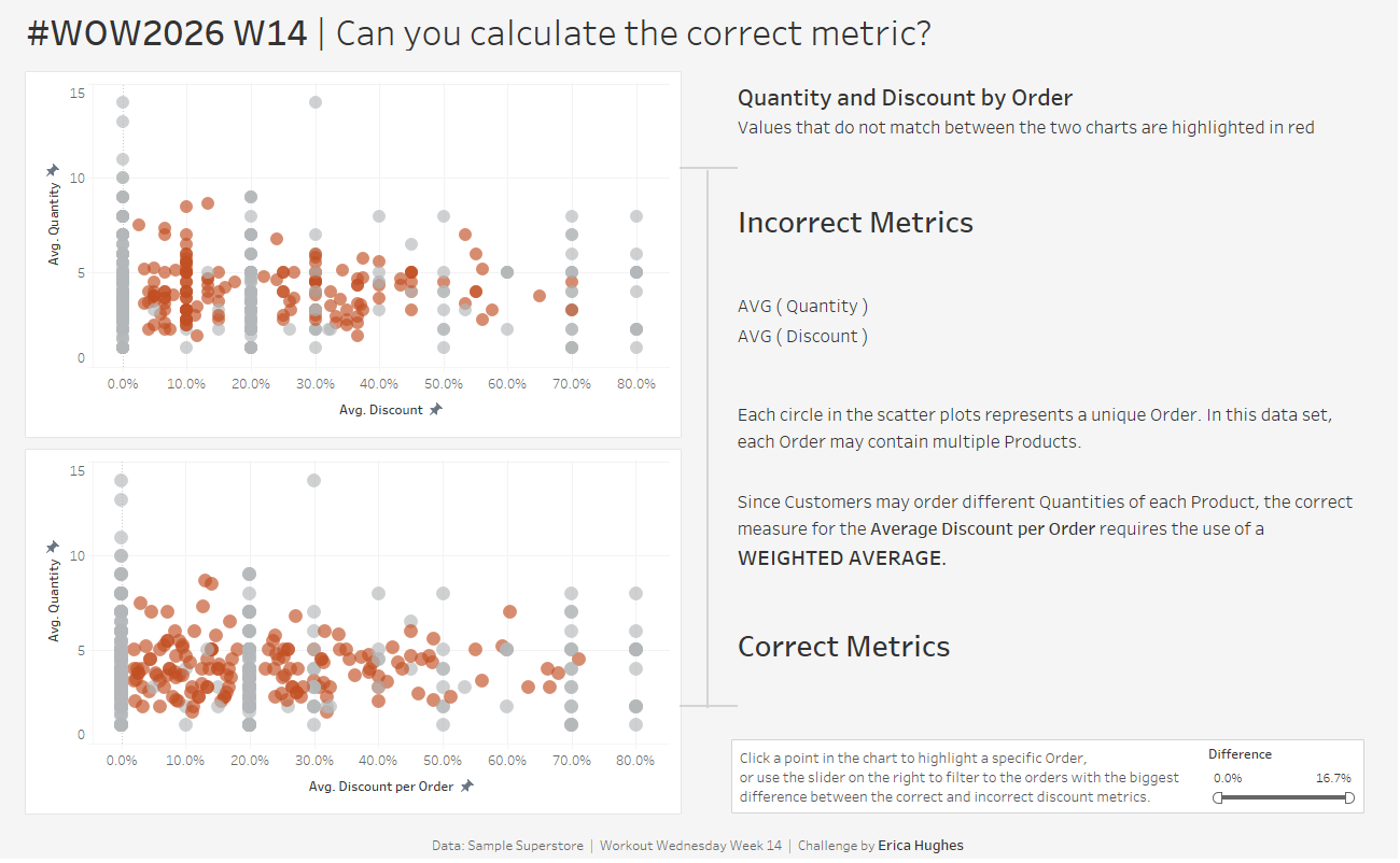
- Create a scatter plot of Avg(Quantity) against Avg(Discount) for each unique order (these metrics will produce innacurate results – the goal is to use this chart to compare with the next one)
- Use a weighted average to calculate the correct Average Discount per Order, and create a second scatter plot using this instead of Avg(Discount)
- Use colour to highlight the orders where Avg(Discount) is different to your calculation of Average Discount per Order.
- Add a highlight action to highlight the same Order in both charts. The Avg Discount metric should appear as a label for the highlighed point.
- Match tooltips and formatting, including product-level data for quantity and discount in the tooltip.
- Optional: Add a filter to allow users to quickly identify orders with a larger difference between the incorrect and correct discount metrics.
Dataset
Sample Superstore
Attribute
When you publish your solution on Tableau Public make sure to take the time and include a link to the original inspiration. Also include the hashtag #WOW2026 in your description to make it searchable!

Share
After you finish your workout, share on Twitter and/or LinkedIn using the hashtag #WOW2026 #Tableau and tag @WorkoutWednsday
Solution
Interactive
