Welcome back to #WOW2026! Thank you all for your continued support, and for bearing with us while we carried out some maintenance on the website.
For the first challenge of the year, I’m asking you to recreate a technique that was originally introduced way back in 2010, and re-shared during a ‘tips and tricks’ battle at #DataFam Europe in London last December. It’s the original “Viz in Tooltip” by the legendary Andy Cotgreave.
The VIT functionality introduced in 2017 can sometimes be slow to render – this technique is much much faster, but doesn’t suit all circumstances. While the idea has been around for a long time, it wasn’t anything I’d actually tried myself, so, as with most challenges I set, it gave me the opportunity to try it out. And it’s always worth having the concept in your ‘toolbox’. Enjoy!
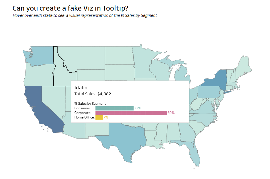
Create a filled map showing Sales (colour) by State for the US only
Add a fake Viz in Tooltip that displays the % Sales per Segment in each state as a bar chart
The tooltip should not use the core functionality where another sheet is inserted into the tooltip
Ideally the label, bar and % value per Segment should display on a single line
Hint : Unicode characters U+2588 █ and U+258C ▌will be your friends
Style / format as you wish
Dataset
The challenge uses Superstore 2025 data, but any version will suffice. You can find the data on Data.World.
Attribute
When you publish your solution on Tableau Public make sure to take the time and include a link to the original inspiration. Also include the hashtag #WOW2026 in your description to make it searchable!