2018

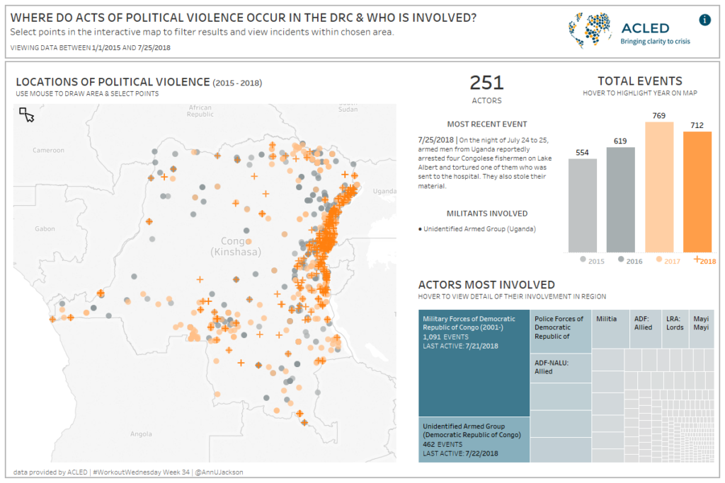
Week 34: Building an Interactive Display to Visualize Violence in the DRC

This week we’re visualizing conflict data provided by ACLED.  ACLED, which stands for Armed Conflict Location & Event Data Project, is a “disaggregated conflict collection, analysis and crisis mapping project.”  You’ll notice throughout the Tableau Community this week that there are several partner projects going on – all designed to provide awareness on ACLED’s cause.  […]

Week 34: Building an Interactive Display to Visualize Violence in the DRC Read More »

Tableau, Workout Wednesday
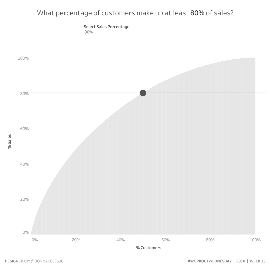
Week 33: What customers make up XX% of sales?

August Community Submission Month Welcome to community submission month. For all 5 of those weeks we’ll have our favorite community submissions as challenges. FYI: You can still submit here.     Community Submission Challenge #3: Donna Coles Donna is located in Didcot, Oxfordshire in the UK. She is a Business Analyst for RM Education and

Week 33: What customers make up XX% of sales? Read More »

Tableau, Workout Wednesday
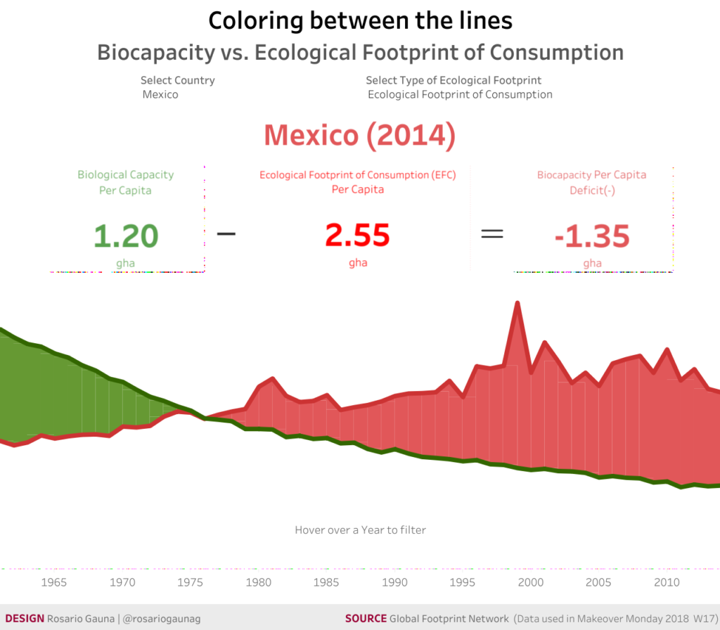
Week 32: Coloring Between the Lines

August Community Submission Month Welcome to community submission month. For all 5 of those weeks we’ll have our favorite community submissions as challenges. FYI: You can still submit here.     Community Submission Challenge #2: Rosario Irasema Gauna González Our second community challenge comes from Rosario Irasema Gauna González. Rosario is located in Monterrey, Nuevo

Week 32: Coloring Between the Lines Read More »

Tableau, Workout Wednesday
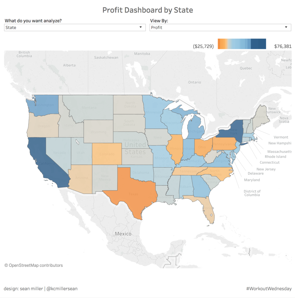
Week 31: Dynamic Color Legend

August Community Submission Month Welcome to community submission month. For all 5 of those weeks we’ll have our favorite community submissions as challenges. FYI: You can still submit here.     Community Submission Challenge #1: Sean Miller Our first community challenge comes from Sean Miller. Sean is located in Kansas City, Missouri in the United

Week 31: Dynamic Color Legend Read More »

Tableau, Workout Wednesday
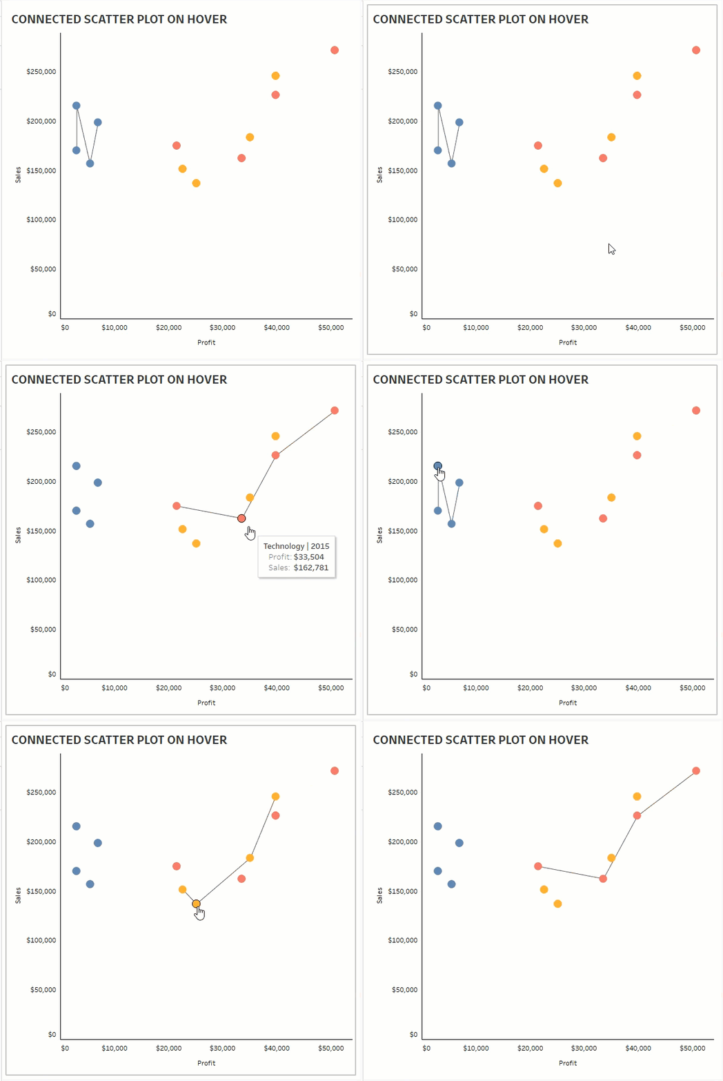
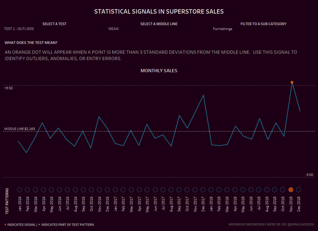
Week 30: Statistical Signals in Superstore Sales

This week’s workout is all about finding signals or patterns in data, specifically using run charts (aka line charts).  Variance over time is one of the most common ways to understand a process and often when we’re visualizing the data we use data summarization tools like the mean (average) or median to help aid in

Week 30: Statistical Signals in Superstore Sales Read More »

Tableau, Workout Wednesday
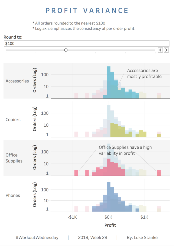
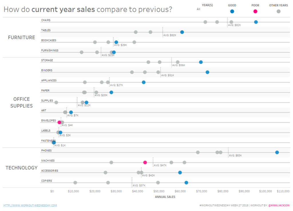
Week 27: How do current year sales compare to previous?

For this week’s workout I’ve decided to keep things simple and focus on creating one powerful alternative visualization for comparison over time.  I think we all tend to get stuck in a bar chart rut and struggle to find ways to spice things up.  I tend to do this a lot, especially when I am

Week 27: How do current year sales compare to previous? Read More »

Tableau, Workout Wednesday