This Week’s Challenge requires some data modelling, but allows for additional UX features not natively available in the product.

Requirements
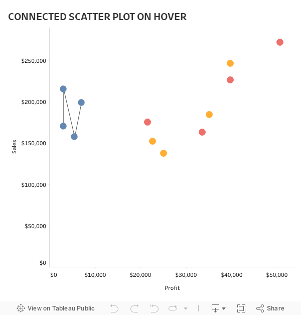
- Dashboard size is 600 x 600
- The Scatter Plot has Sales by Profit for each Category and Year
- When a user hovers over any category, all years for the category will be connected by a line
- The line connects the categories by year in ascending order
Dataset
This week uses the superstor-ish. It doesn’t matter which one you use, but you can get 2018.1 here at data.world
Share
After you finish your workout, share on Twitter using the hashtag #WorkoutWednesday and tag @AnnUJackson, @LukeStanke, and @RodyZakovich. (Tag @VizWizBI too – he would REALLY love to see your work!)
Track your progress
Also, don’t forget to track your progress using this Workout Wednesday form
#SPOILERS
- @jonathandrummey has written about this technique on his blog http://drawingwithnumbers.artisart.org/
- I have also written about this technique, just in far less detail