
This week you will need to use your formatting skills and your knowledge with formatting color. You’ll also be using using the rarely-utilized hierarchy on this dashboard and you’ll need to utilize the “+” and “-” to drill in and out of the hierarchy.
Below are images and check out the version on Tableau Public
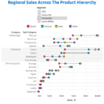
Requirements
- The dashboard size is 600px by 800px
- You must use Category and Sub-Category in your product hierarchy.
- Right-align each member in the hierarchy.
- Sort each level in the hierarchy descending by sum of sales.
- Match the color on Region using a palette. You may not custom assign, you must assign a palette that comes with Tableau.
- Show “lines” going from the region with the lowest value in a member of the hierarchy to the highest level.
- Make sure the min/max “lines” also sits between a horizontal grid line.
- Make the “lines” between min/max values appear as a thin black line.
- Use Segment as a filter.
This week utilizes the Superstore dataset. You can get it here at Data.World
As you complete this example, feel free to share on Twitter using the #WorkoutWednesday hashtag. Don’t forget to tag @VizWizBI, @RodyZakovich, and @LukeStanke. We really want to see your work.
Also, if you want your efforts throughout 2018 tracked, feel free to fill out this Google Form.
Good luck!
Spoilers
- Seriously, there is a palette that if you assign colors will give you exactly what you see.
- Add a white border to your black bar to make it appear to be a thin line.