2021 Week 41 | Power BI: Mapbox Maps
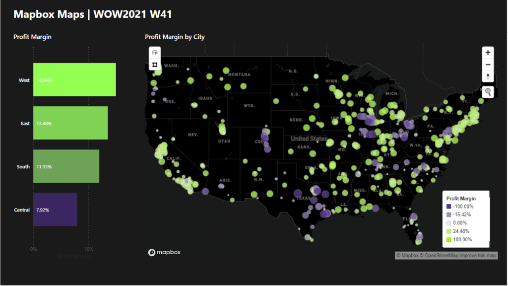
Introduction We have declared October to be mapping month! This month, we will focus on maps and geospatial data. There are several different maps available in Power BI as default and custom (AppSource) visuals. This week we are going to give you a fairly simple challenge that will show you some features of Power BI […]
2021 Week 41 | Power BI: Mapbox Maps Read More »