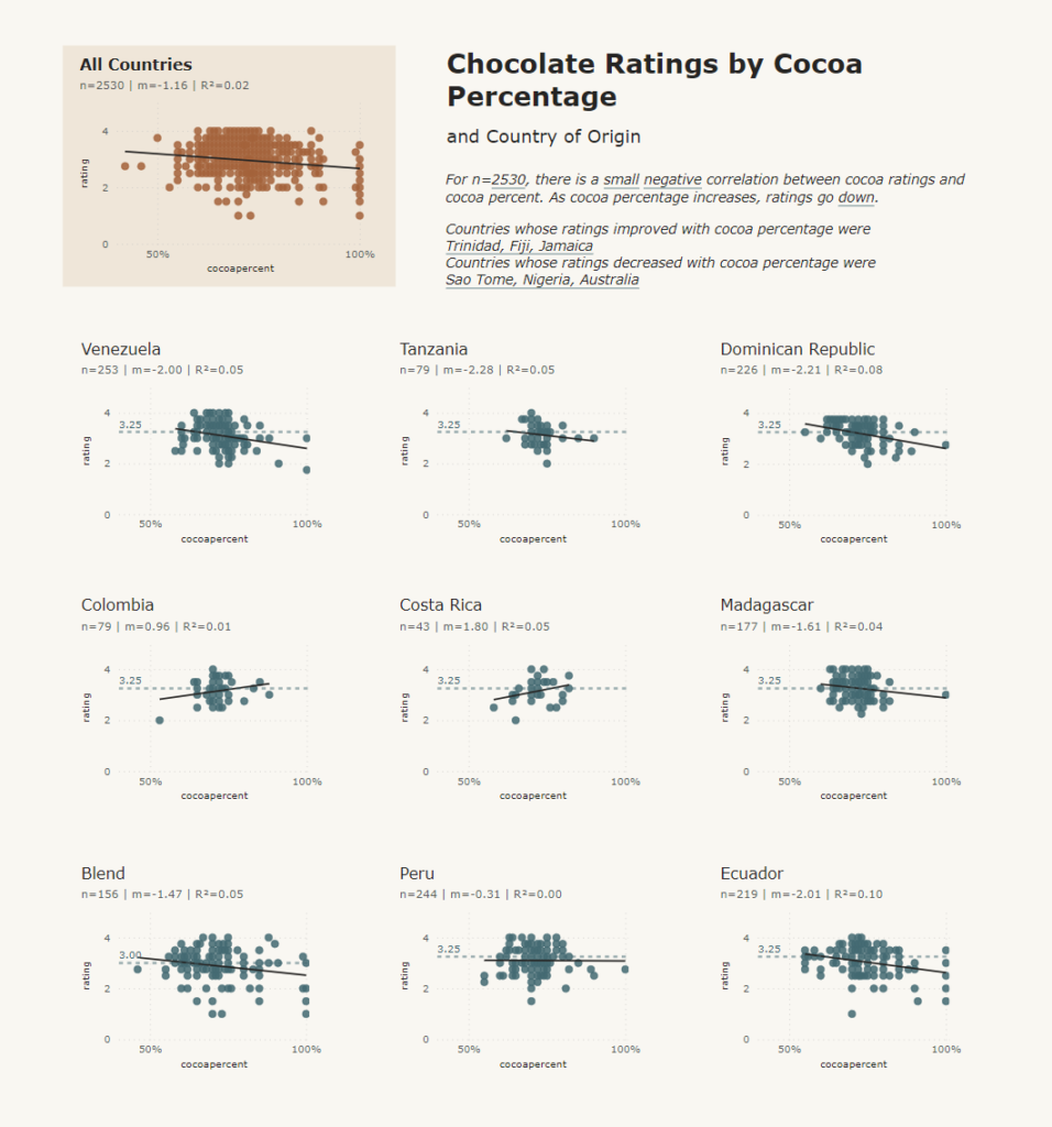
2024 Week 5 | Power BI: Create a Strip Plot with Median Overlay
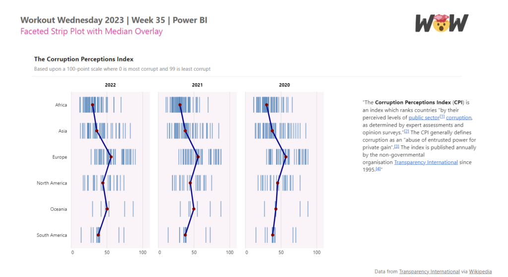
Introduction Sometimes it can be useful to show all data points instead of aggregating them. That is where an instance chart, also called a strip plot or a barcode plot, can be useful. This week we are building on a faceted strip plot made in 2023 week 35, and adding a median overlay. Inspired by […]
2024 Week 5 | Power BI: Create a Strip Plot with Median Overlay Read More »
Power BI, Workout Wednesday