2024 Week 03 – Double bar amount by accounts
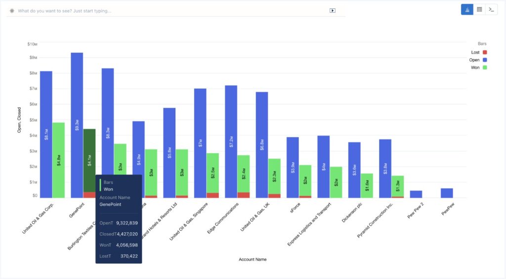
Introduction 2024 is here! And with that, a completely new set of challenges for you, data lover. Let’s sharpen our CRMA skills with this challenge: A double bar chart displaying open and closed amounts by account. The closed amount should display won and lost amounts in a single stacked bar. The open amount should be […]
2024 Week 03 – Double bar amount by accounts Read More »